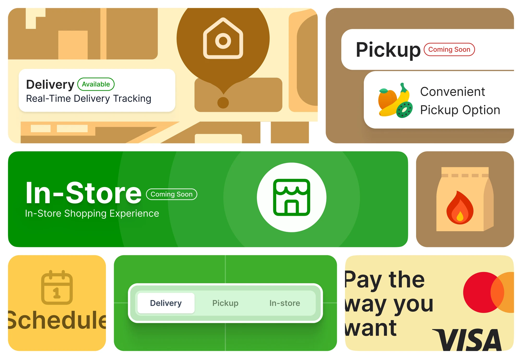
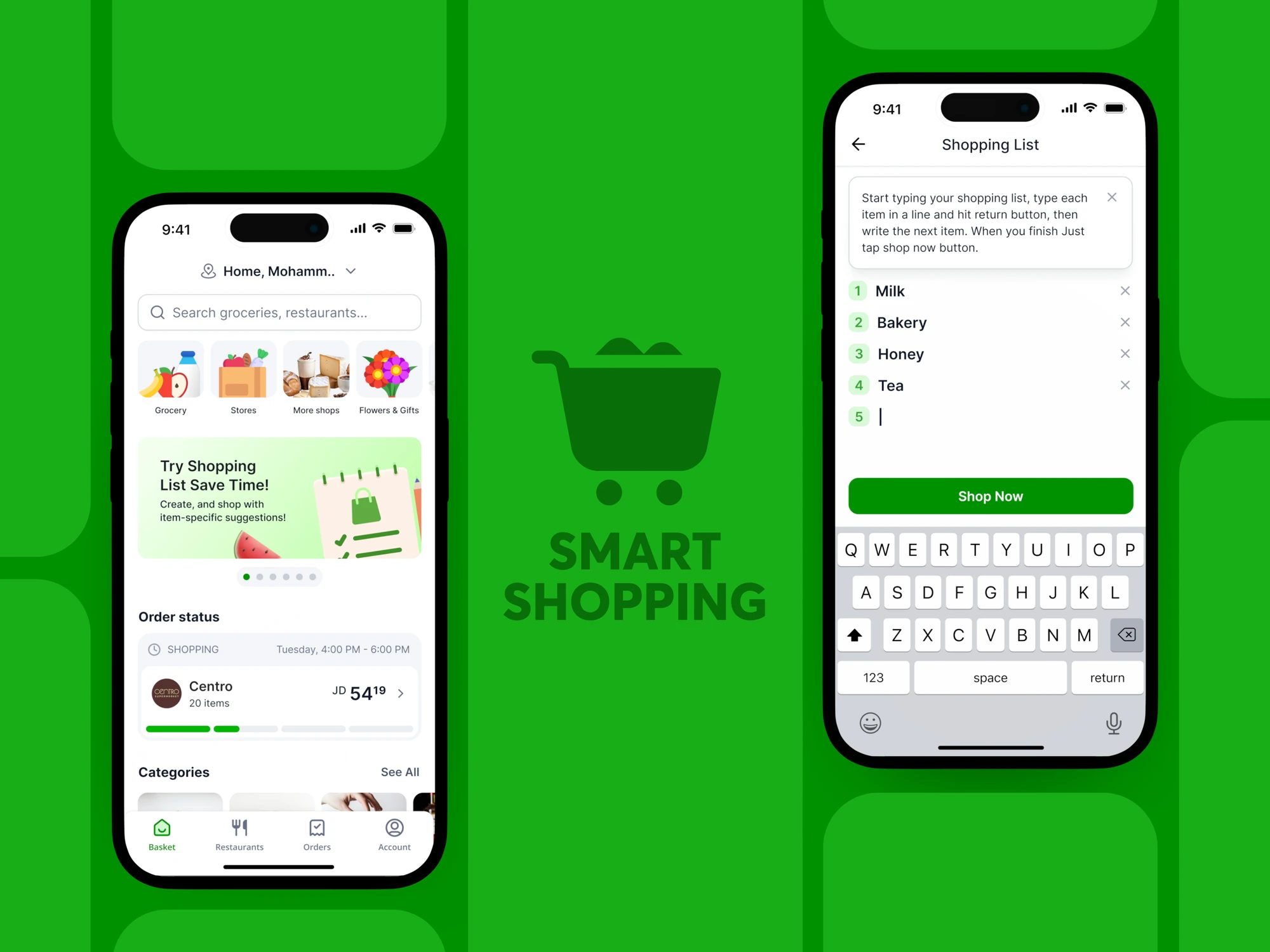
← Back/Grocery / Delivery

Basket

Basket's hour-delivery grocery app in Amman was functional and unreadable: one green scheme with text laid over product photography made every screen look identical and nothing easy to scan. In 2023 I interviewed 15 active customers, ran usability tests on real shopping sessions and benchmarked regional and international leaders, then rebuilt the experience from onboarding to checkout around readability, hierarchy and conversion.

RoleProduct Designer
Year2023
Tags
GroceryDeliveryUser ResearchMobile
View on Dribbble
Basket
At a glance

35%

Higher onboarding completion

22%

Less cart abandonment

4.6 / 5from 3.2

Satisfaction

01The problem

Basket's grocery app worked but could not be read or scanned.

Text sat directly on product photography and one green scheme made every screen look identical. Customers in Amman could not distinguish primary actions or sections.

Basket, the problem

02How we thought about it

Legibility was the foundation, not polish to add after the flow.

The visual system had been applied uniformly for consistency, ignoring the different jobs each screen does. No amount of flow work survives a screen people cannot scan. So I fixed readability first and only then shortened the path to checkout.

03What we changed

  1. 01

    Lifted text off the imagery

    Dedicated content areas with contrasting backgrounds mean text never fights a photograph.

  2. 02

    Differentiated sections with varied treatments

    A single green scheme caused banner blindness. Distinct palettes and treatments let people tell sections apart.

  3. 03

    Redesigned checkout at measured drop-offs

    Once screens were legible, each checkout change targeted a specific abandonment point from the usability tests.

The trade-off

I kept the brand recognisable while the hierarchy changed, so regular customers were not lost.

04What it did

Onboarding completion improved by 35% and cart abandonment dropped 22%. Satisfaction scores rose from 3.2 to 4.6 out of 5.

How we knewEvidence

Interviews and live-session usability tests found the friction; each change aimed at a measured drop-off.

Interviews

Qualitative

15

Active customers of an hour-delivery grocery app in Amman.

Usability test

Mixed

Sessions run on real shopping, so the friction observed was the friction that actually costs orders.

Benchmark

Qualitative

Regional and international grocery delivery leaders, studied for how a mature experience handles hierarchy and density.

Analytics

Quantitative

3.2 → 4.6

Satisfaction out of 5, with 35% higher onboarding completion and 22% less cart abandonment.

DecisionsAnd why

What we saw, what we knew, what we chose, and what we gave up.

01

Readability first: text never fights an image

What we saw
Every screen looked the same, and text laid over product photography made nothing easy to scan.
Evidence
Usability test· MixedTests ran on real shopping sessions, so the friction observed is the friction that actually costs orders.
Interviews· Qualitative15 active customers were interviewed alongside the session tests.
So we
Rebuild the hierarchy so text and imagery are separated and sections become distinguishable, keeping the brand recognisable.
Not
Adding more flow features on top of screens people could not scan.
What happened
Across the redesign, satisfaction rose from 3.2 to 4.6 out of 5.

02

Redesign against measured drop-off

What we saw
Abandonment happened at specific points between onboarding and checkout.
Evidence
Analytics· QuantitativeEach checkout change was aimed at one measured abandonment point rather than at the flow in general.
So we
Shorten the path at each drop-off, with onboarding and checkout rebuilt around what people did.
Not
A visual refresh that left the funnel unchanged.
What happened
Across the redesign, onboarding completion rose 35% and cart abandonment fell 22%.

User testingWhat was and was not tested

Usability tests were run on live shopping sessions before the redesign, and the outcome was measured after launch. A formal before-and-after usability test of the new design is not recorded.

My role

Product Designer

What I personally owned on this project.

  • 01Ran 15 customer interviews and usability tests on real shopping sessions
  • 02Benchmarked regional and international grocery delivery leaders
  • 03Redesigned the full experience from onboarding through checkout
  • 04Rebuilt the visual system for readability while keeping the brand recognisable
Made with
FigmaUser interviewsUsability testingCompetitive analysis
Next Project

Neumorphism

© 2026 Alhasan HosniDesigned & Built with precision