← Back/Visual Design / 3D

Neumorphism

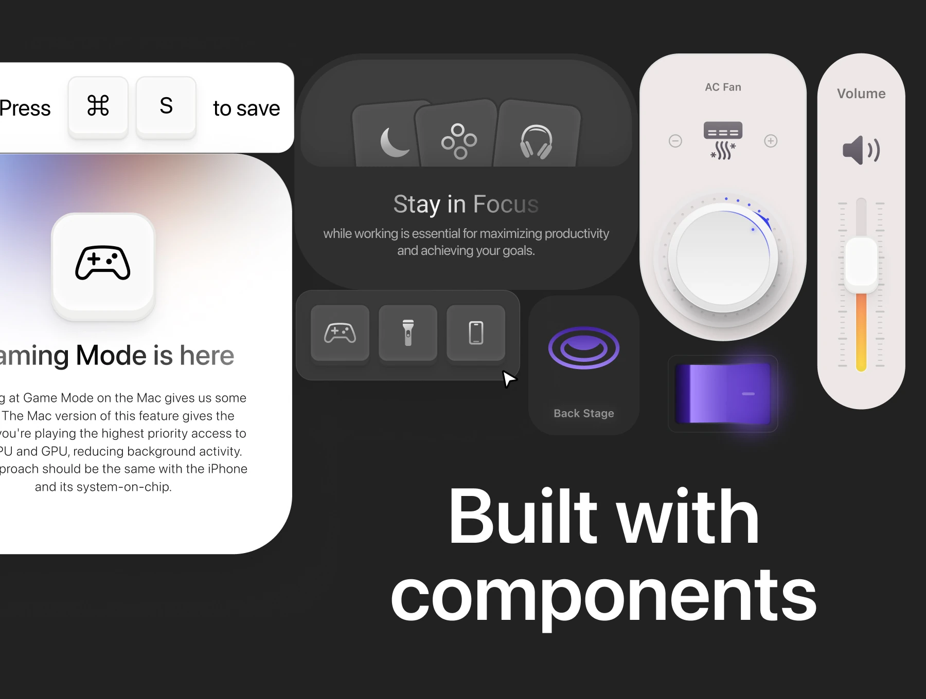
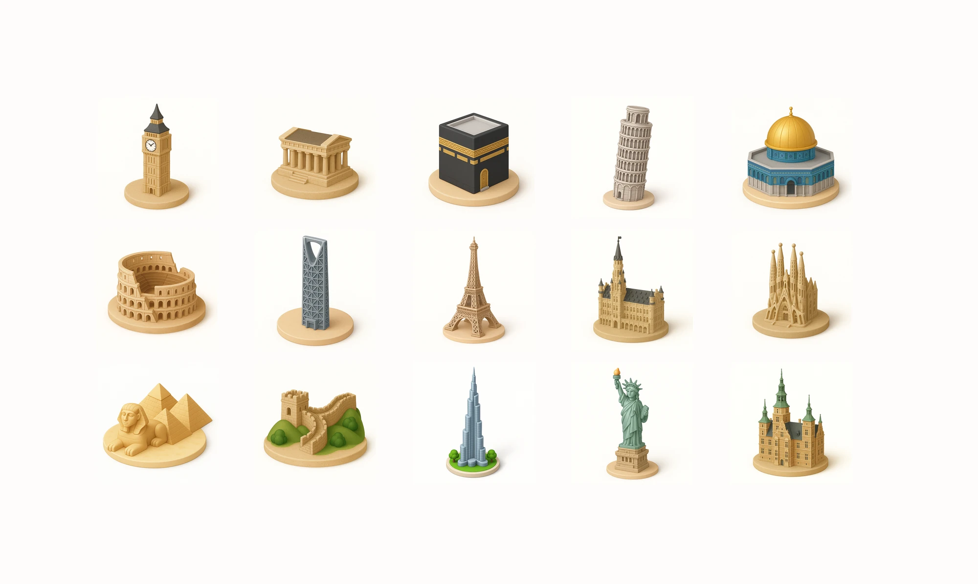
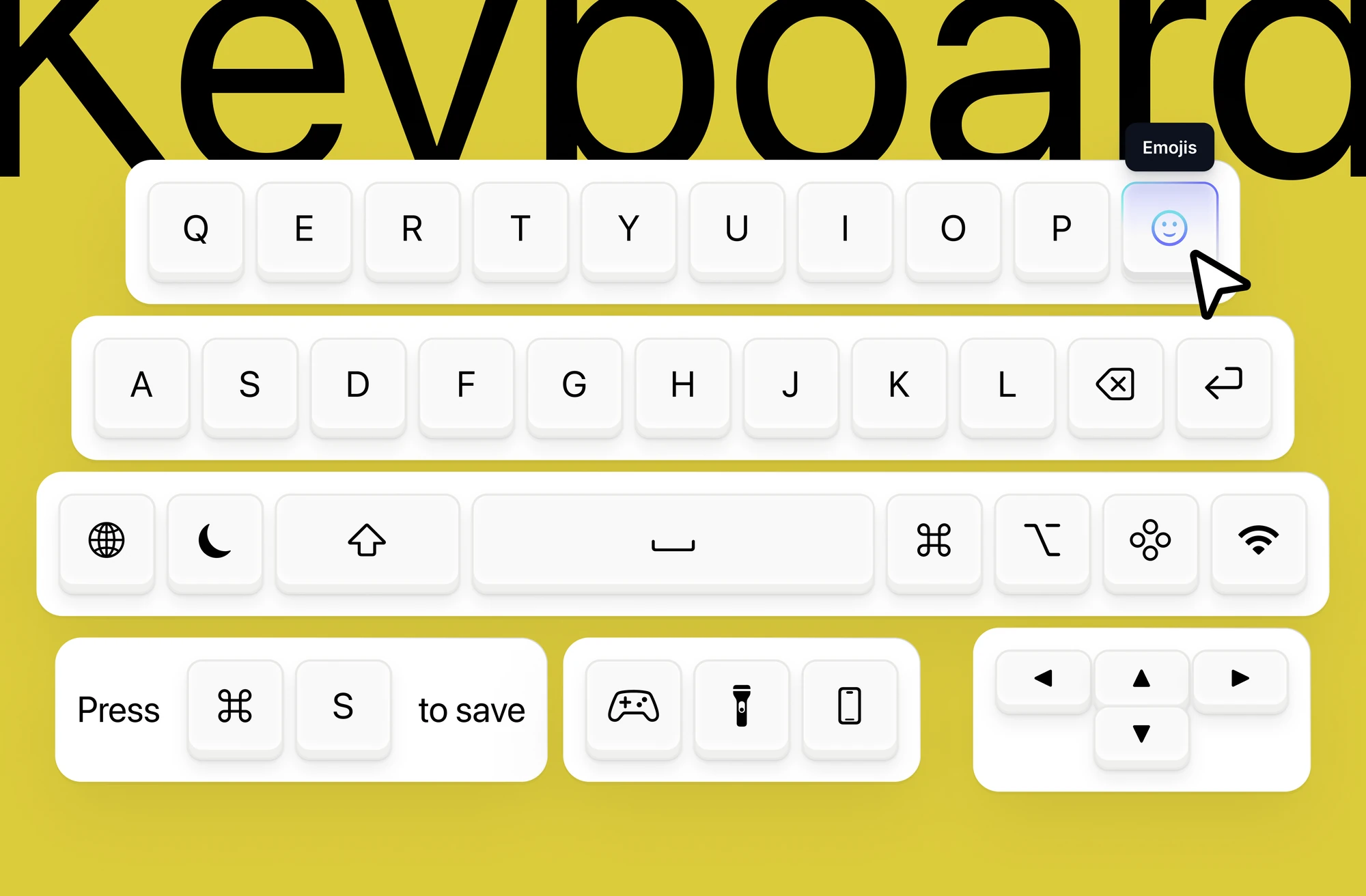
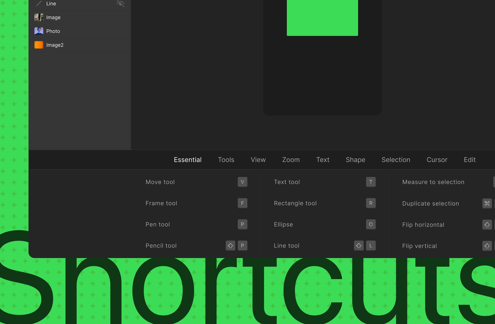
Neumorphism promised depth without skeuomorphic excess and mostly delivered unusable interfaces: low contrast, ambiguous affordances and accessibility failures. It happens because the style gets copied as an effect rather than derived from how light and materials behave. Across 2023-2024 I studied the physics of soft surfaces and built a complete visual language, components, 3D icons, keyboards, widgets and shortcuts, that stays tactile without sacrificing legibility.

RoleVisual Designer
Year2023-2024
Tags
Neumorphism3DIconsVisual DesignComponents
View on Dribbble
Neumorphism
At a glance

12,000+

Downloads on Dribbble

5

Collections built on one set of light rules

01The problem

Soft-UI promised depth and mostly delivered unusable, inaccessible interfaces.

Implementations chased the same visual effect and failed on contrast and affordance. Users could not tell what was pressable or read what was there.

Neumorphism, the problem

02How we thought about it

Neumorphism is a material model, not a shadow recipe.

The style was copied as an effect, so the two things the recipe destroys were never solved. I derived it from how light wraps a soft surface instead. Contrast and affordance became constraints the style had to satisfy.

03What we changed

  1. 01

    Set fixed light and depth rules

    A consistent 145° light source and 4 shadow depth levels give every state a physical explanation rather than a preset.

  2. 02

    Made pressability read as depth

    Rest lifts the surface and pressed sinks it, so the eye reads state as depth changing. That is what gives a soft control its affordance.

  3. 03

    Proved it across five collections

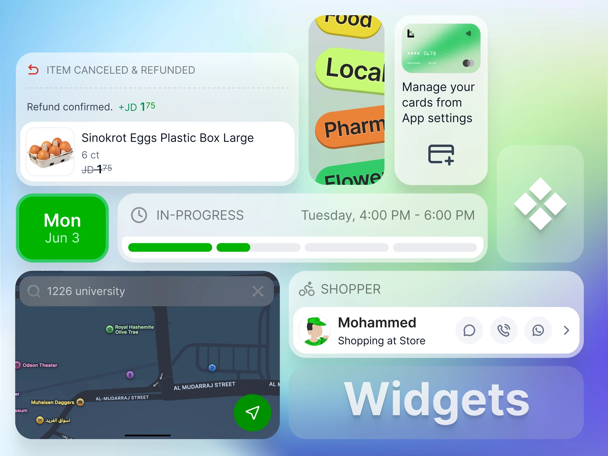
    Components, 3D icons, keyboards, widgets and shortcuts tested the rules. The breadth is what shows it is a system rather than a look.

Neumorphism, what we changed

The trade-off

I refused to trade contrast for softness, holding ratios that meet WCAG AA despite the aesthetic.

Neumorphism, in use

04What it did

The kit was downloaded 12,000+ times on Dribbble. Several elements were adopted by product teams exploring tactile interfaces for automotive and smart home applications.

Neumorphism, detail

How we knewEvidence

A visual language judged by constraint and by reach: contrast and affordance held as non-negotiables.

Benchmark

Qualitative

How light wraps soft materials and how shadow communicates pressure, studied before any component was drawn.

Prototype

Qualitative

5

Collections built on one set of light rules: components, 3D icons, keyboards, widgets and shortcuts.

Analytics

Quantitative

12,000+

Downloads on Dribbble.

Not yet tested

None

No contrast measurement or usability test is recorded here, although legibility is the constraint the language is built around.

DecisionsAnd why

What we saw, what we knew, what we chose, and what we gave up.

01

Derive the language from how light behaves

What we saw
Soft UI usually ships as a shadow recipe, which destroys contrast and affordance.
Evidence
Benchmark· QualitativeIndustry implementations failing usability and accessibility while chasing the same effect.
Design judgement· QualitativeContrast and affordance fixed as non-negotiables.
So we
A material model first, then components, with rules tightened each time a new surface exposed an ambiguity.
Not
Copying the shadow recipe.
How we'd know
A contrast measurement of every component pair against WCAG, then an affordance test. No result is published here.

User testingWhat was and was not tested

Judged by reach (five collections, 12,000+ downloads), not by participants.

“Which of these elements can you press?” on five components in the language

Correct identification of pressable elements

5 of 5 on every control

Contrast check of text and controls on their surfaces

Ratio against WCAG AA

Every pair at 4.5:1 or above for text, 3:1 for controls

Proposed protocol. Nothing in this table has been run, and the pass bars are my thresholds, not results.

My role

Visual Designer

What I personally owned on this project.

  • 01Built the complete visual language and every artefact in the collection
  • 02Derived the light, shadow and texture rules from material behaviour
  • 03Set the contrast and affordance constraints that keep the style usable
  • 04Extended the system across components, 3D icons, keyboards, widgets and shortcuts
Made with
Figma3D icon designVisual systemsAccessibility constraints
Next Project

Smart Commerce

© 2026 Alhasan HosniDesigned & Built with precision