


← Design systems/2026 · Lead Product Design Engineer

Talentera DS & Sanad

A design system for white-label hiring software, and the AI assistant that lives inside it: Sanad, built as seven components that are interruptible, explainable and priced, on the foundations and components every page shares.

132
Components on one token source
7
Of them are Sanad, the assistant
3
Faces: a 2D head, a 2D creature, a 3D orb
10
AI Points per sourced candidate, stated on the card

Components only, never full pages. The product screens built with them are under NDA and are not shown.

01The problem

Recruiters would rather write a job description by hand than accept a generated one.

The assistant wrote into records recruiters sign their name to, so every error became theirs. Teams also avoided the AI surfaces once they suspected usage was metered somewhere they could not see. Neither problem is about model quality.

02How I thought about it

The design problem was trust, not capability, so Sanad became part of the system.

An assistant earns its place by being interruptible, explainable and priced. AI features built outside the system look bolted on within one release, so Sanad was specified as components from the first day, with the same tokens, the same inventory and the same approval path for changes.

03The flow I designed

From the first hello to the price on the card.

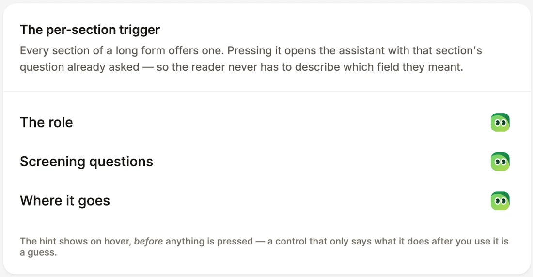
Sanad moved to where the work is. Every section of a form carries its own trigger, replies arrive review first, and the credit is charged after the reply rather than before the question.

  1. 01

    Meet him once, then never again

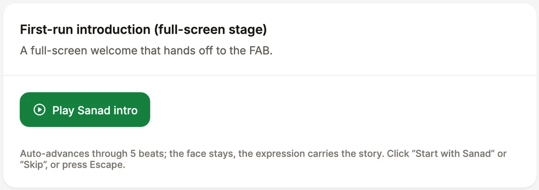
    First run is a full screen stage that blurs the workspace and puts Sanad at the centre. Five scripted beats, one avatar throughout, the expression carrying the story from idle to asking to thinking to excited to done, with the copy arriving on a blur reveal. Skip for now sits under Start with Sanad, because an introduction you cannot decline is an obstacle.

  2. 02

    Ask from the field, not from a launcher

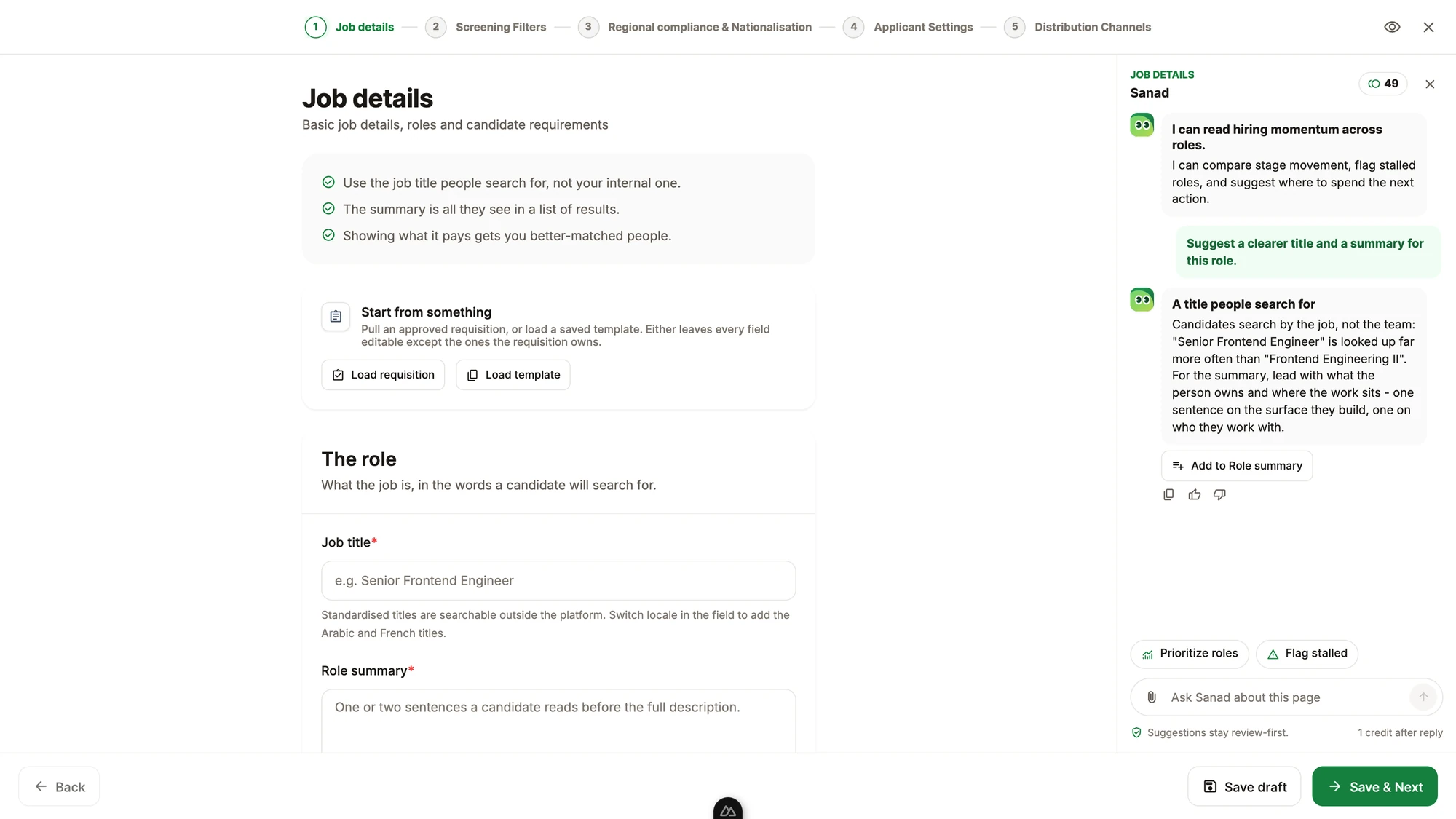
    Every section of the job form carries its own trigger. The hint on hover names the action rather than the capability, so The role offers to suggest a title candidates actually search for and write the summary under it. Pressing it opens the assistant with that question already asked, which is the step that removed the blank thread problem.

  3. 03

    Watch him read the work

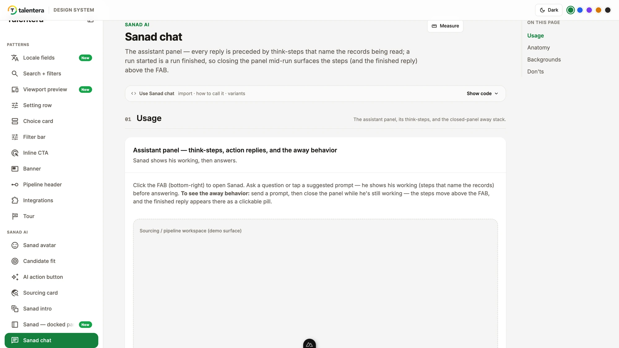
    A reply is preceded by think steps that name the records being read, so the answer is visibly computed from this job and these candidates rather than from a general model. A run that starts finishes: close the panel halfway and the steps move above the floating button, with the finished reply waiting there as a pill you can press.

  4. 04

    Take the answer into the field

    The reply carries the apply action for the field it belongs to, Add to Role summary or Add to Job description, so an answer becomes work in one press. Suggestions stay review first, and the credit is charged after the reply, which means a question that returns something useless costs nothing to have asked.

  5. 05

    Let AI sit below the primary action

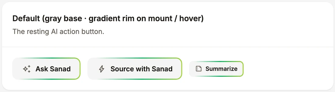
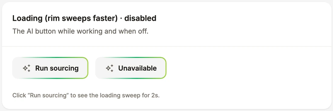
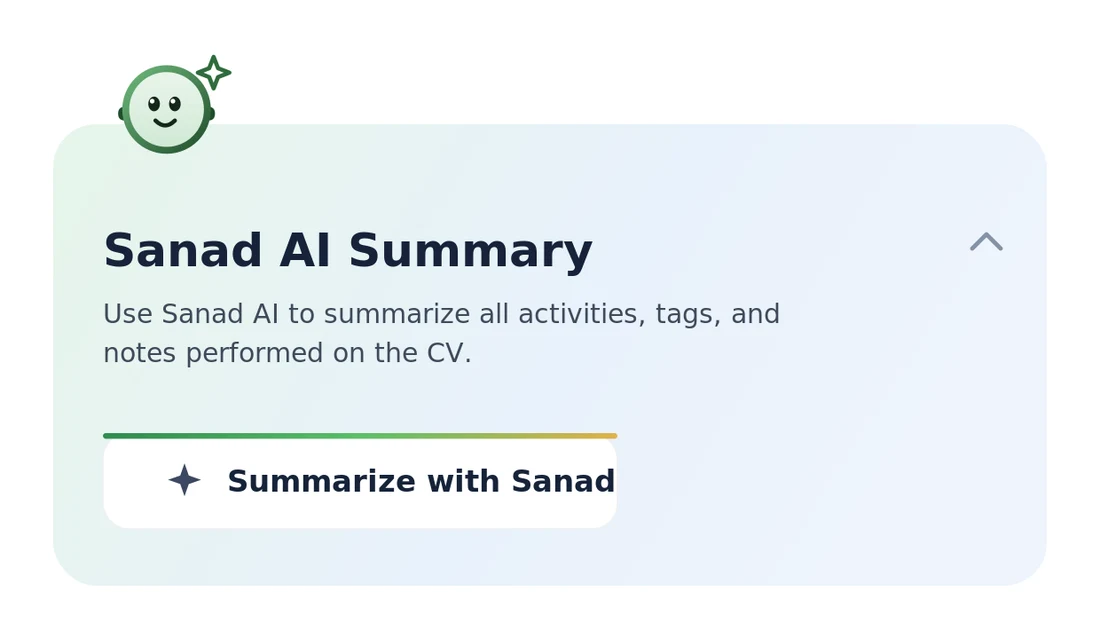
    The AI action button is deliberately grey with the Talentera gradient rim sweeping on mount and hover, faster while loading. It never competes with the primary call to action on the screen, because an assistant that shouts louder than Save gets pressed by accident and then distrusted.

  6. 06

    Pay by the thing, not by the token

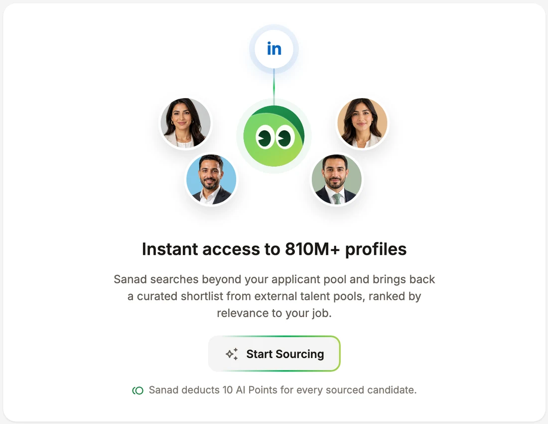
    Sourcing states its own price on the card that runs it, ten AI Points for every sourced candidate, next to what it actually does: search beyond the applicant pool across 810 million profiles and bring back a shortlist ranked by relevance to this job. Nobody has to translate tokens into money.

Live / Sanad AI

Sanad, in the system that owns him

The design system application itself, opened on Sanad chat and held to the Sanad AI pages: the avatar with its modes and expressions, candidate fit, the AI action button, the sourcing card, the first run intro and the docked panel.

Sanad, in the system that owns him· the product's own code
loading the real thing…

This is the design system application, running, with only the seven Sanad AI pages shown. Every specimen is the component itself, with its usage, anatomy, backgrounds and don'ts beside it.

04How we knew

Specified by running it, and honest about what has not been tested.

Design judgement

Qualitative

2

Acceptance criteria every Sanad surface is designed against: accountability, because output lands in records the recruiter signs, and cost, because nobody could see what an AI action cost until the invoice.

Prototype

Qualitative

7

Sanad pages in the design system, each a live specimen with usage, anatomy, backgrounds and don'ts, so the behaviour is specified by running it.

Code review

Quantitative

1

A component inventory an agent is told to read before building, and lint rules in CI, so adherence does not depend on who is reviewing.

Usability test

Mixed

Sanad was tested internally with the Talentera team and with clients, and every task passed. Participant details and figures are not published on this page, and no adoption or accuracy figures are claimed.

01 of 10

A character, not an icon

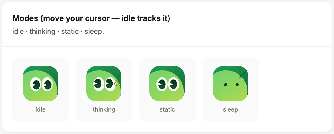
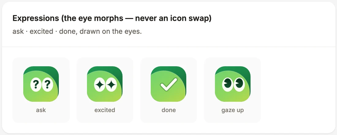
Sanad is a green face drawn inside whatever hosts it, with pupils that track the cursor, blink every few seconds and glance away when the cursor is still. The expression carries the state: asking, excited, done. One shared animation loop drives every avatar on the page.

Modes
Expressions
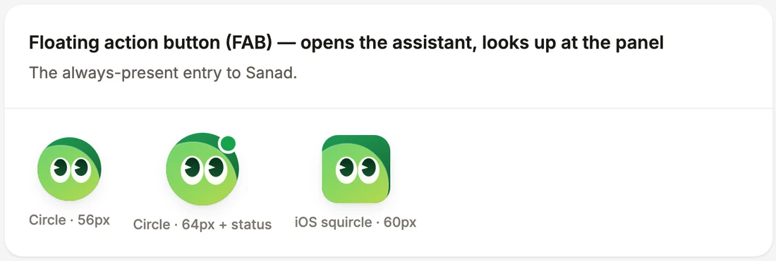
Floating action button

02 of 10

AI that never shouts louder than Save

The AI action button is grey with a thin gradient rim that sweeps once on mount and on hover, faster while loading. It sits on any surface where the work is, and never competes with the primary action.

Default and hover
Loading and disabled
Per-section trigger in a job post

03 of 10

A fit score that gives its reasons

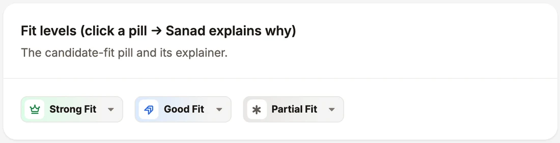
The candidate-fit pill shows strong, good or partial in a tinted pill. Pressing it opens an explainer that first shows an analysing state and then the matched reasons. The score is never shown without them.

Fit levels

04 of 10

A conversation that shows its working

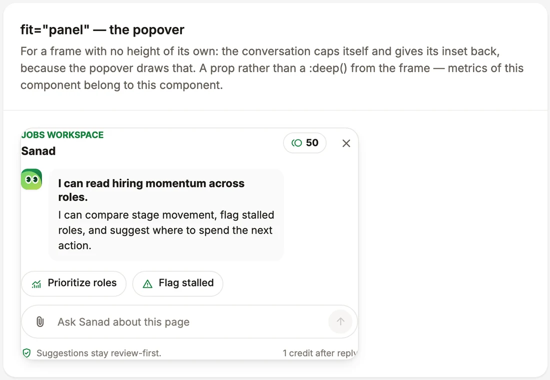
The assistant opens docked beside the work or as a popover. Before each reply, think steps name the records being read. If the panel is closed mid-run, the steps move above the floating button and the finished reply waits there as a pill.

Per-section trigger
Popover panel
Reply with an apply action

05 of 10

Meeting him once, and paying by the thing

First run is a full-screen stage, never a popover, with one avatar throughout while the expression tells the story, and Skip for now under the primary action. Sourcing states its own price on the card that runs it.

First-run introduction
Sourcing card

06 of 10

Tokens first, so a component can be one thing

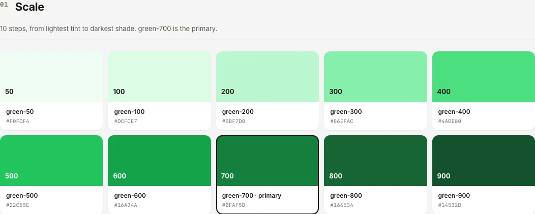
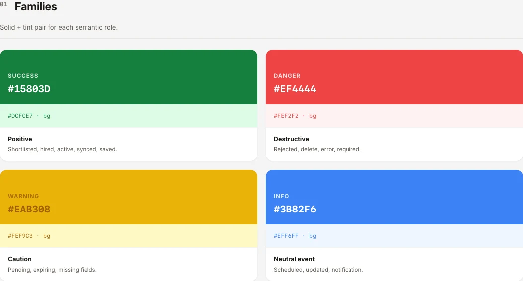
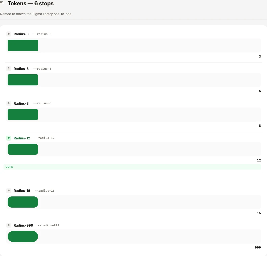
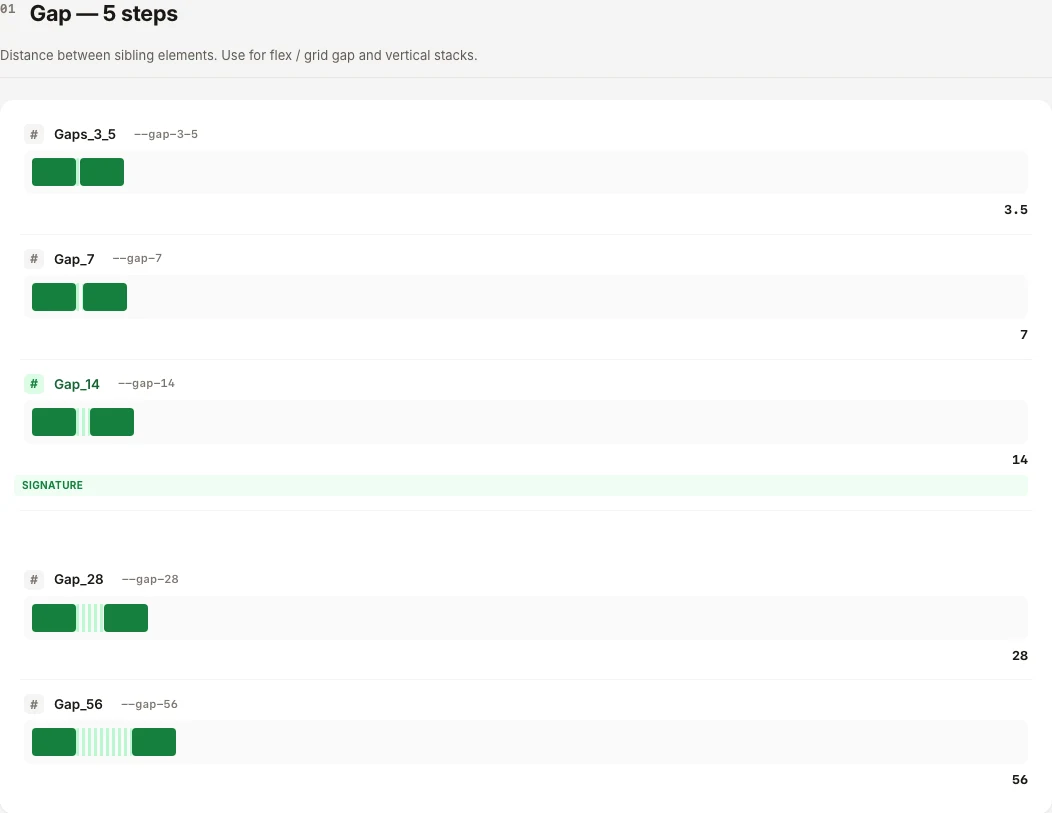
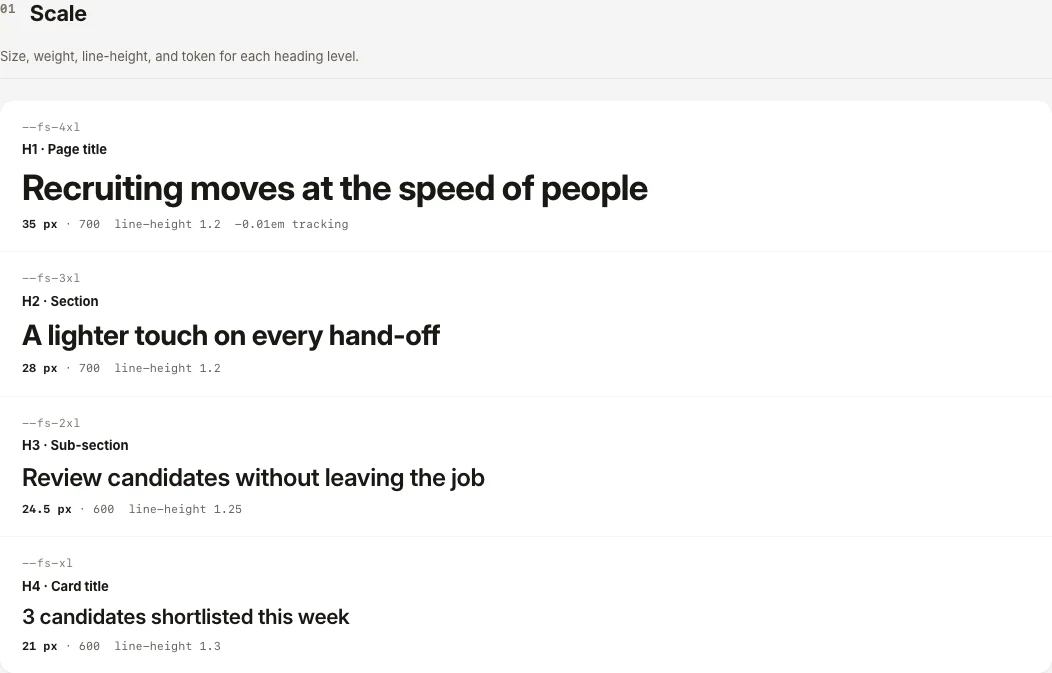
Sanad is built from the same foundations as everything else. Green 700 is the one primary, on a ten-step scale. Success, danger, warning and info each come as a solid and a tint. Radius has six stops and spacing five gaps, so a component picks a name instead of a number.

Primary green scale
Semantic colours
Radius tokens
Spacing tokens
Type scale

07 of 10

One filled button per surface

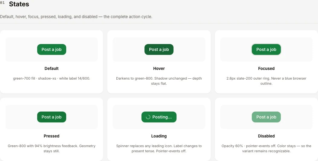
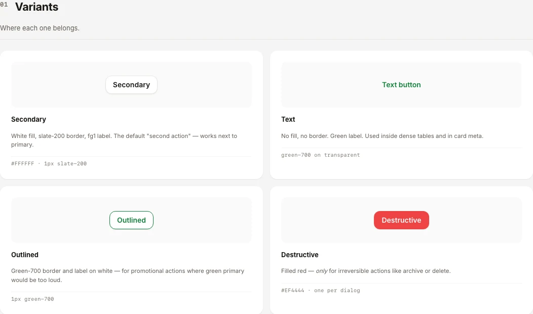
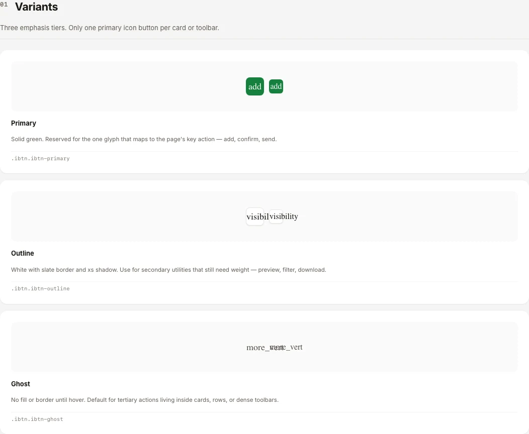
Actions follow one rule: a single filled green button says what the page is for, and everything else steps down through secondary, outline and ghost. Each variant lists its default, hover, focus, pressed, loading and disabled states.

Primary button states
Secondary and text variants
Icon buttons

08 of 10

Forms that say what state they are in

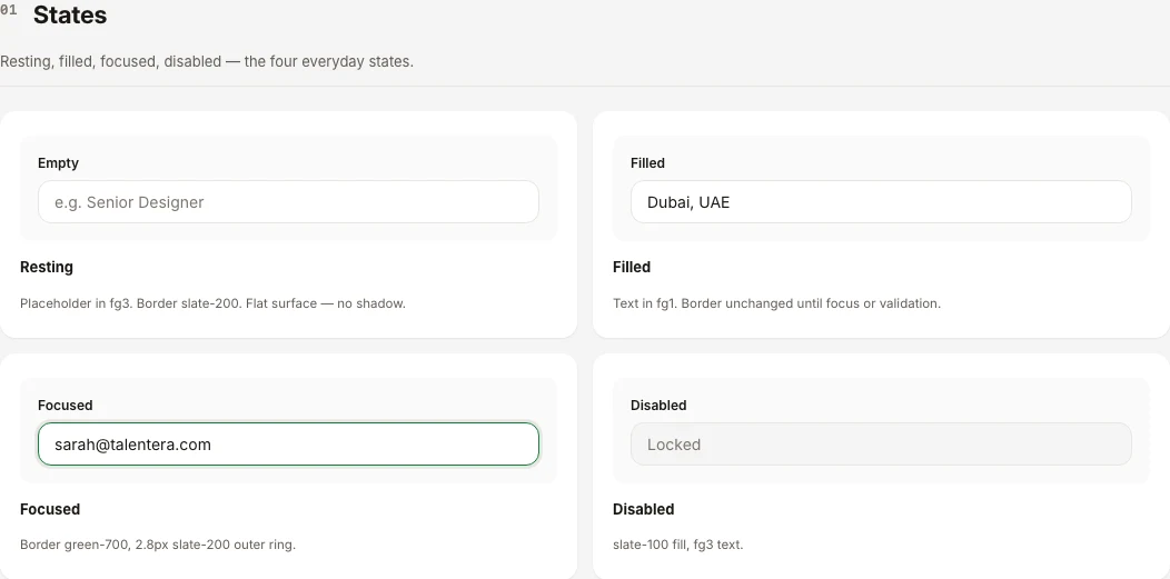
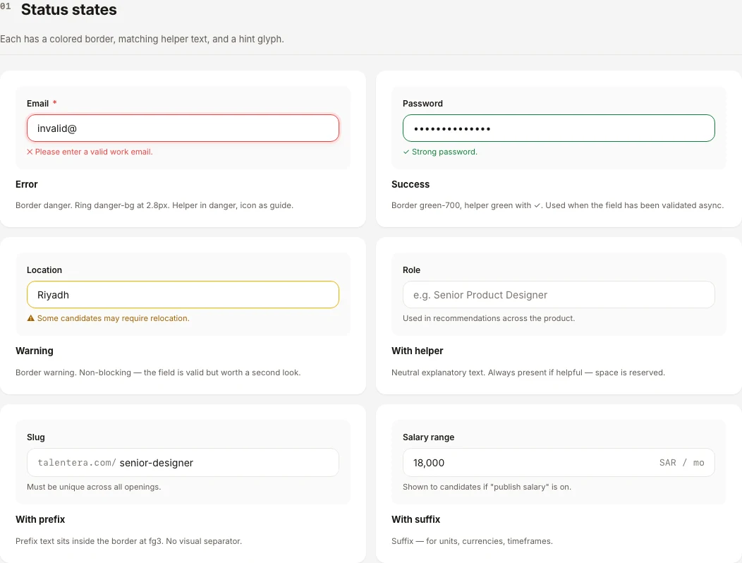
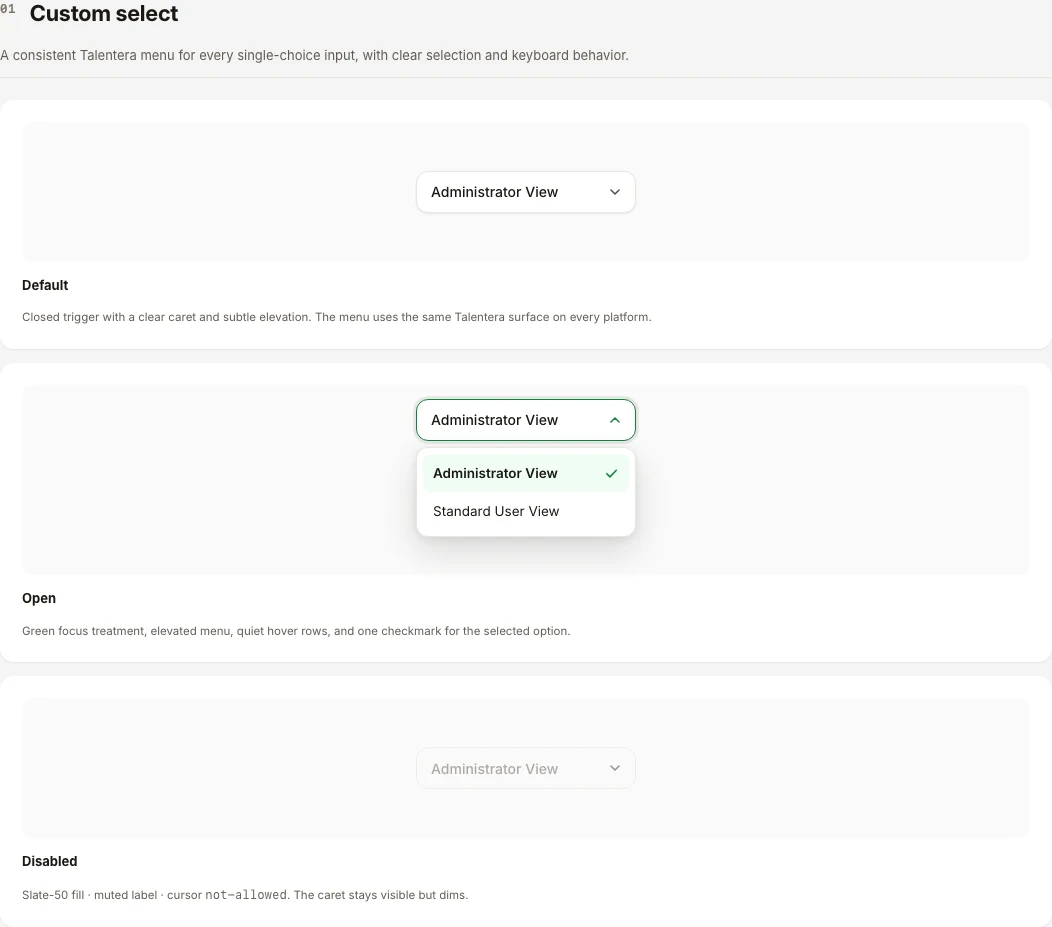
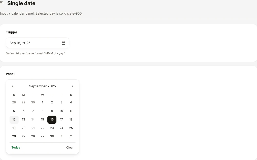
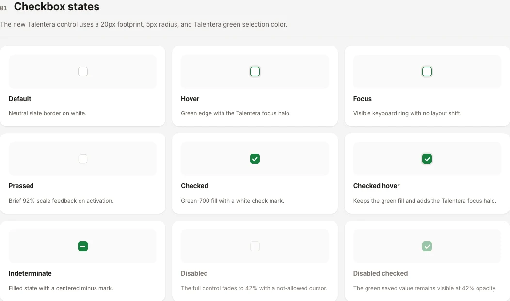
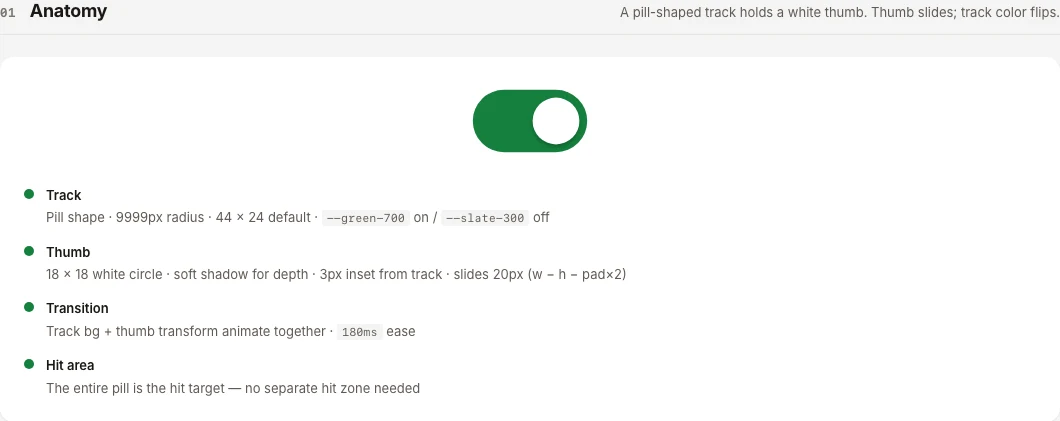
Inputs show empty, filled, focused and disabled, then error, success and warning with helper text. The custom select, the date picker, the checkbox states and the toggle are documented the same way, so a form is assembled rather than invented.

Input states
Status states
Custom select
Date picker
Checkbox states
Toggle

09 of 10

Moving through a flow

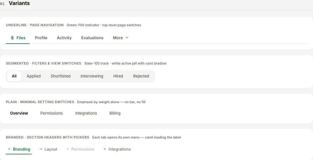
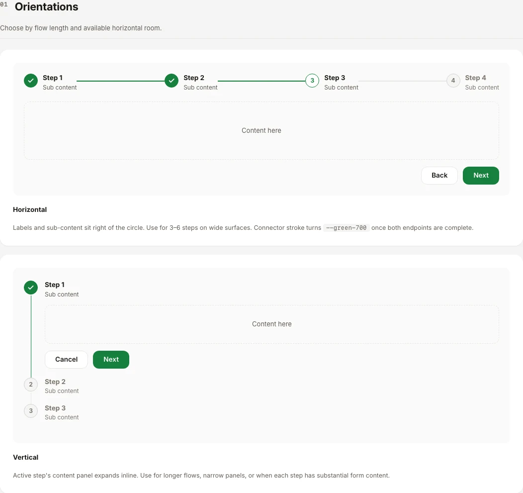
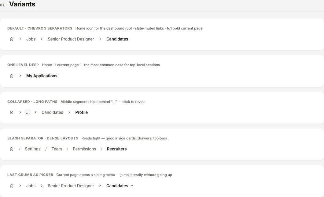
Tabs come as underline, segmented, plain and branded. Steppers run horizontally or vertically, breadcrumbs collapse long paths, and pagination keeps its 28px targets. Sanad sits inside these flows rather than replacing them.

Tabs
Stepper
Breadcrumbs
Pagination

10 of 10

The data Sanad reads, and the messages around it

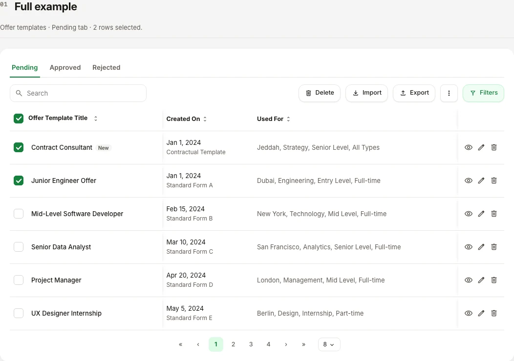
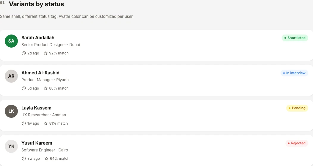
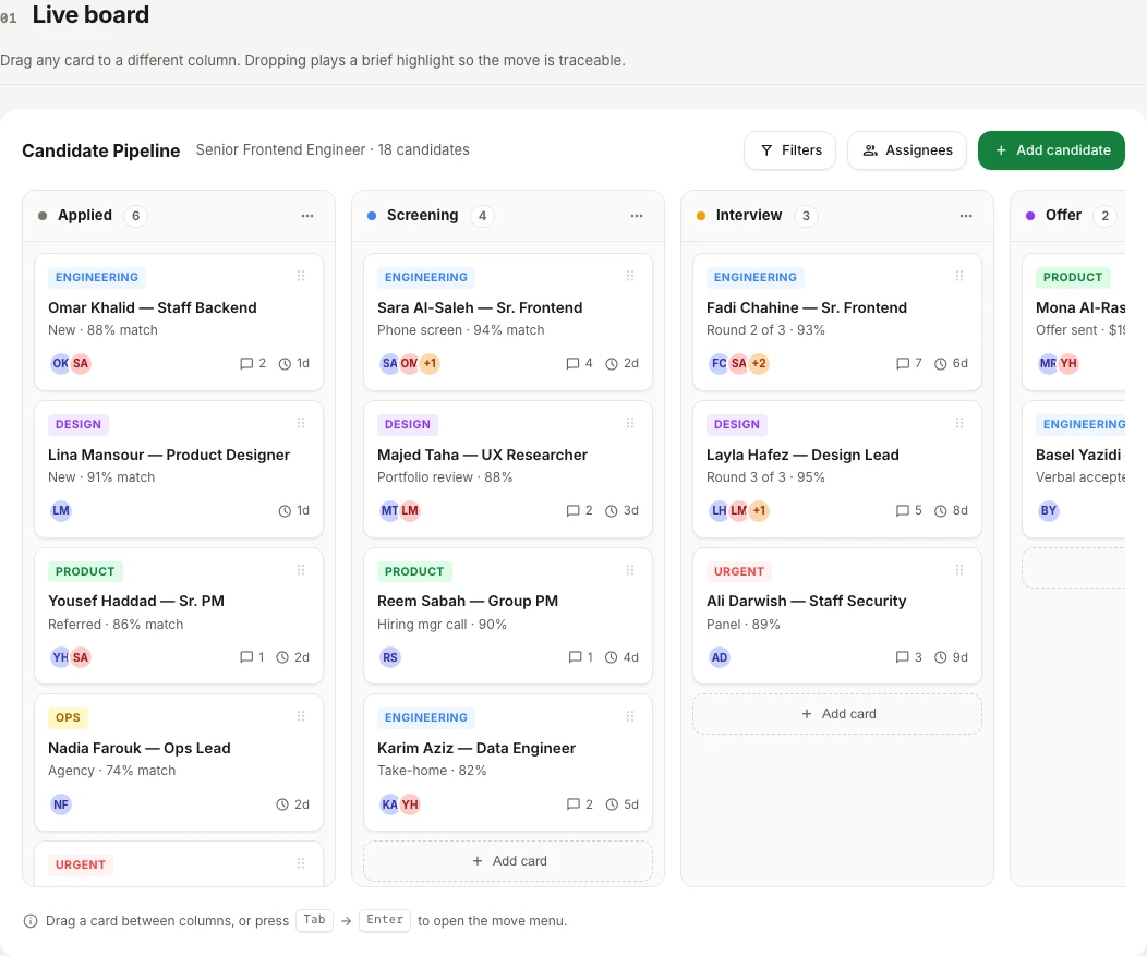
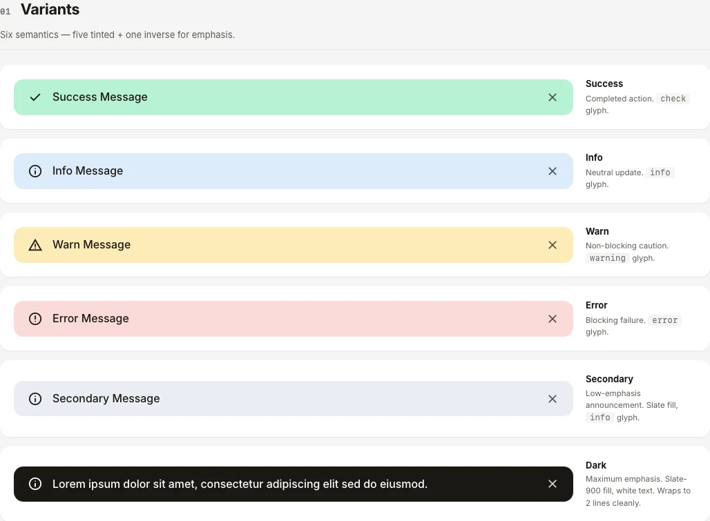
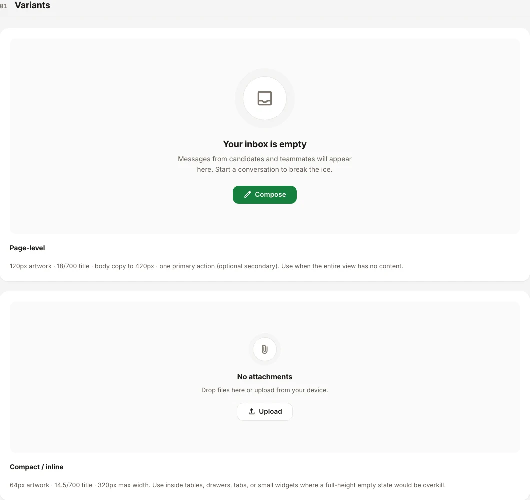
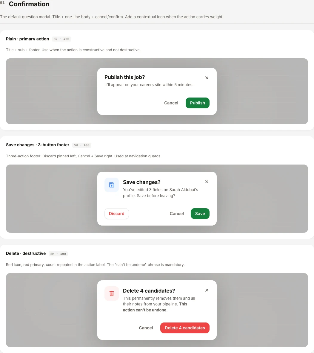
A fit score is only as good as the records it sits beside, so tables, candidate cards, the pipeline board, tags and avatars share one definition each. Alerts, empty states and modals give every failure and every empty list a designed answer.

Data table
Candidate cards
Pipeline board
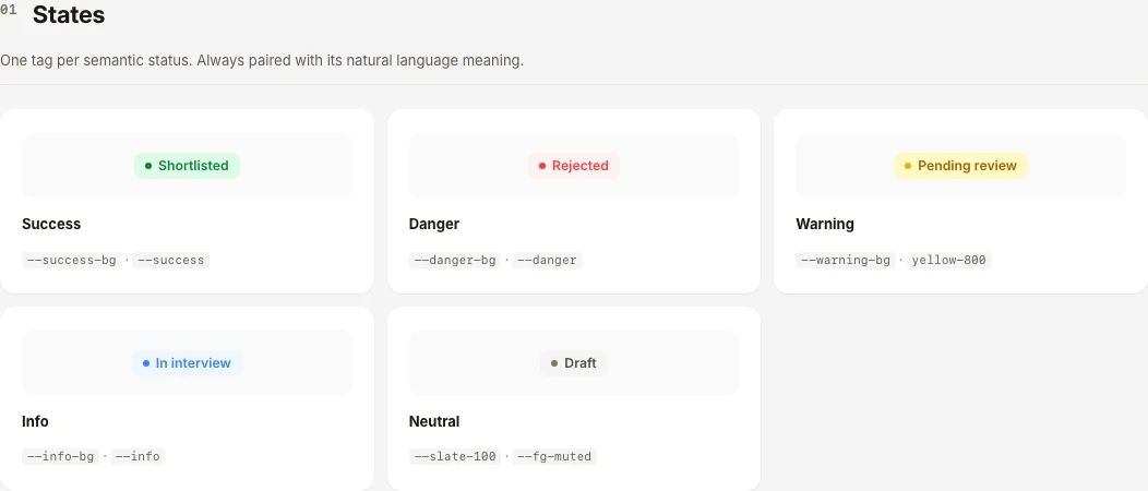
Status tags
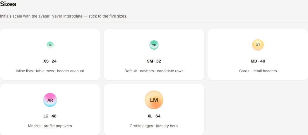
Avatars
Alerts
Empty states
Modals

The characterThree faces

Sanad started as a 2D face. He is now a 3D orb.

The first Sanad was a smiling head with a symbol beside it. The second was a creature that sits inside the button holding him. The third is a soft orb whose body is the character. Below is every example of each, with what changed and why.

Version 1 · June 2026

A smiling head with a symbol beside it

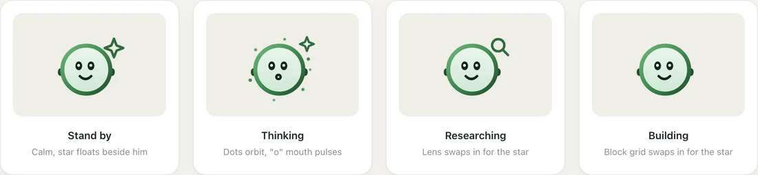
A 2D character with ears and a mouth. The state rides on a symbol next to his head: a star, orbiting dots, a lens, a grid of blocks.

Version 2 · August 2026

A green creature, cropped by its host

A 2D SVG character drawn larger than his box and cropped by whatever holds him. No mouth: the eyes carry the expression.

Version 3 · August 2026

A soft 3D orb

A WebGL2 orb whose whole body is the character. It keeps its shape and shows feeling in the eyes, and becomes something when Sanad is acting.

Version 1 · June 2026

A smiling head, with a symbol beside it

A round, outlined head with ears and a smile. The mode icons share one anchor close to his head: a star for standby, a star with orbiting dots for thinking, a lens for researching, blocks for building. His pupils follow the cursor, and each switch crossfades the icon, morphs the mouth and gives a little bounce.

Four states, one character
Switching modes: the icon crossfades, the mouth morphs
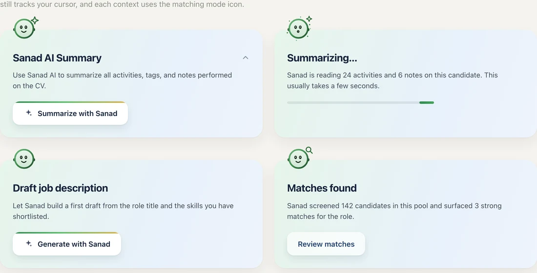
Attached to a card
A test render, 4 June
Test renders, 4 June: researching, thinking, visibility

From the character-system page and the test renders of 4–7 June 2026. The sample copy on those cards is placeholder text.

Version 2 · August 2026

A creature that lives inside the control

A green body drawn larger than its box and cropped by the host, with two white eyes and a darker ground behind. Four modes (idle, thinking, static, sleep) and expressions that morph the eyes: ask, excited, done and a gaze up. Thinking adds three outlined sparkles that orbit his face.

Modes: idle, thinking, static, sleep
Expressions: the eye morphs
Floating action button
The per-section trigger
Inside a job post

Specimens from the Sanad pages of the design system, and one product screen.

The state moved off the symbol

In version 1 a single icon slot beside the head swapped between star, lens and blocks. In version 2 the character carries it: pupils ease toward the cursor, sparkles orbit his face, three z's rise when he sleeps. The system's rule is explicit: don't swap the icon for an expression, the eye morphs.

He sits inside the control that holds him

The body is drawn larger than its box and cropped by the host's shape, so a circular button gives a circular crop. The spec calls letterboxing him in a padded container the wrong build: it makes him an icon scaled to fit.

A mode for repeated rows

A dozen blinking faces down a chat transcript is noise, so version 2 adds a static mode that costs nothing per frame. The flat mark stays for brand and logo positions; the character is for moments where the assistant is present and acting.

Version 3 · August 2026

A soft 3D orb

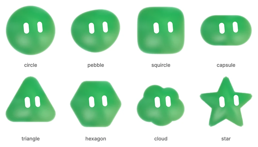
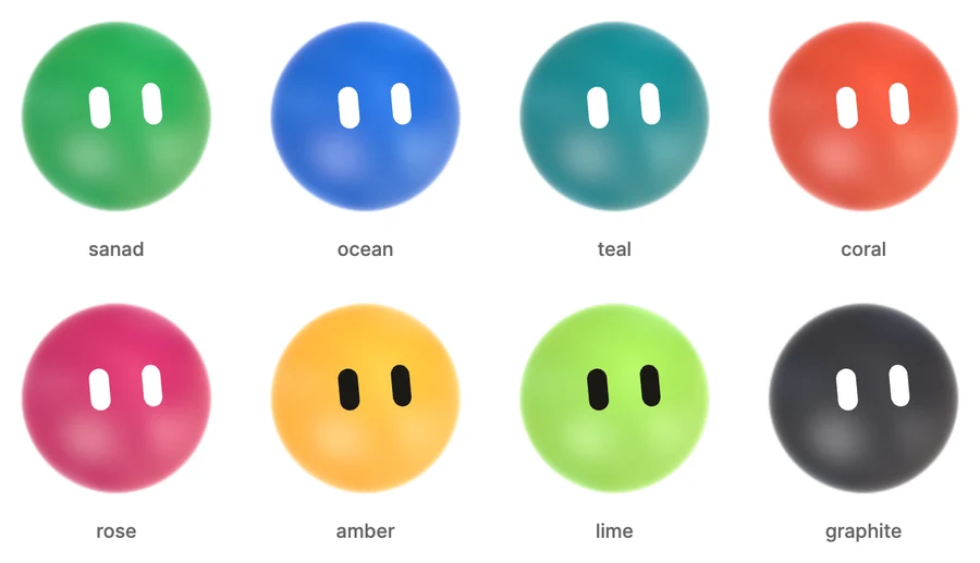
A WebGL2 orb: a fragment shader that renders the shading, texture, soft edge and glow inside the silhouette, with an eye layer on top. It is ported from an orb editor, with the body silhouettes adapted from an open-source customiser. Each panel below was rendered with the product's own engines.

Four modes: the body itself changes
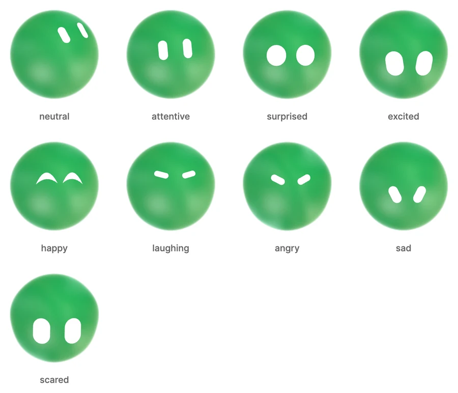
Expressions 1 to 9, all in the eyes
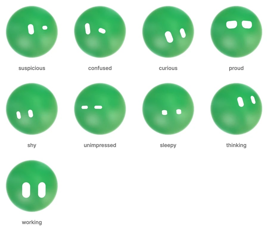
Expressions 10 to 18
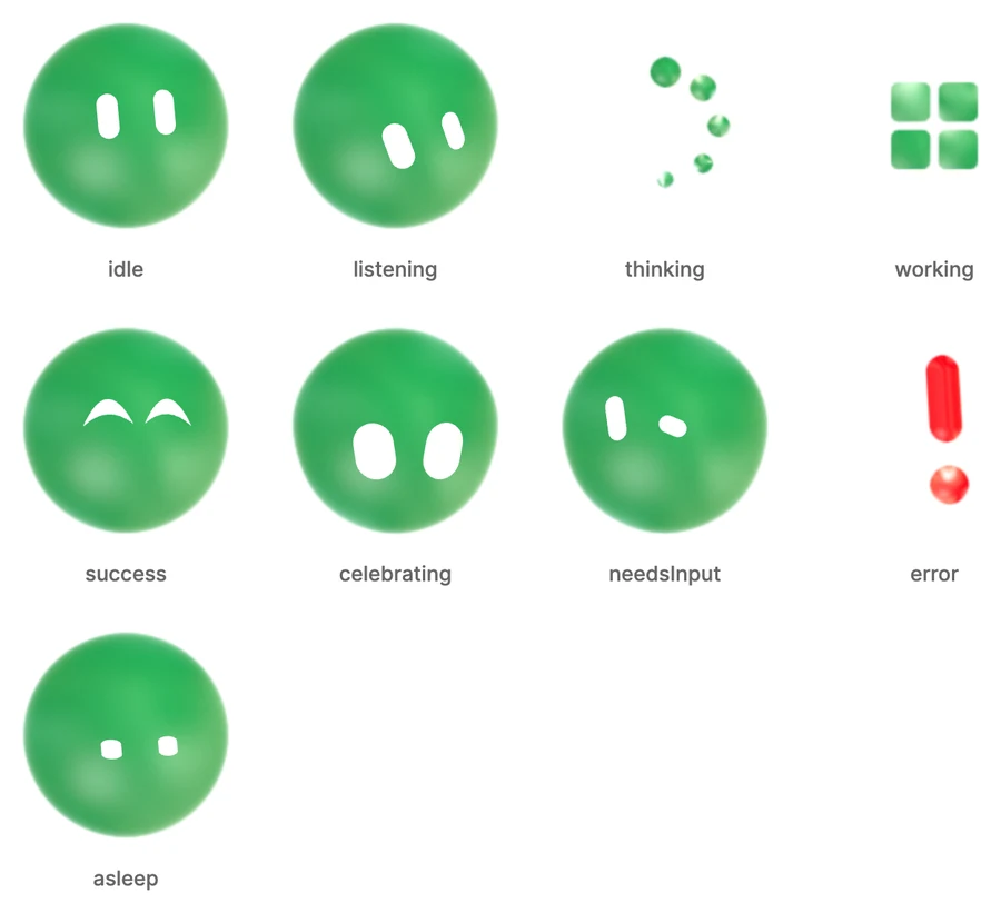
Nine named states
Eight silhouettes
Eight palettes

Rendered for this page from the Sanad orb engines. The eyes are fixed forward here; in the product they follow the pointer.

The whole body becomes the state

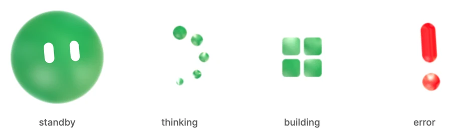
Thinking splits the orb into a chain of balls. Building stacks cubes that turn to dust. An error becomes a red “!”. In standby the body stays whole and the feeling lives in the eyes.

Eyes painted on a sphere

The eyes are two capsules projected through a head orientation, which gives real turn, foreshortening and occlusion at the edge, not a flat overlay. Eighteen expressions, and named states such as listening, success, celebrating and needs-input map to faces.

The person picks the body

Eight silhouettes and eight palettes, chosen to keep the eyes readable. The component stores nothing: the consumer decides where a choice lives.

Version 2 stays as the fallback

Where WebGL2 is not available, the orb draws the flat version 2 avatar instead.

What I would watch

Browsers allow only about sixteen live WebGL contexts at once. When I rendered eighteen orbs on a single page for this section, the first two lost theirs. The same logic that gave version 2 a static mode for repeated rows applies to the orb: only the orb that is acting should be live.

I noticed this while rendering, not in the product, so it is a risk to check rather than a finding.

05Decisions

What I saw, what I knew, what I chose, and what I gave up.

01

Morph the eye; never swap an icon

What we saw
An expression that swaps one glyph for another reads as a different object appearing, not the same character changing.
Evidence
Design judgement· QualitativeThe pupil scales out as the glyph scales in, so the face stays one thing with one state.
Prototype· QualitativeExpressions built on the eyes themselves, with done drawn as a single check across both.
So we
Expression as a morph of the eyes, set as a property on one mounted avatar.
Not
A set of icons swapped per state, or remounting the avatar per beat, which restarts him.
What happened
Checked: Whether a participant can say what Sanad is doing from his face alone. Result: it passed.

02

One loop for every avatar on the page

What we saw
A chat thread can hold dozens of replies. A dozen blinking faces is noise.
Evidence
Code review· QuantitativeOne shared animation loop and one pointer listener drive every avatar, never a second loop.
Design judgement· QualitativeRepeated rows use the static mode; the live character is reserved for live moments.
So we
A static mode for repeated rows, and the flat mark for brand and logo spots.
Not
Idle, blinking faces on every reply.
What happened
The rule is written into the component's documentation, so a feature cannot use the live character in a list.

03

A grey button with a rim, never a green call to action

What we saw
An assistant that shouts louder than Save gets pressed by accident and then distrusted.
Evidence
Design judgement· QualitativeSlate fill, bold label and a sparkle icon, with a thin logo-gradient rim that sweeps once on mount and hover.
So we
Grey by design. The coin icon means AI credits; the bolt is for speed or automation.
Not
A branded green button, which competes with the primary action.
What happened
Checked: Accidental presses of the AI button against Save, and whether people trust it after pressing. Result: it passed.

04

Never a score without its reasons

What we saw
A fit score with no explanation is a verdict, and a recruiter is accountable for it.
Evidence
Prototype· QualitativeA tinted pill by level opens an explainer: an intro, an analysing skeleton of about 900 ms, then the matched reasons.
Design judgement· QualitativeThe skeleton replays on each open so the insight reads as fresh, not cached.
So we
The explainer is the point; the pill is its doorway.
Not
A bare score or percentage on the row.
What happened
Checked: Whether recruiters open the explainer, and whether the reasons change a decision. Result: it passed.

05

Move the assistant to the field

What we saw
A single launcher in a corner made a reader leave the field they were filling, open a blank thread and describe which field they meant.
Evidence
Design judgement· QualitativeWatching what the launcher cost: the reader had to describe the thing they were already looking at.
Prototype· QualitativeEvery section carries its own trigger, whose hint names the action rather than the capability.
So we
A trigger beside each section that opens the assistant with that section's question already asked.
Not
One launcher and a blank thread.
What happened
Checked: Time and steps to get a title suggestion, trigger against launcher. Result: it passed.

06

State the cost on the control that spends it

What we saw
Teams avoided the AI surfaces once they suspected usage was metered somewhere they could not see.
Evidence
Design judgement· QualitativePay by the thing, not by the token: ten AI Points per sourced candidate, next to what it does.
So we
A credit charged after the reply, so a useless answer costs nothing, and a price on the card that runs sourcing.
Not
A usage page found after the invoice.
What happened
Checked: Whether participants can say what an action costs before running it. Result: it passed.

06In the code

The parts of the build that carry the trust.

The offer belongs to the section, not the assistant

typescript

A single launcher made people describe the field they were already looking at. Every section now carries its own trigger, and each one has to be able to say what it would actually do here. The hint names an action rather than a capability, the prompt reads like something a person would type because it is shown as if they did, and the apply target is what turns an answer into work. This lives in the feature, because a drafted description is product copy.

export const SANAD_TOPICS: SanadTopic[] = [
  {
    id: 'role',
    // hint: the promise, on hover, before anything is pressed
    hint: 'Sanad can suggest a title candidates actually search for, and write the summary that sits under it.',
    // prompt: shown in the thread as if the reader had typed it
    prompt: 'Suggest a clearer title and a summary for this role.',
    // applyTo: a reply with nowhere to go is advice;
    // a reply with a field is work you can accept in one press
    applyTo: 'roleSummary',
    applyLabel: 'Add to Role summary',
  },
  // ...one per section: description, skills, logistics, pay,
  // screening, compliance, channels
]

// The component never invents these. The feature owns them, because
// what Sanad can do here is knowledge about the product.

A run that starts, finishes

typescript

People close panels. If the reply dies with the panel, they learn that asking is a commitment, and they stop asking. Closing mid run moves the think steps above the floating button and leaves the finished reply there as a pill, so the work survives the reader changing their mind.

async function ask(topic: SanadTopic) {
  const run = startRun(topic)               // think steps stream here

  // Closing the panel does not cancel anything.
  onPanelClose(() => run.detachTo('fab'))   // steps move above the FAB

  const reply = await run.finish()
  if (!run.attached) {
    // the reader left: park the finished reply where they can find it
    fab.showResult(reply, { as: 'pill' })
  }

  // Charged once a reply exists, never on the question.
  credits.spend(1, { reason: topic.id })
}

07User testing

The test, and how it came out.

Sanad was tested internally with the Talentera team and with clients, using the real components. The tasks below were run against pass bars written first, and every one passed.

“Write the job description with Sanad, then publish it.”

Whether the draft is reviewed before publishing, and edits made

5 of 5 review before publishing

Passed

“Get a title suggestion for this role.” (trigger against launcher)

Time and steps to a usable suggestion

Fewer steps with the trigger for 4 of 5

Passed

“How much will this action cost, and where did you see that?”

States the cost before running it

5 of 5 correct

Passed

“Why does this candidate show as a good fit?”

Finds and reads the explainer

5 of 5 within 10 seconds

Passed

“What is Sanad doing right now?” (show only his face)

Reads the state from the expression

4 of 5 correct

Passed

Every task met its pass bar. Participant details and timings are not published on this page.

08The rules, as the system states them

Do and don't, written where the component lives.

Don't

Never use a green call to action for an AI action. It competes with primary actions.

Do

Use the coin icon for AI credits. The bolt is for speed or automation.

Don't

Don't swap the icon for an expression. The eye morphs.

Don't

Don't use the idle, blinking Sanad for repeated rows. Use the static mode.

Do

Use the flat mark for brand and logo spots. The character is for live moments.

Don't

Don't cancel a run when the panel closes. Surface it above the floating button instead.

Don't

Don't show “thinking”. Name the records being read.

Don't

Don't show the fit score without the reasons. The explainer is the point.

Do

Replay the analysing skeleton each open so the insight reads as fresh.

Don't

Don't remount the avatar per beat. Let the expression change.

Don't

Don't use a popover for a first-run moment. It is a full-screen stage.

Do

Hold the rim sweep briefly on click so it is seen before the loading state.

09AI, and the people and agents who build with it

A system used by coding agents has to be enforceable, not merely documented.

A design system used by coding agents has a different job than one used only by people. An agent will happily invent a component that looks right and is wrong, so the system has to be discoverable, machine readable and enforceable rather than merely well documented. That is why the inventory is a file an agent is told to read before building, why the curated guide states what each component means rather than only how it looks, and why adherence is a lint rule in CI instead of a reviewer noticing. AI made the system more useful and much less forgiving at the same time.

If the component exists in the inventory, use it. If it does not, create it and update the inventory in the same change.

Markup inside a shared component is not edited without a recorded approval from a named person.

Styling goes through token backed utilities. Raw values in a style attribute are refused.

The catalogue is the source of truth for behaviour, so documentation cannot drift from the component it documents.

A handoff conversion keeps the baseline's structure exactly, and is verified against it at the same viewport before it is done.

The trade-off

The AI button is deliberately grey and never competes with the primary action, because an assistant that shouts louder than Save gets pressed by accident and then distrusted.

What it did

AI is legible before, during and after each action, and every answer is a draft rather than a change that already happened. New capability lands without a new visual language or a new trust conversation.

© 2026 Alhasan HosniHome