


← Work/2022 – 2024 · UI/UX Designer

WOD.co

A workout platform built around the coach: a typed editor to write the class, a calendar that decides who sees it, and an iOS app where the athlete does it and logs the result.

47 → 12
Coach context switches an hour in a live class
60%
Less time spent programming workouts
6
Coaches shadowed through live classes
3
Surfaces: the coach web app, the iOS app and the public site

Source: six coaches timed through live classes. The switch counts come from observation, not from instrumentation in the product. No usage or revenue figures are recorded, so none are claimed.

How it beganBefore the first screen

The interview ended with a homework assignment: go and train.

The CEO asked why I wanted to work on CrossFit. I told him the truth: I had never done it. And anything I have not done yet pulls me in, because that is where I learn fastest.

01

A hidden gem, and a fog

To me the whole world was a hidden gem I had to discover. How do athletes actually practise? How is a workout written down? How are the movements and the exercises recorded, and where does a result go afterwards?

I could not answer any of it. The area was foggy, and I had no way to see through it from a desk.

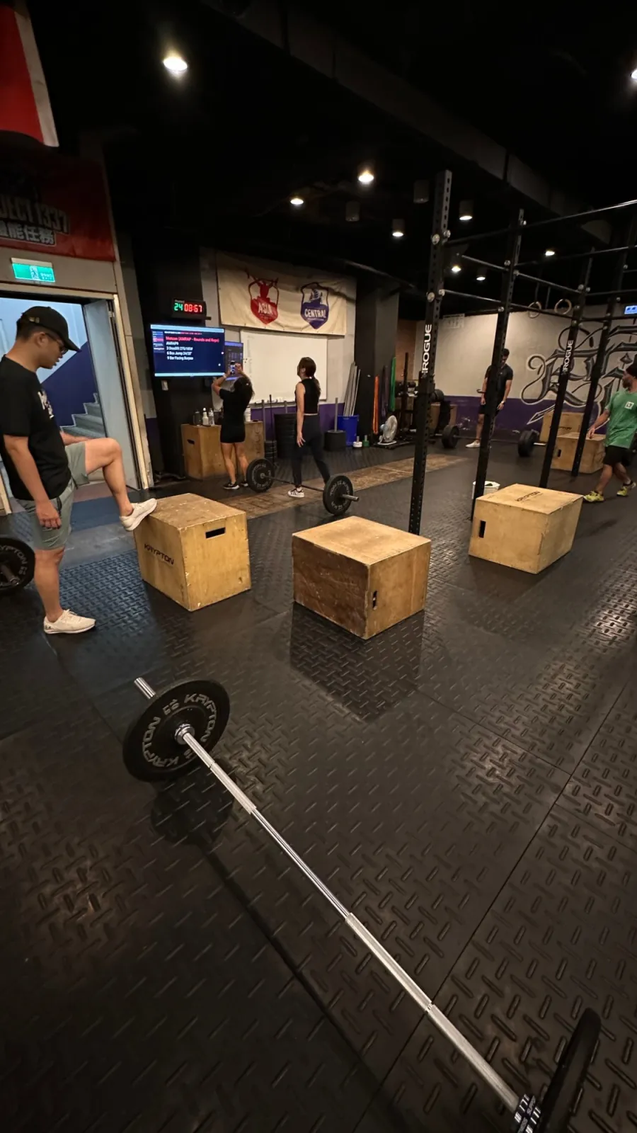
A CrossFit floor before class: plyo boxes, loaded barbells and a screen showing the workout
A floor before class. The workout is on the screen, the whiteboard and the coach's head, and nowhere else.

02

The assessment was the research

So he did not ask me for a deck. He gave me an assessment, and it was part of the hiring: go to real CrossFit gyms, find the coaches and the athletes, ask them questions, and find out which apps they use and how the whole thing really works.

I was in the middle of a hiring process, and my first task was to leave the screen and stand in a room full of barbells.

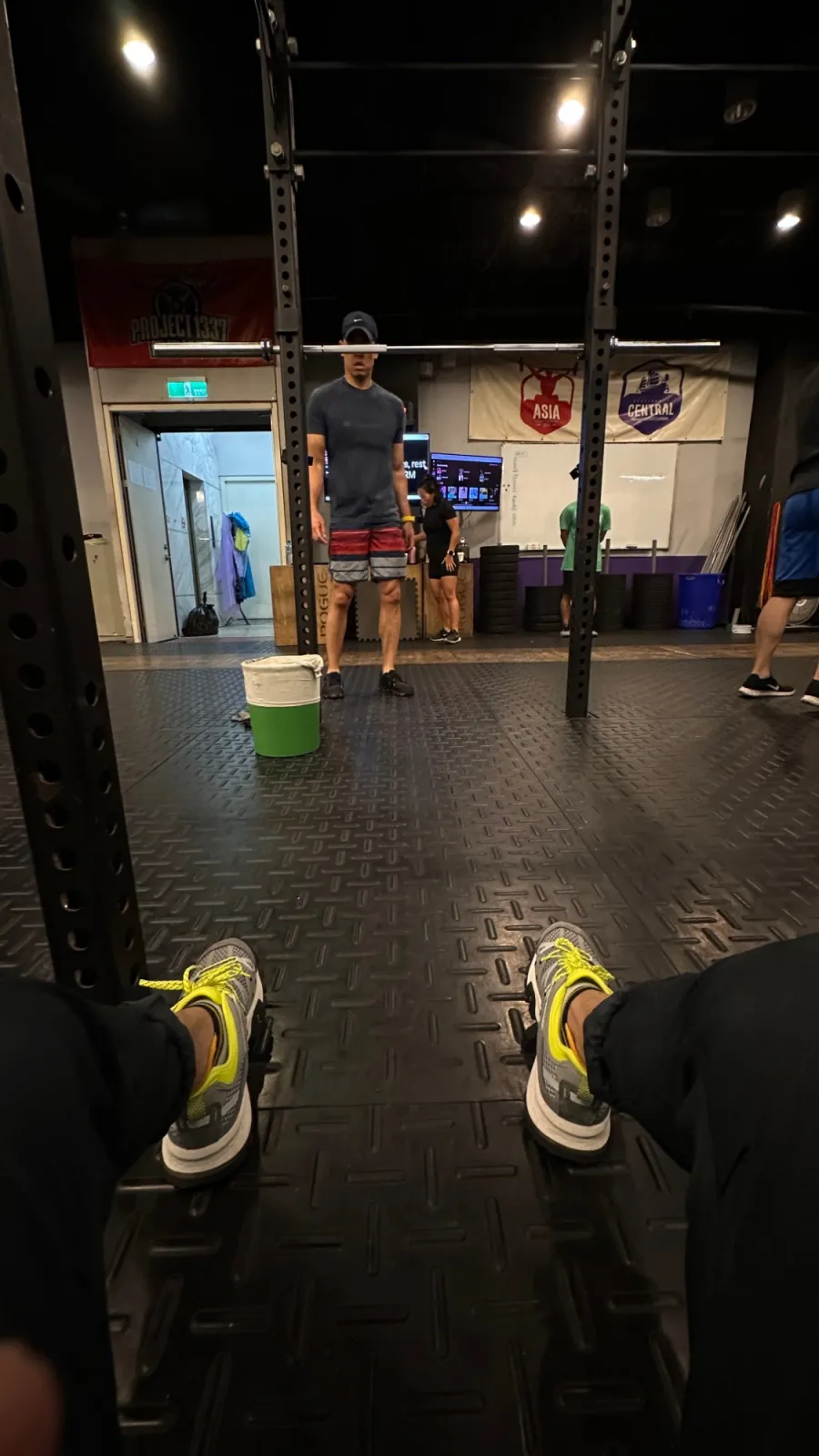
A class seen from the floor, through the uprights of a rack
A class from the floor.
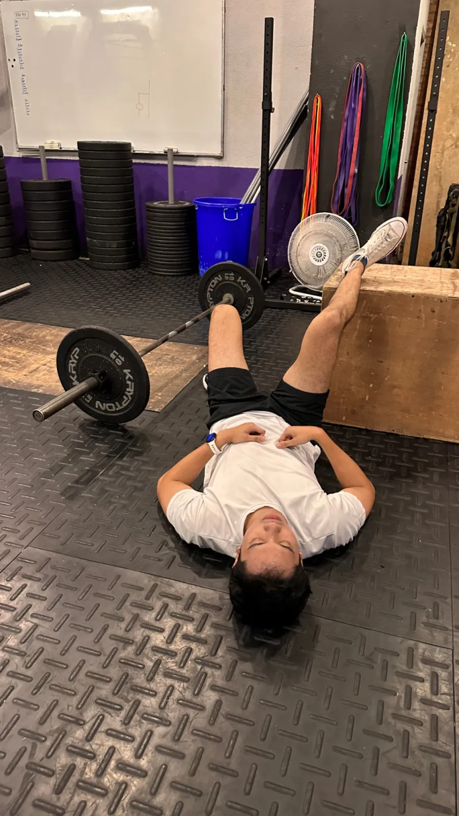
Someone lying on the floor of a gym with a leg up on a box, barbell beside them
How a class ends, for everyone.
Seven people posing after a class in front of a graffiti wall, flashing peace signs and shakas

03

It was painful. It was also the point.

You cannot ask a coach about a class you have never survived, so I did the classes too. I had never done CrossFit, and it is nothing like a normal workout. It is much harder and much tougher, and I felt every minute of it.

But it opened a door. I was standing in an area I had never been in, with questions I could finally ask in the right words.

04

One gym was not enough, so I went looking

I was in Turkey at the time, and one gym could not give me the whole picture. So I travelled: the Emirates, then Egypt, then Taiwan.

In every gym I watched the same three things: how the athletes do the workouts, how they record them, and how the coaches train them.

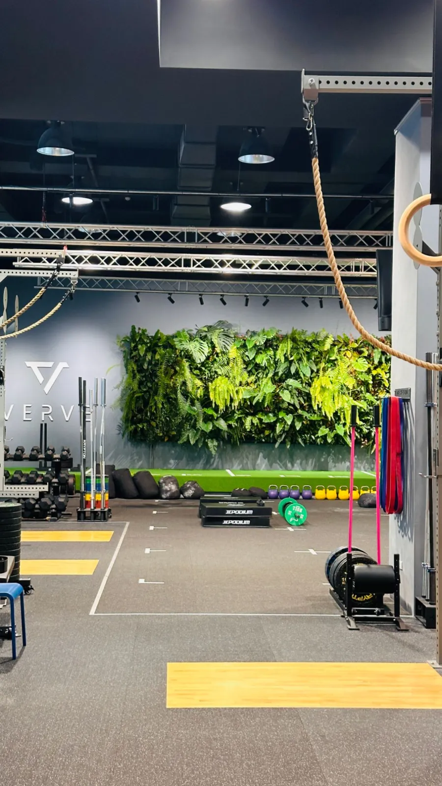
A gym floor with a living plant wall, kettlebells, ropes and rings
Another floor on the road. Different walls, the same question.

4 stops · 3 legs

Turkeyto Dubai

Leg 1 of 3

🇹🇷 Turkey
🇦🇪 Dubai
🇪🇬 Cairo
🇹🇼 Taiwan

05

Then I moved to Taiwan

By then I knew the product could not be designed from a distance. I moved to Taiwan to work with the team up close, near the gyms and the people we were building for.

It hurt at the beginning. It was also one of the most exciting stretches of the whole project, and everything on this page started on a gym floor.

Alhasan taking a selfie with a class at 4SC CrossFit, everyone smiling, holding cut-out signs
At 4SC CrossFit, after a session.

Where it was designed

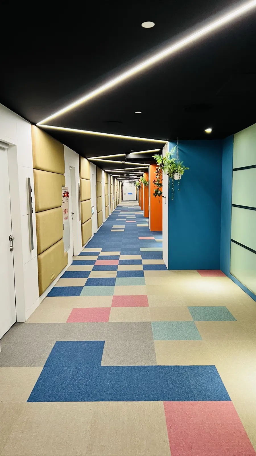
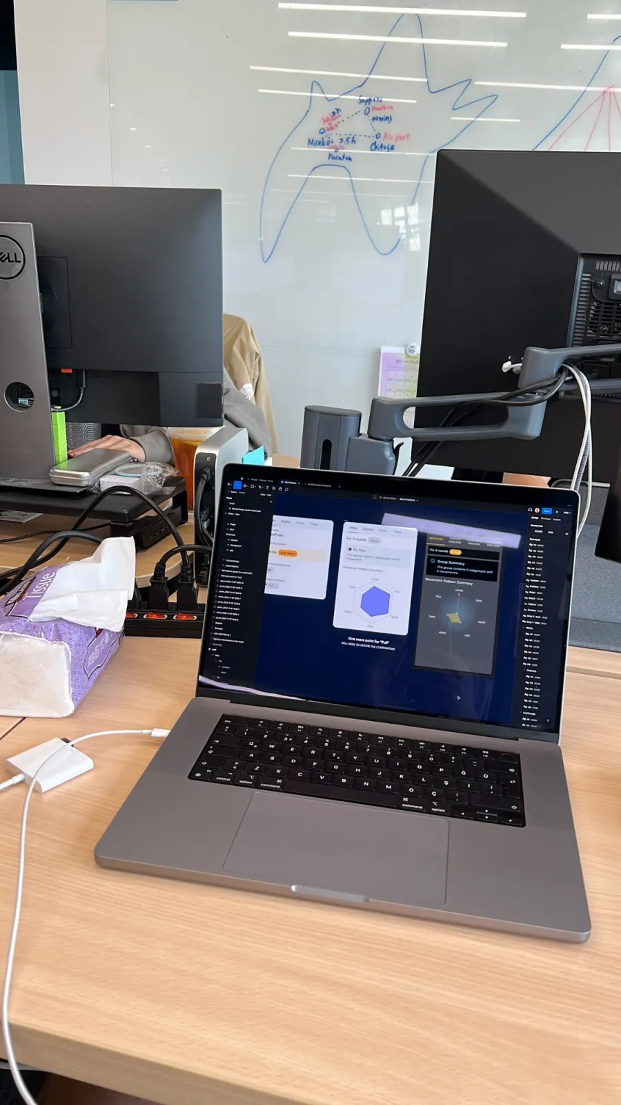
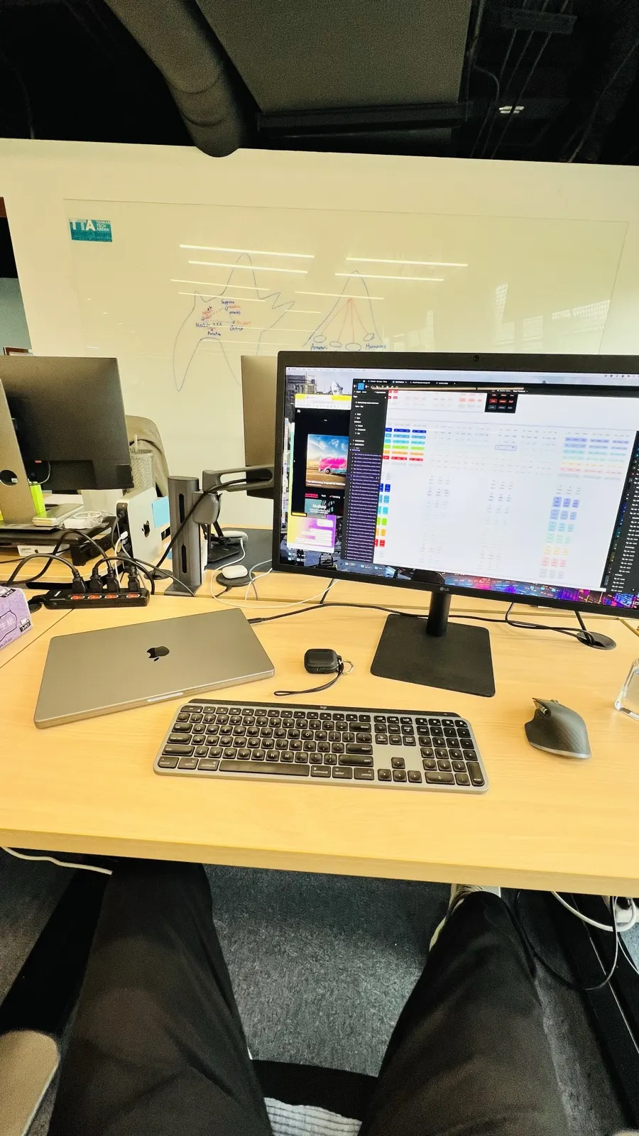
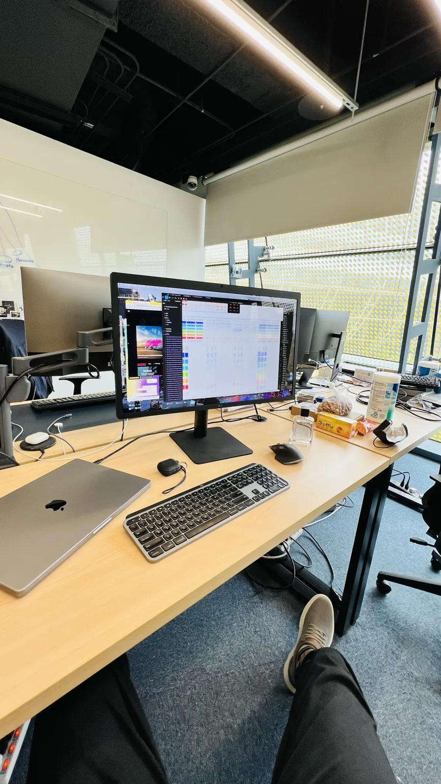
Back from the gym, the office.

A colourful office corridor with patterned carpet, plants and wood panels
The way in.
A laptop on a desk showing the WOD.co platform in Figma, with monitors and a whiteboard map behind it
The platform on the laptop.
A desk with a monitor open on design files, a laptop, keyboard and mouse
The desk.
A desk by the window with a monitor, laptop, keyboard and snacks
The desk, by the window.

The problemWho it is for

A class runs on a clock, and the coach was running it from three places.

Twenty people are warming up while the coach checks the plan in a spreadsheet, answers a message in a group chat and looks at a paper log to see what someone lifted last week. Timed across six coaches, that came to 47 switches an hour. Every tool in the category assumed the person holding the phone was the athlete.

The coach was the unserved user, not the athlete logging alone.

Wodify, SugarWOD and BTWB were built for an athlete's solo logging session. A coach's real job is running a room in real time, and nothing had been designed for it. So the product starts with the person standing in a loud gym, and the athlete's app is built from what that person writes.

The loopOne thing, passed along

What the coach writes is what the athlete logs against.

Five steps, three surfaces. The lettering the coach types, A and A1, is the lettering on the athlete's results sheet, and the result comes back to the coach as a number on a chart.

01

Write

Coach · web

A typed editor: sections, blocks and movements, with commands on a slash.

02

Plan

Coach · web

A calendar that decides what each athlete can see, and when.

03

Do

Athlete · iOS

Workout of the day: the plan, the movements, a way to ask how.

04

Log

Athlete · iOS

Results typed against the plan, with weights worked out and PRs flagged.

05

Review

Both

Volume, movement balance, streaks and records, back to the coach and the squad.

How we knewEvidence

What is recorded, what is not, and how far to trust it.

Interviews

Qualitative

6

Coaches shadowed through live classes, with every context switch timed. The 47 an hour came from this, and it is what reframed the product.

Benchmark

Qualitative

3

Wodify, SugarWOD and BTWB. All three were built for the athlete's solo logging session; none was built for the coach running a room.

Confidence: Medium

Design judgement

Qualitative

60+

Captures read one by one for this page: the web editor and its states, the calendar, the athlete dashboard, the iOS app and the public site. The notes below describe only what is visible on them.

Analytics

Quantitative

47 → 12

Coach context switches an hour, with 60% less time programming workouts. Both come from timed observation, not from instrumentation in the product.

Confidence: Medium

Usability test

Mixed

Flows were tested back in the gym, where the real constraints are noise, movement and time pressure. Participant numbers and timings are not published on this page.

Analytics

Quantitative

No figures for athletes, workouts posted, retention or revenue are recorded in the project files, so none are claimed here.

01 of 08

Writing the workout

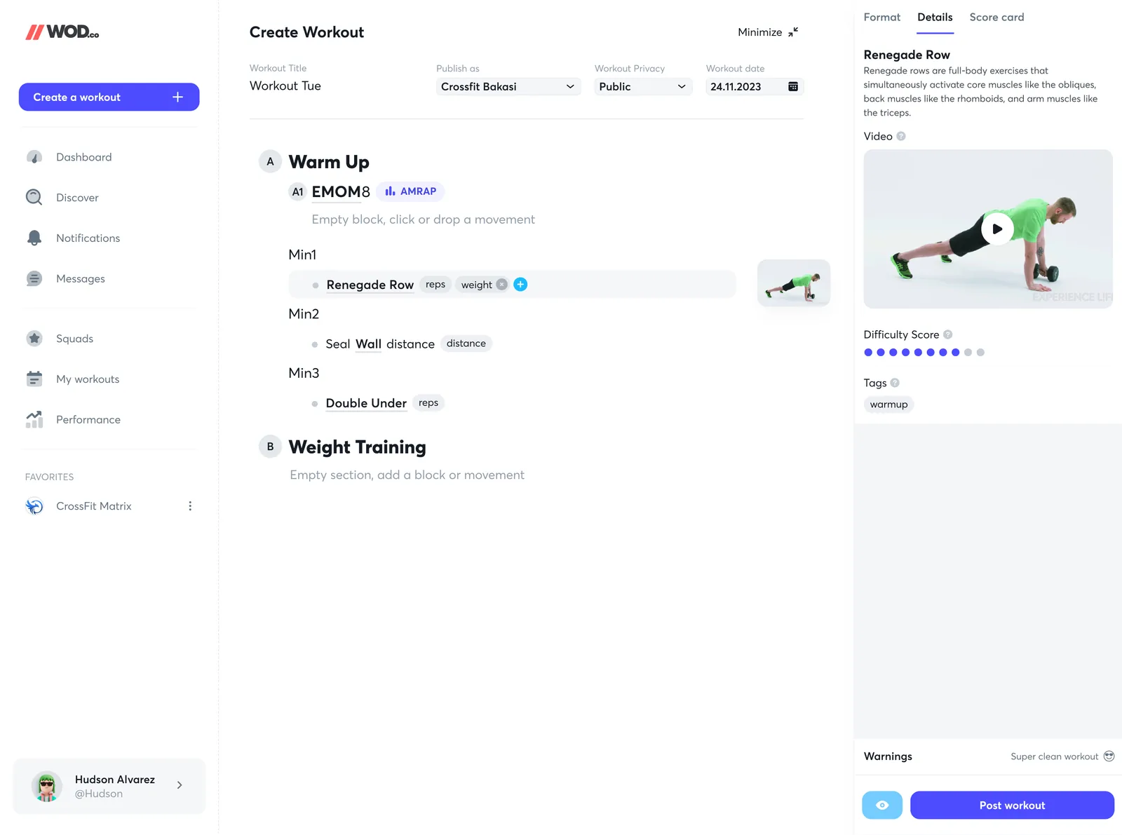
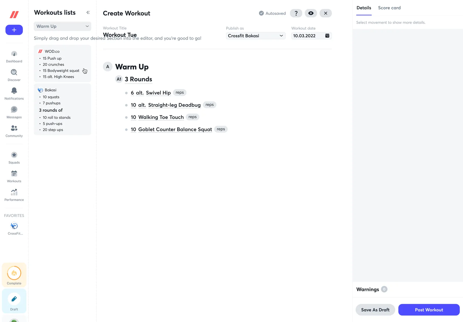
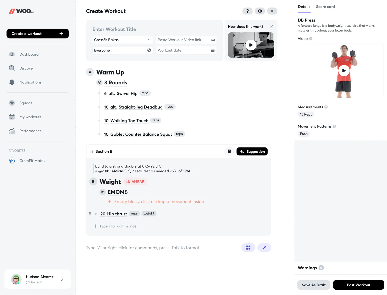
The editor is a document. The title and the date sit on one line, the workout is lettered sections, and the right-hand panel opens on whatever movement you are pointing at, with its video, measurements, movement pattern, difficulty and tags. A warnings count at the foot says when something is off, and “Super clean workout” when it is not.

Create workout
Drag a section in from a list
Empty block and a movement's details
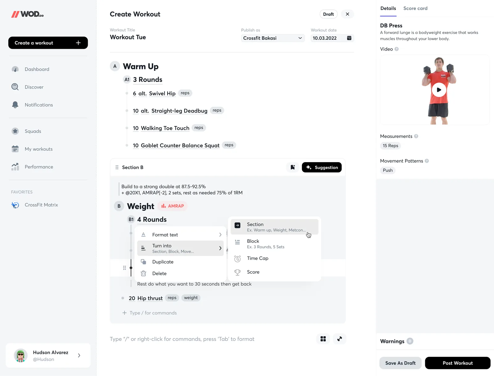
Turn a line into a section or block

Structure is typed, not built

Sections, blocks and movements are lines with letters (A, A1). The coach adds structure by typing and by pressing Tab, and the layout follows.

Sections come from lists

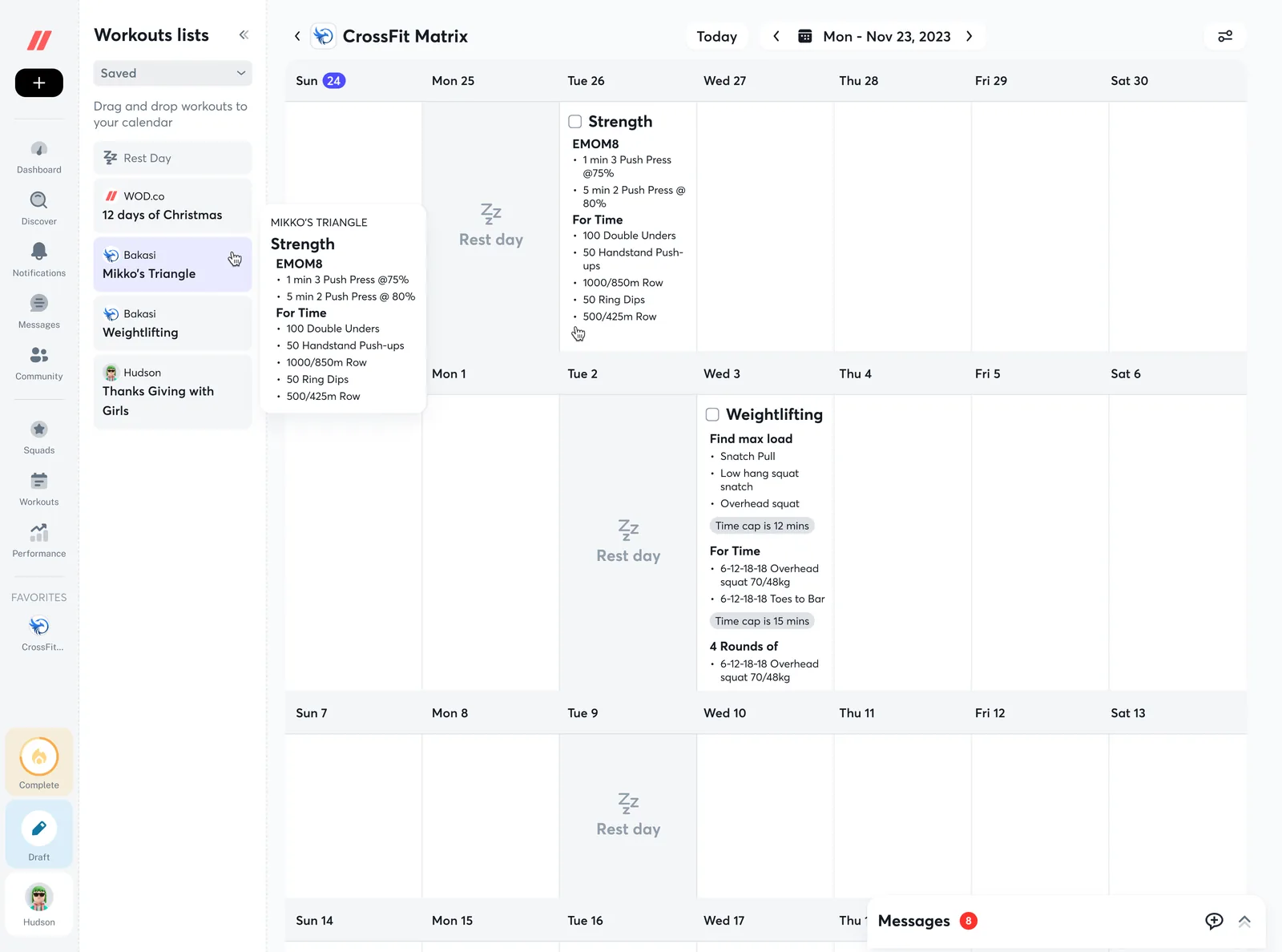
A Workouts lists panel holds ready-made sections, from WOD.co and from the coach's own box. “Drag and drop your desired section into the editor, and you're good to go.”

Details open where you point

Selecting a movement fills the side panel. Before that it says “Select movement to show more details” and stays quiet.

Editor statesSmall things, decided on purpose

One interaction at a time.

The editor is a text field that behaves like a tool. These are the moments I drew separately: the drop, the grab, the cue, the structure menu, the format menu and the review.

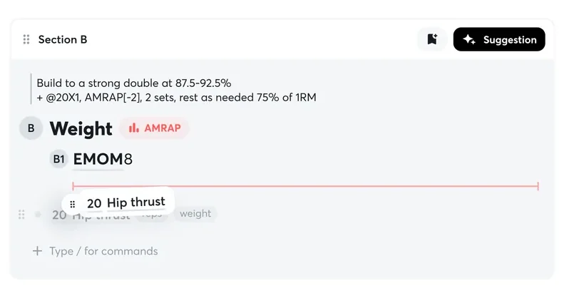
Drop: Dragging a movement draws a red line where it will land.

Drop

Dragging a movement draws a red line where it will land.

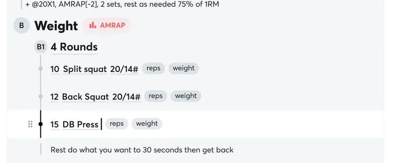
Grab: A handle appears at the left of a row on hover. Until then the row is just a line of text.

Grab

A handle appears at the left of a row on hover. Until then the row is just a line of text.

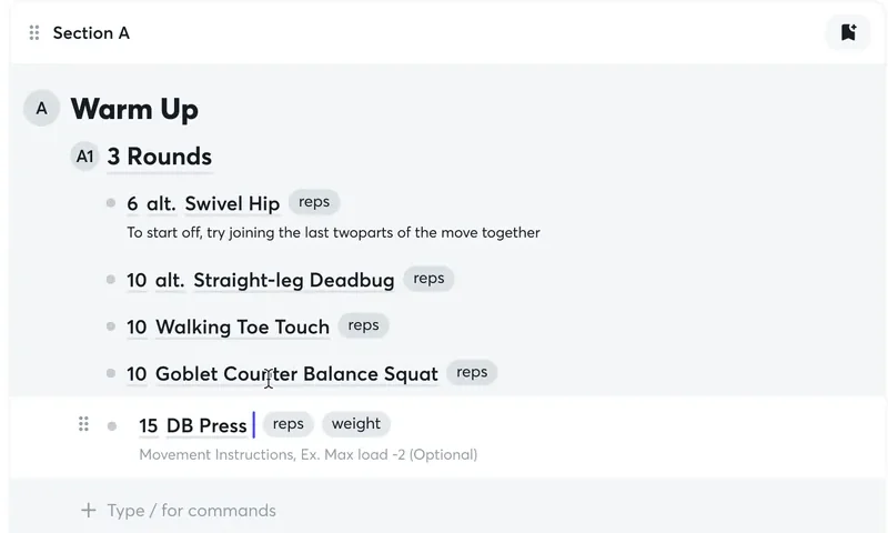
Instruct: Under any movement, an optional line for the cue: “Ex. Max load -2 (Optional)”.

Instruct

Under any movement, an optional line for the cue: “Ex. Max load -2 (Optional)”.

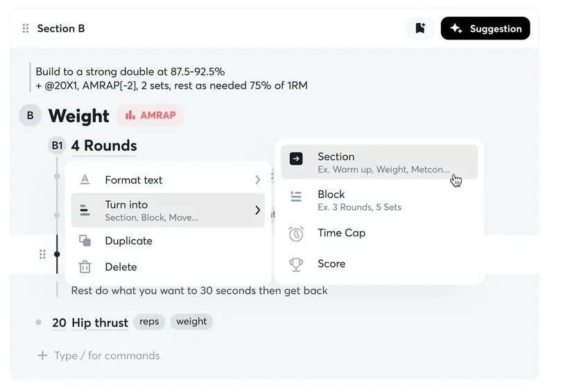
Turn into: Any line can become a Section, a Block, a Time Cap or a Score, so a mistake in structure is one click.

Turn into

Any line can become a Section, a Block, a Time Cap or a Score, so a mistake in structure is one click.

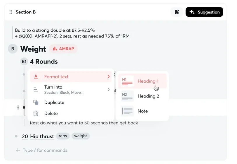
Format: Heading 1, Heading 2 or Note, from the same menu.

Format

Heading 1, Heading 2 or Note, from the same menu.

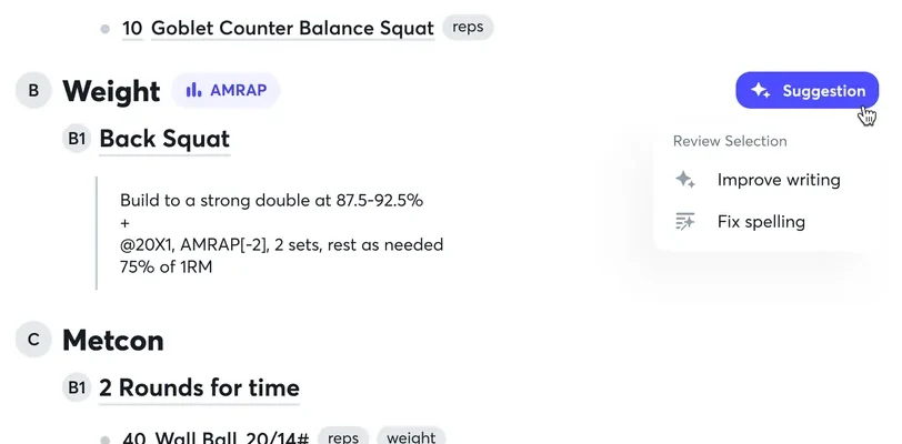
Suggest: Select text and ask for a review. The two options on offer, Improve writing and Fix spelling, change wording and nothing else.

Suggest

Select text and ask for a review. The two options on offer, Improve writing and Fix spelling, change wording and nothing else.

02 of 08

Planning the week

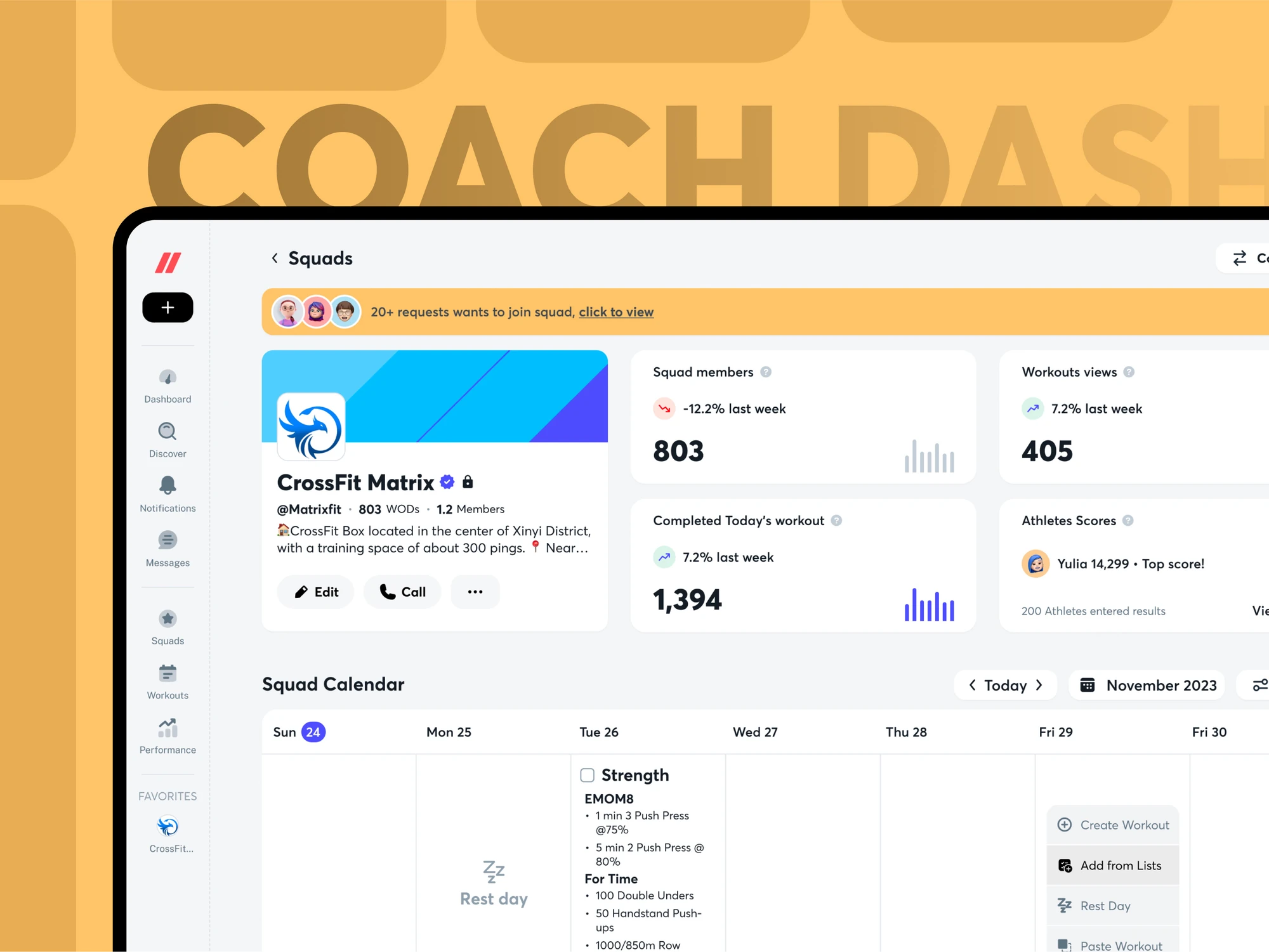
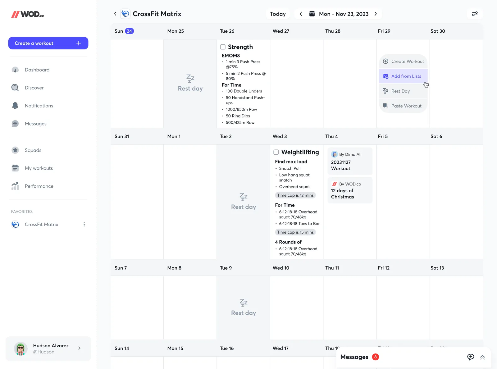
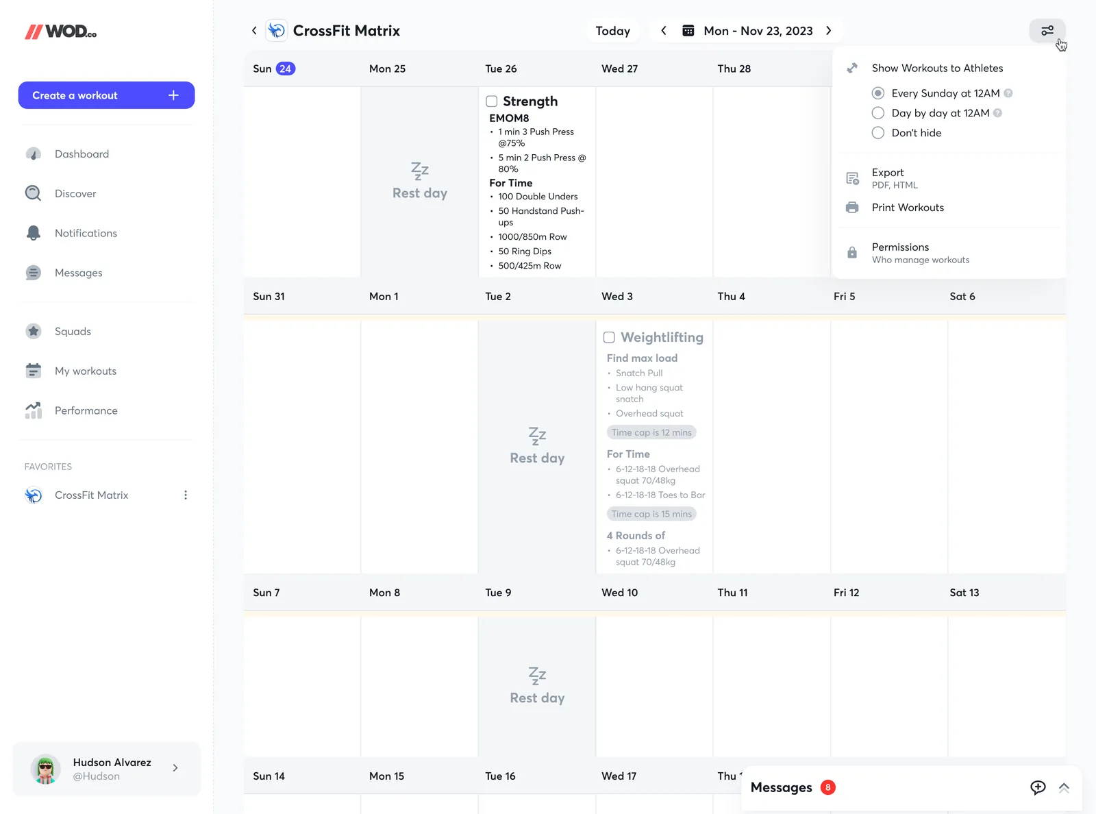
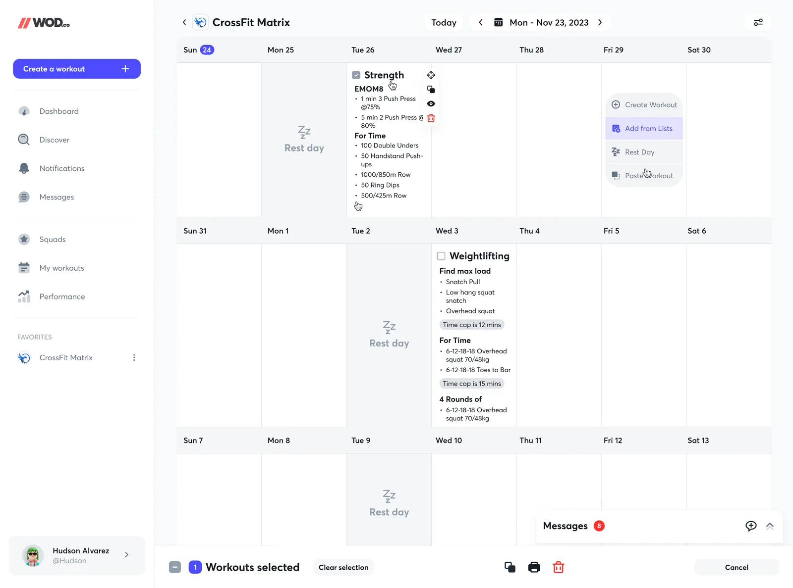
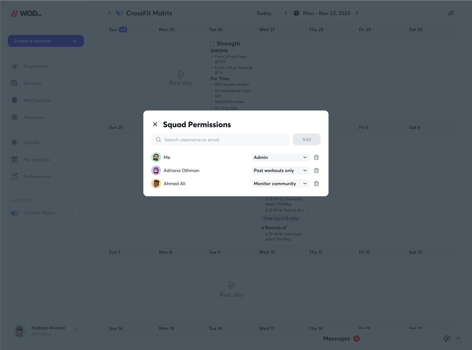
The calendar is where a programme becomes something a squad can see. A week is a row, a rest day is a state with its own glyph, and clicking an empty day offers four things: create a workout, add one from a list, mark a rest day, or paste one. The squad's own page above it carries members, views, completions and top scores.

Squad page and calendar
Calendar, coach side
Who sees the week, and when
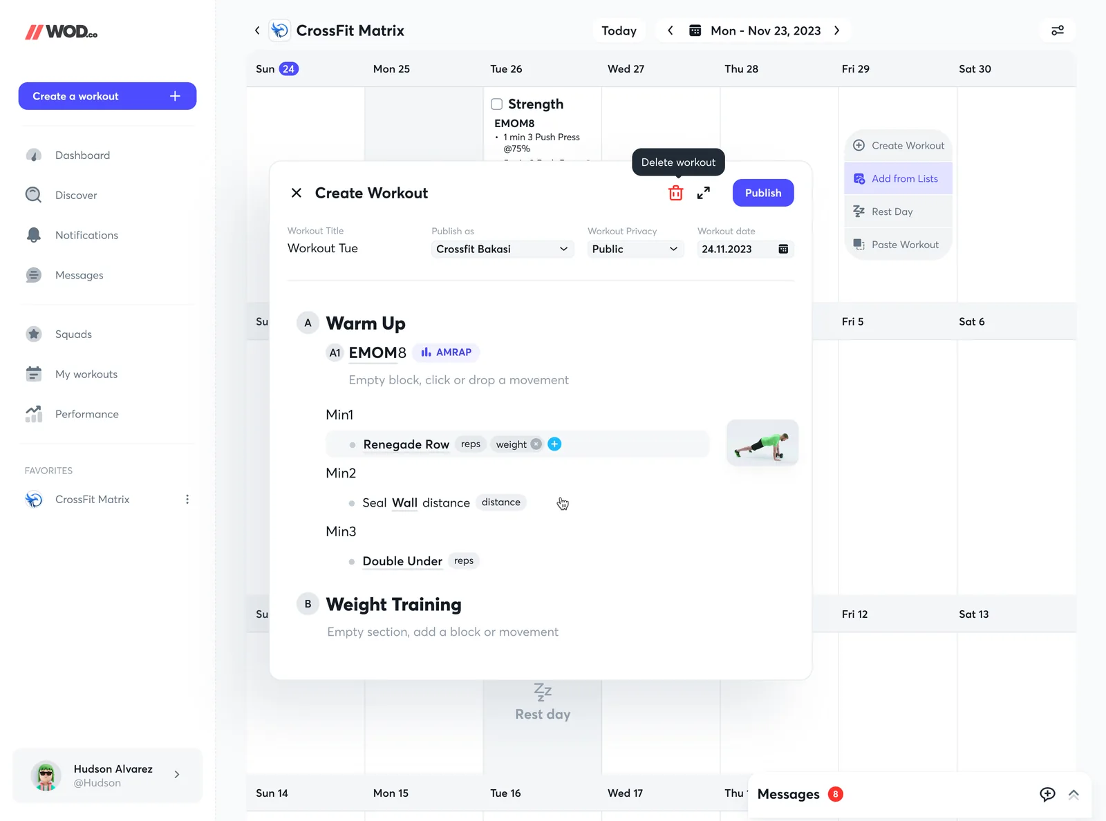
Create from the calendar
Drag from lists onto a day
Select days, then act on them
Squad permissions

A week shows its visibility

A green “Visible to athletes” band and an amber “Not visible to athletes” band sit over the days they describe.

Create without leaving the grid

A new workout opens in a dialog over the calendar, with Publish at the top and an expand control for the full editor.

Messages stay one tap away

A docked Messages bar with an unread count lives at the foot of the screen, so a coach answers a question without losing their place.

03 of 08

What an athlete sees on the web

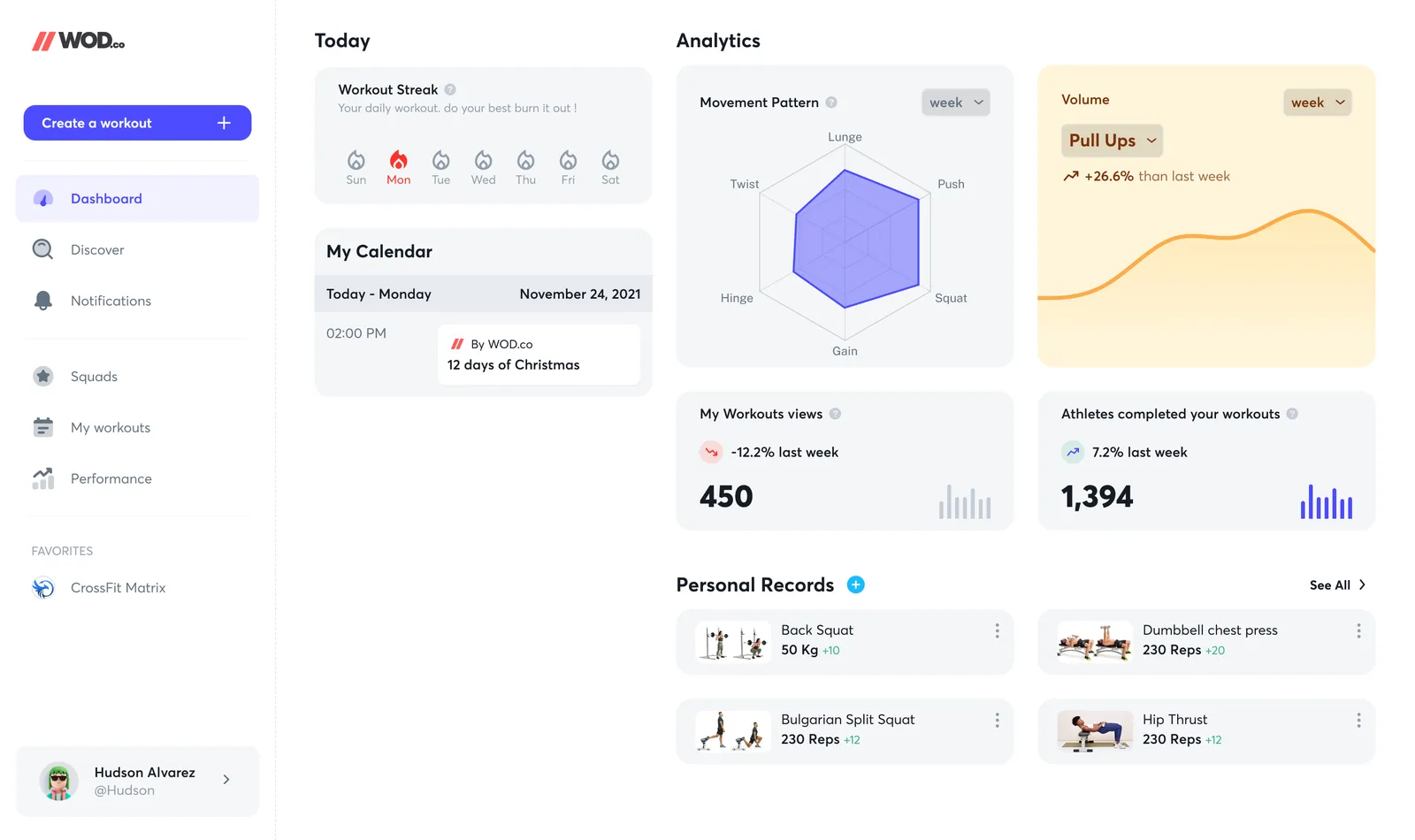
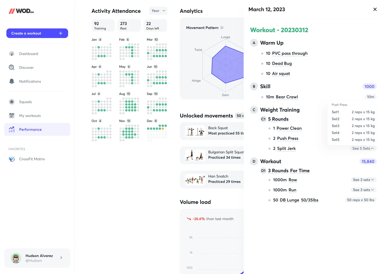
The athlete dashboard is a week at a glance and a year in one image. A row of flames for the workout streak, today's workout from the calendar, a six-axis chart of movement patterns, volume for a chosen movement, and the personal records, each with its photo. The attendance view opens a year of training days beside the day's workout.

Dashboard
Attendance and a day's workout

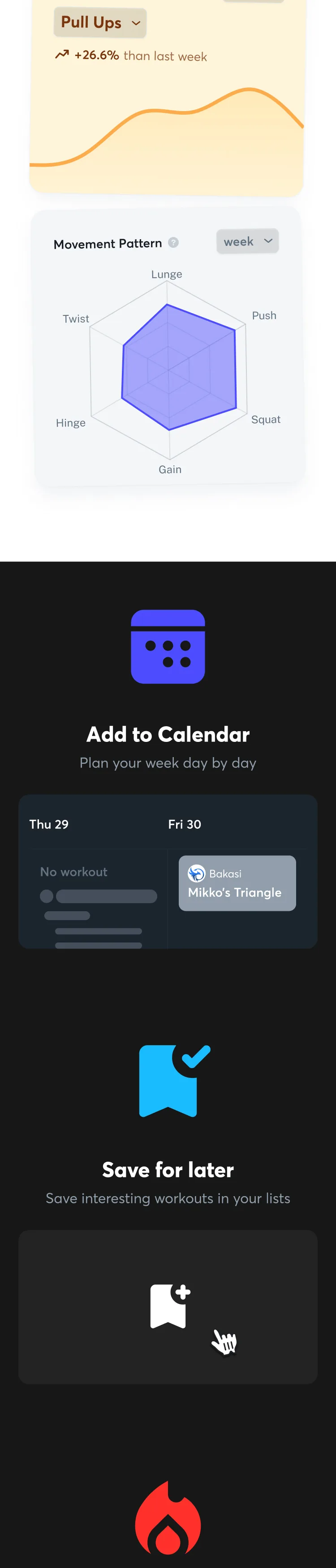
Balance, not only totals

The movement-pattern chart answers “am I training everything?” in one shape, which a volume number cannot.

A coach's numbers on the same page

Views of your workouts, and athletes who completed them, sit beside the athlete's own, with the change on last week.

Records have pictures

Each personal record shows the movement as a small photo, so it is recognised before it is read.

04 of 08

The day, on a phone

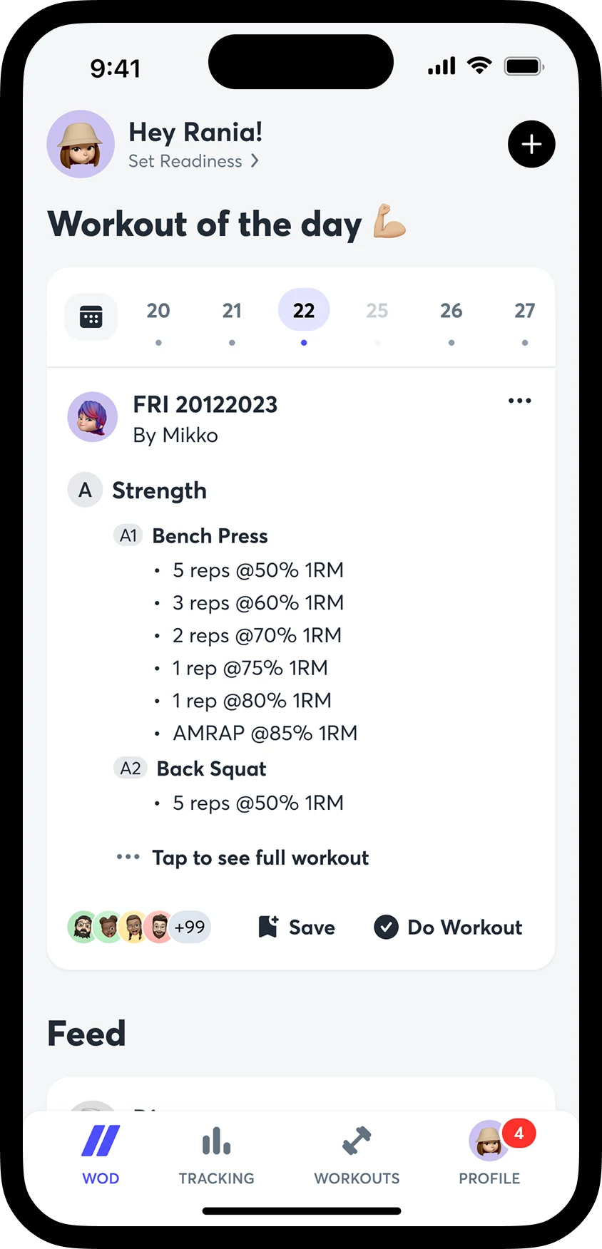
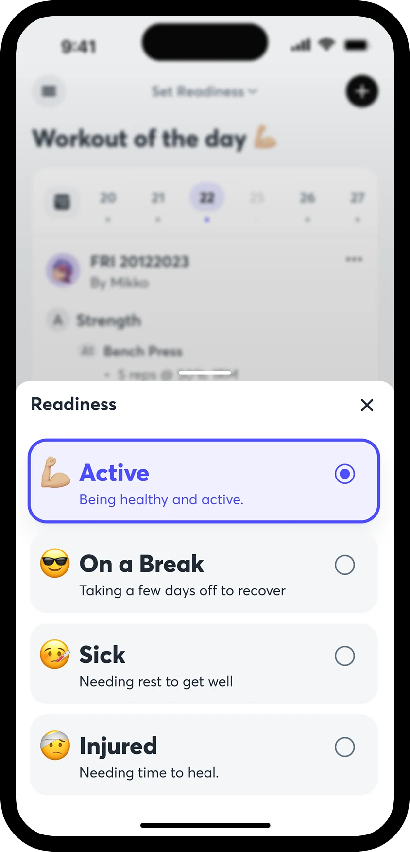
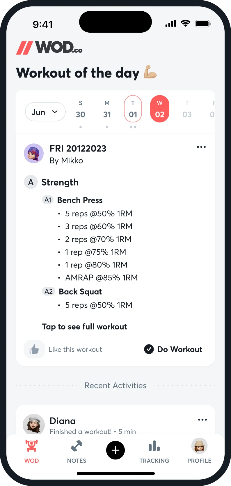
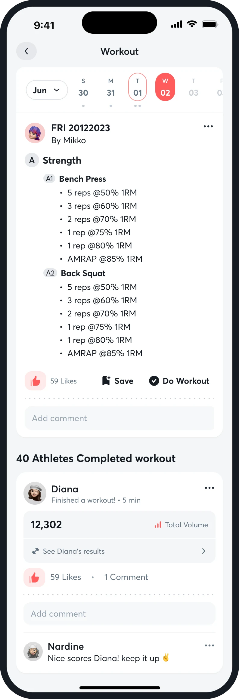
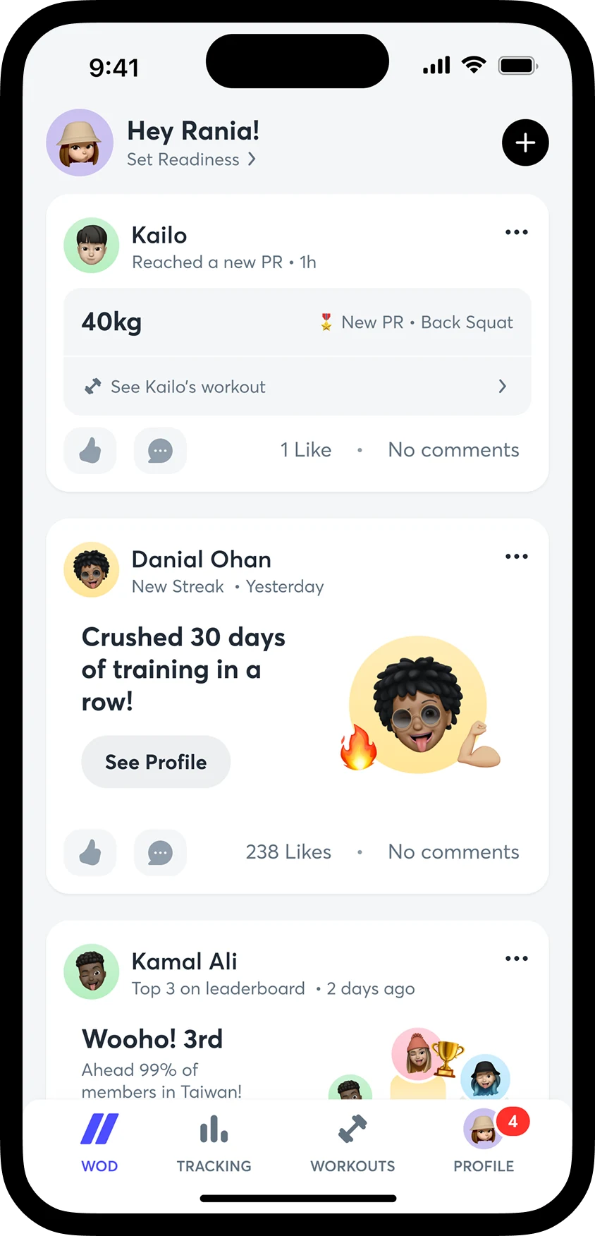
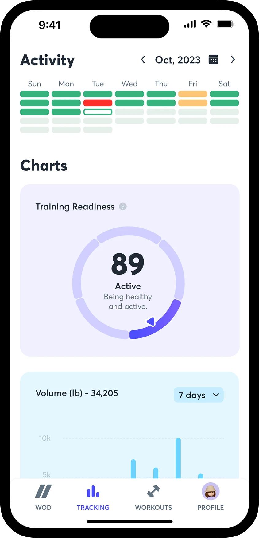
The iOS app opens on the workout of the day. The week sits in a strip across the top, the workout is a card with its sections and movements, and under it the squad's activity. Tracking, Notes and Profile are a tap away. A readiness status sits under the greeting, one tap from changing.

Home
Readiness
Workout of the day
Full workout
Feed
Activity and charts
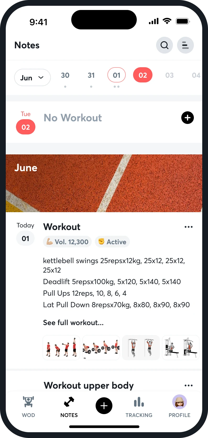
Notes

The card says enough to start

Sections, movements and “Tap to see full workout”, with Like, Save and Do Workout on the same card.

Status is a sheet of four

Active, On a Break, Sick, Injured. Each has a face and one line, and the selected one is outlined.

A personal log, next to the shared one

Notes puts the athlete's own workouts on a calendar, with an empty day shown as “No Workout” and a plus to add one.

05 of 08

Logging a result

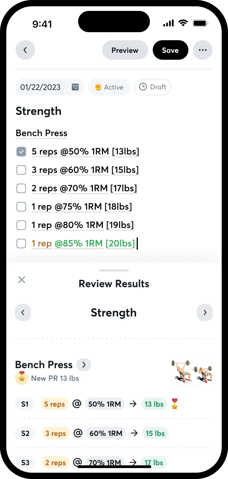
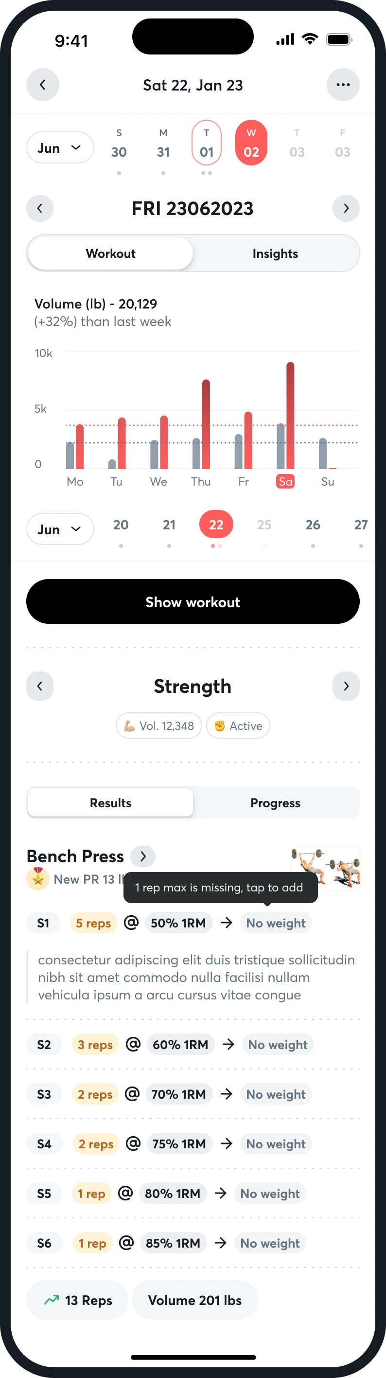
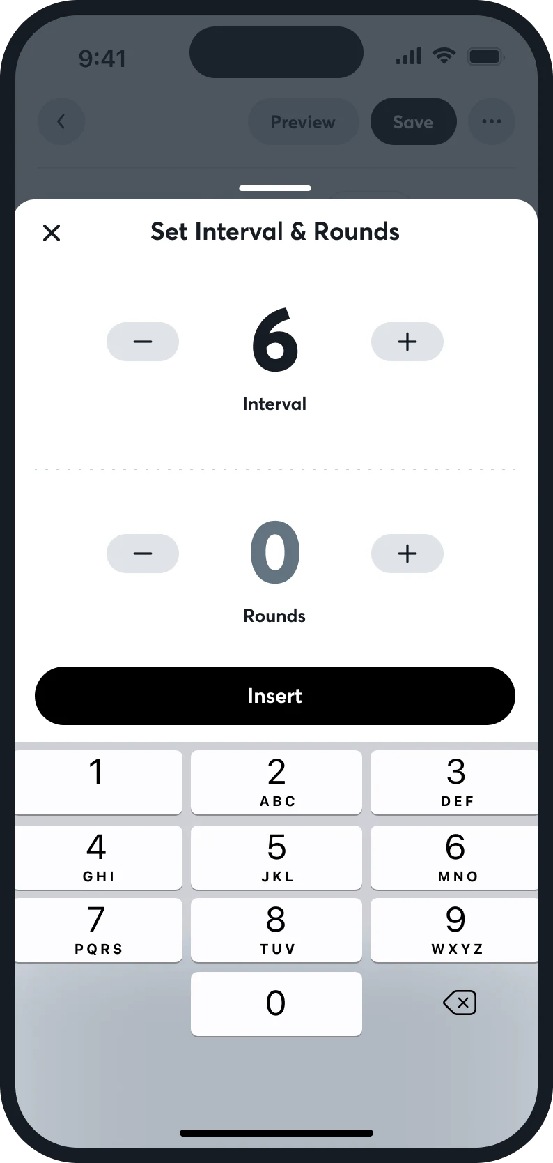
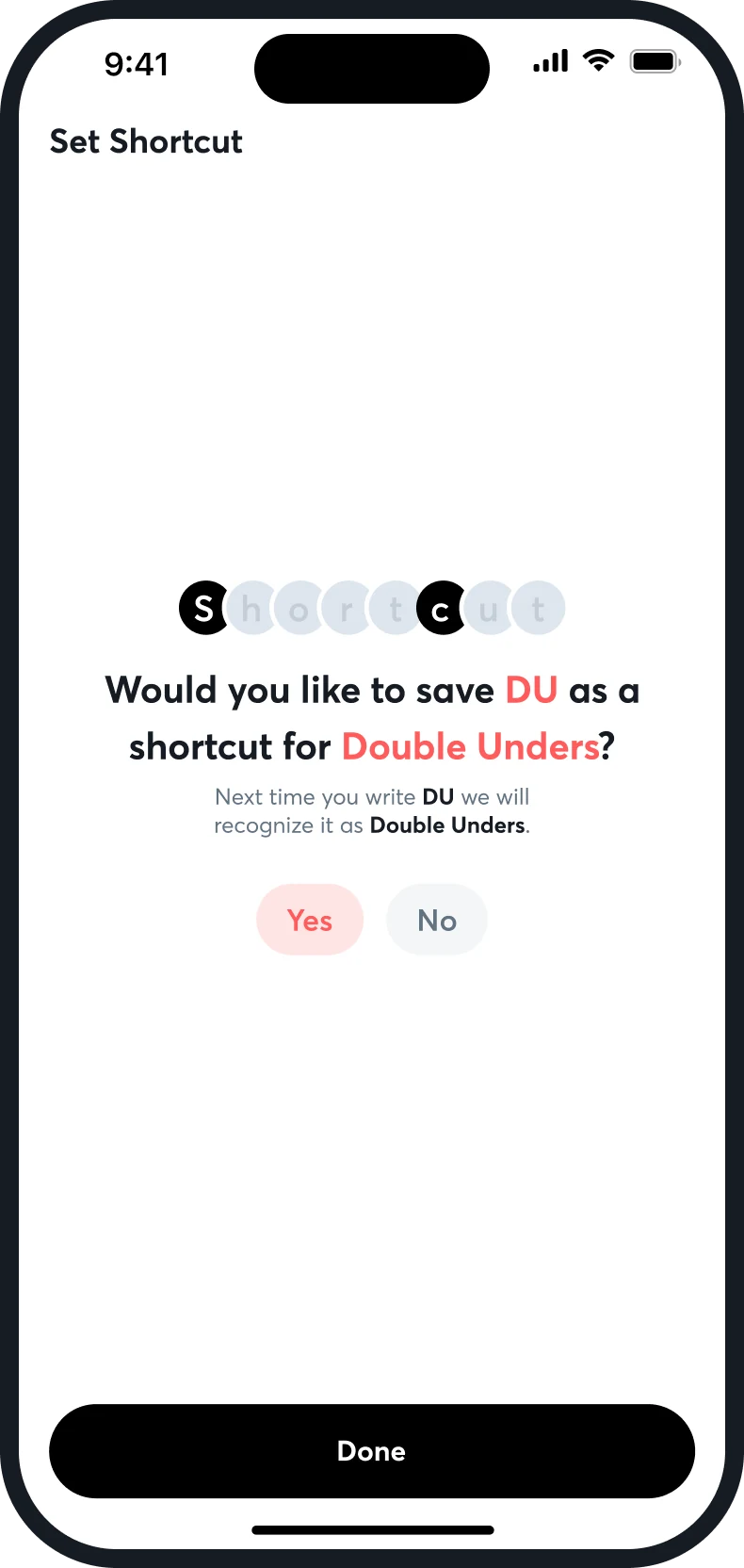
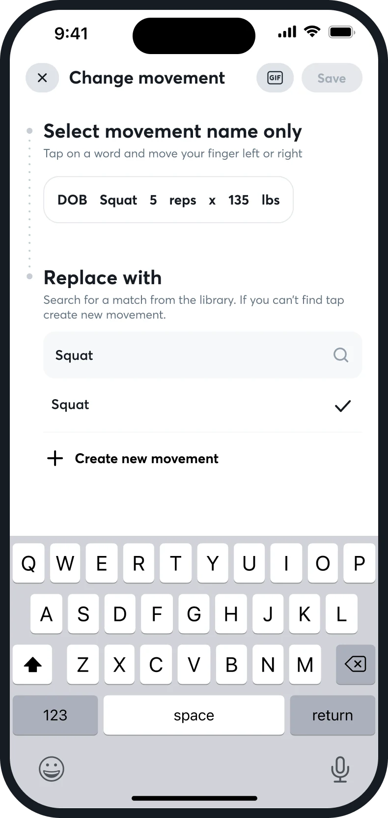
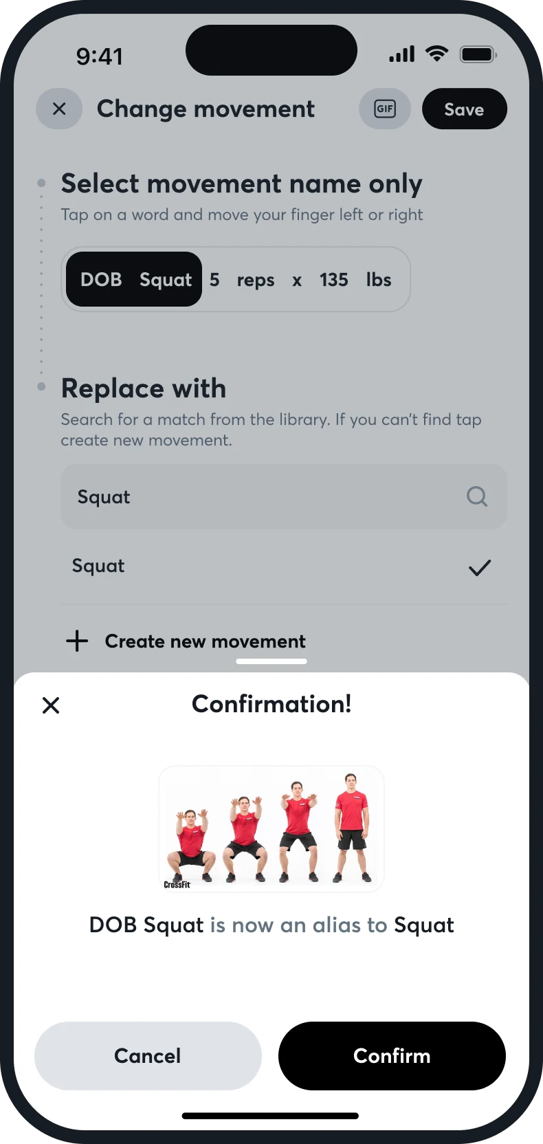
Results are typed against the plan. A set written as a percentage shows the weight it means, a new PR is marked on the line it happened, and an EMOM asks for an interval and a number of rounds on a number pad. Words an athlete types are matched to the movement library, and the match can be kept as a shortcut.

Writing results
Results by set
Interval and rounds
A shortcut offered
Change movement
Match confirmed
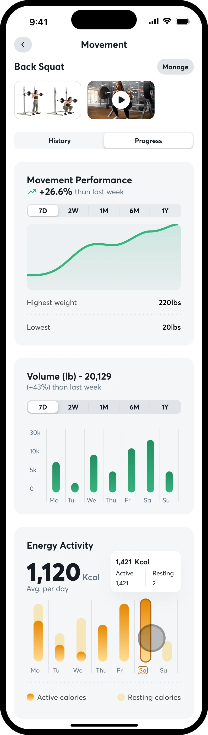
Movement history
Records by rep count

Plan and result side by side

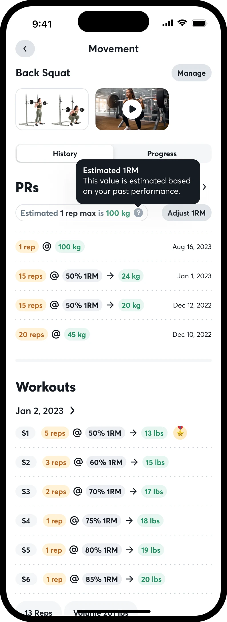
Each set reads reps, percentage, arrow, weight. Where the athlete beat it, a medal sits on the line.

A number pad for numbers

Interval and rounds are large figures with plus and minus, and an Insert button. No keyboard until the athlete needs words.

History shows where a number came from

A movement's page keeps its chart, its volume, its energy and its PRs by rep count, and flags that the 1RM is an estimate.

06 of 08

Getting in

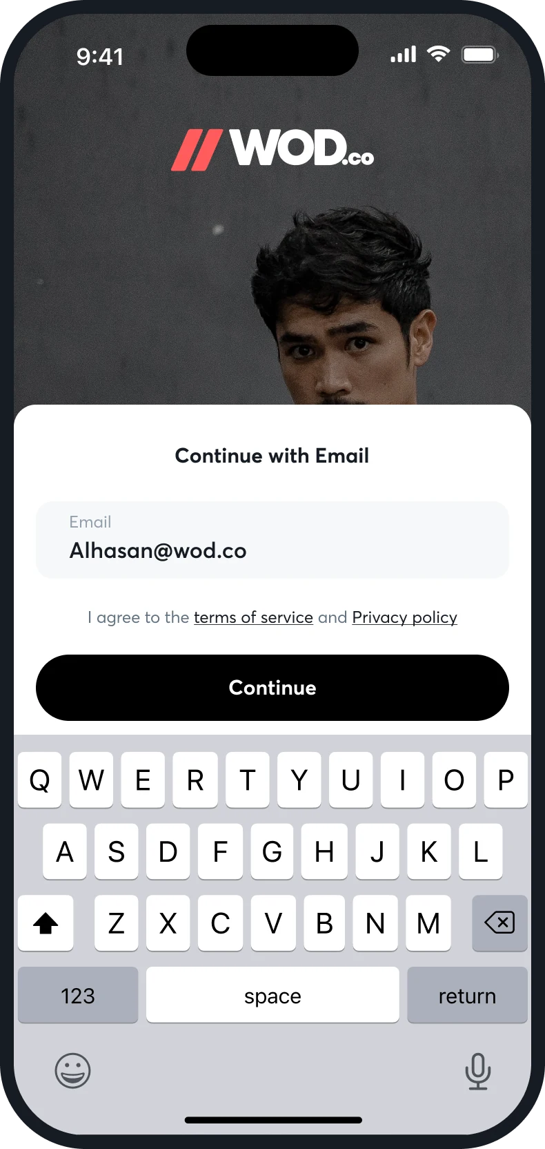
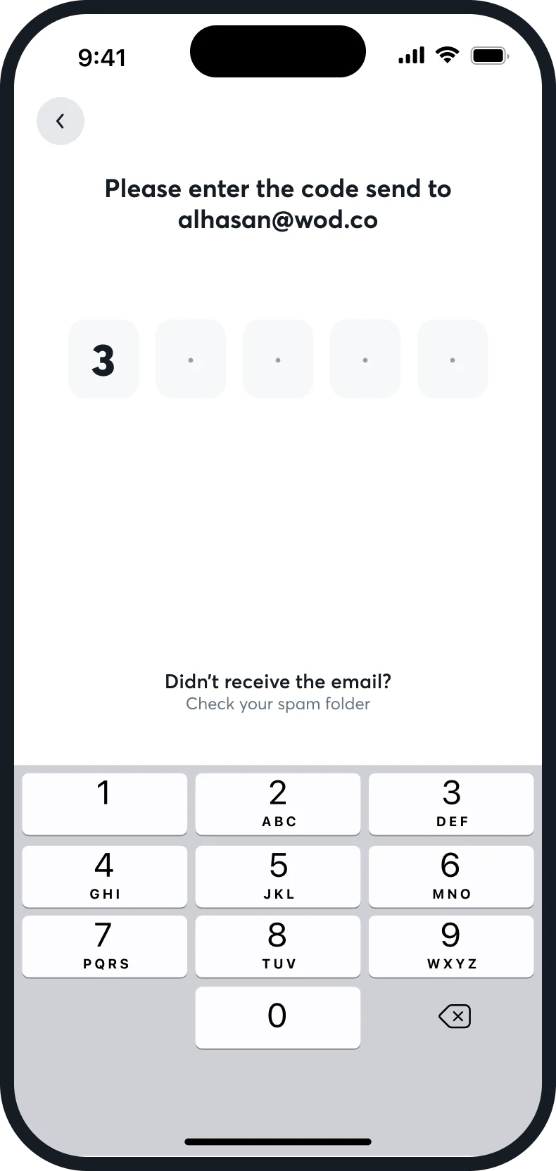
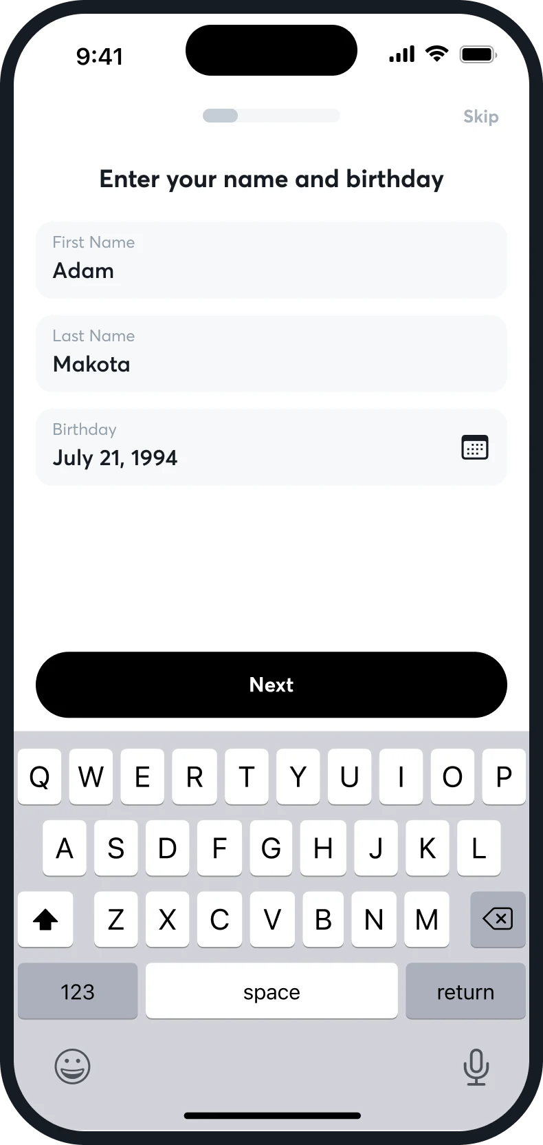
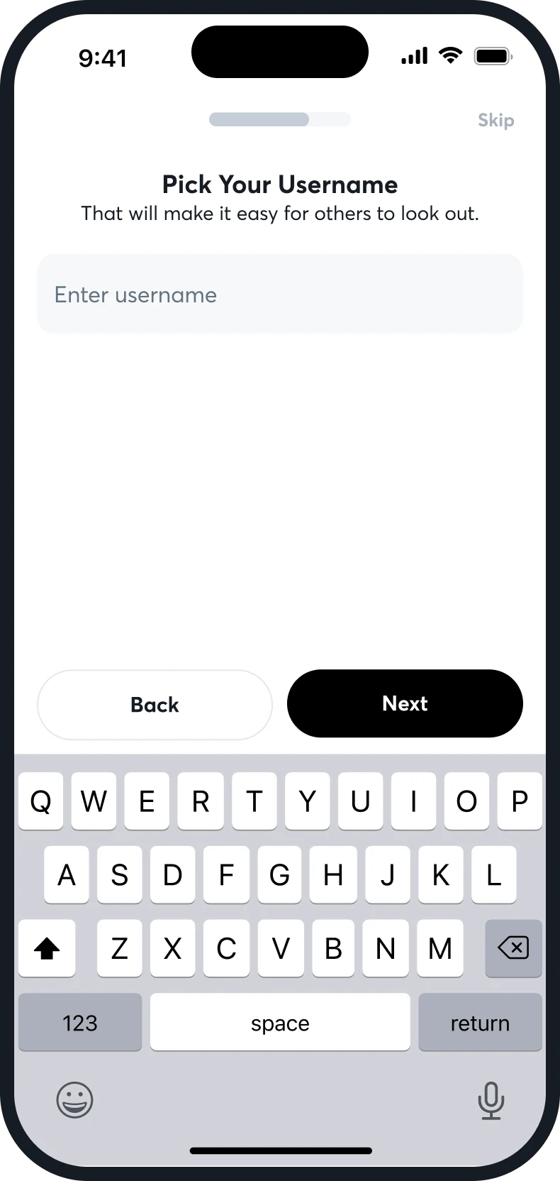
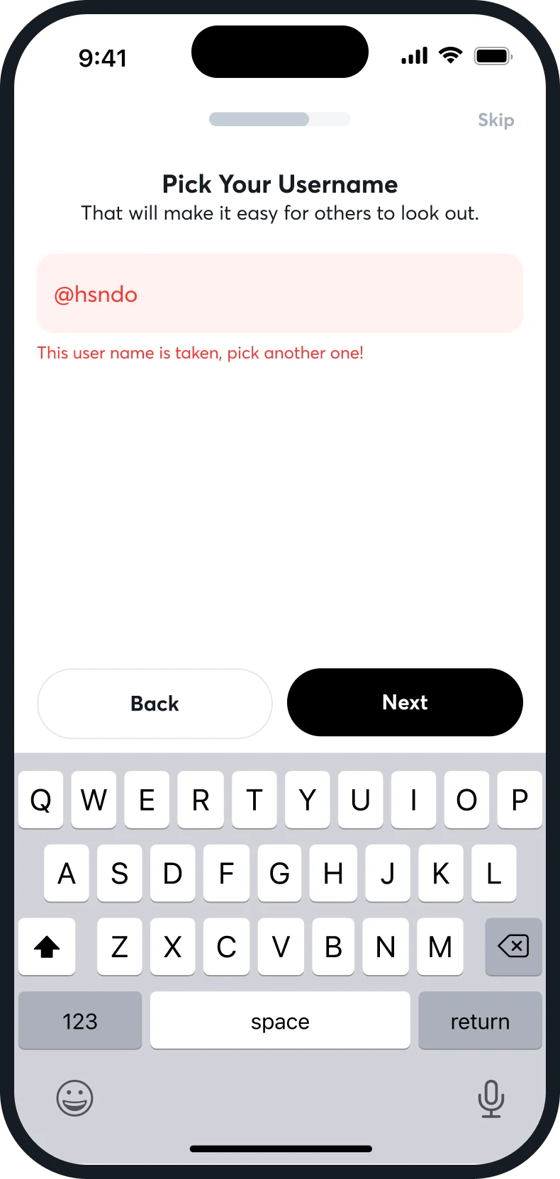
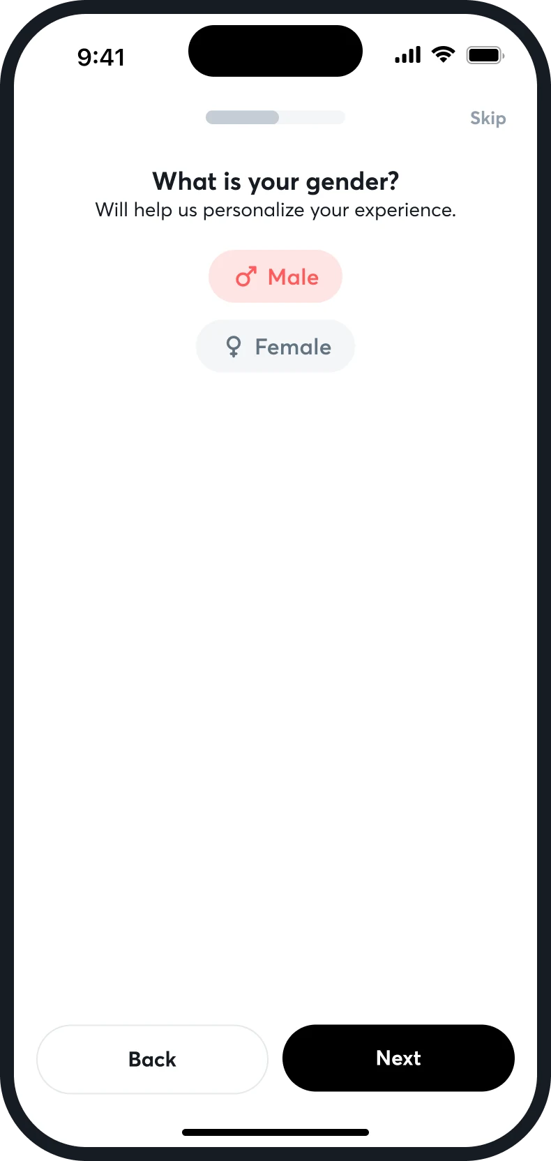
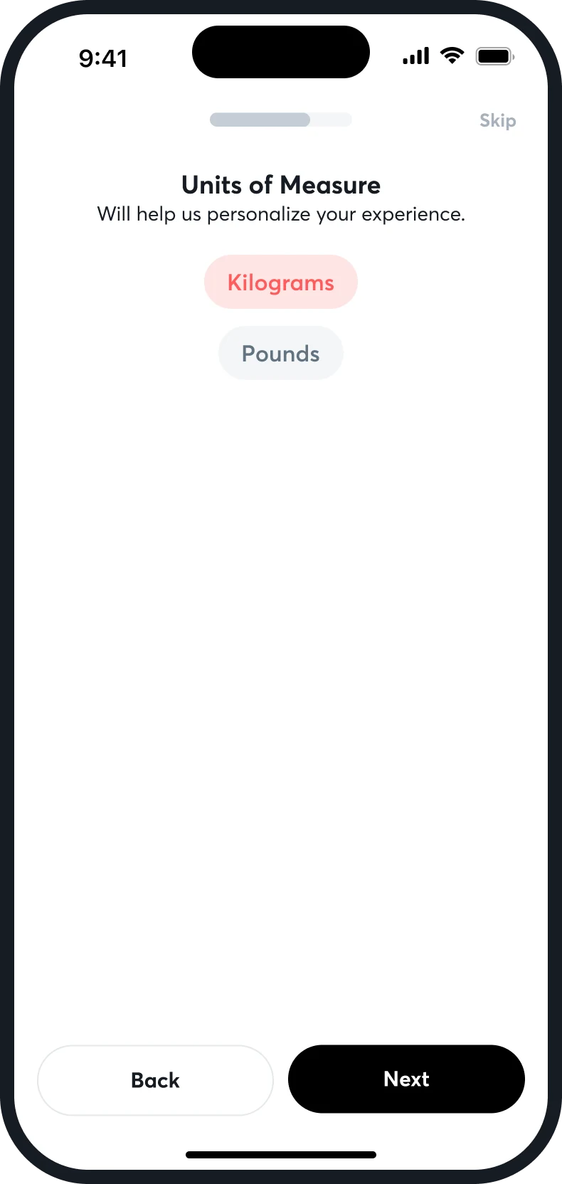
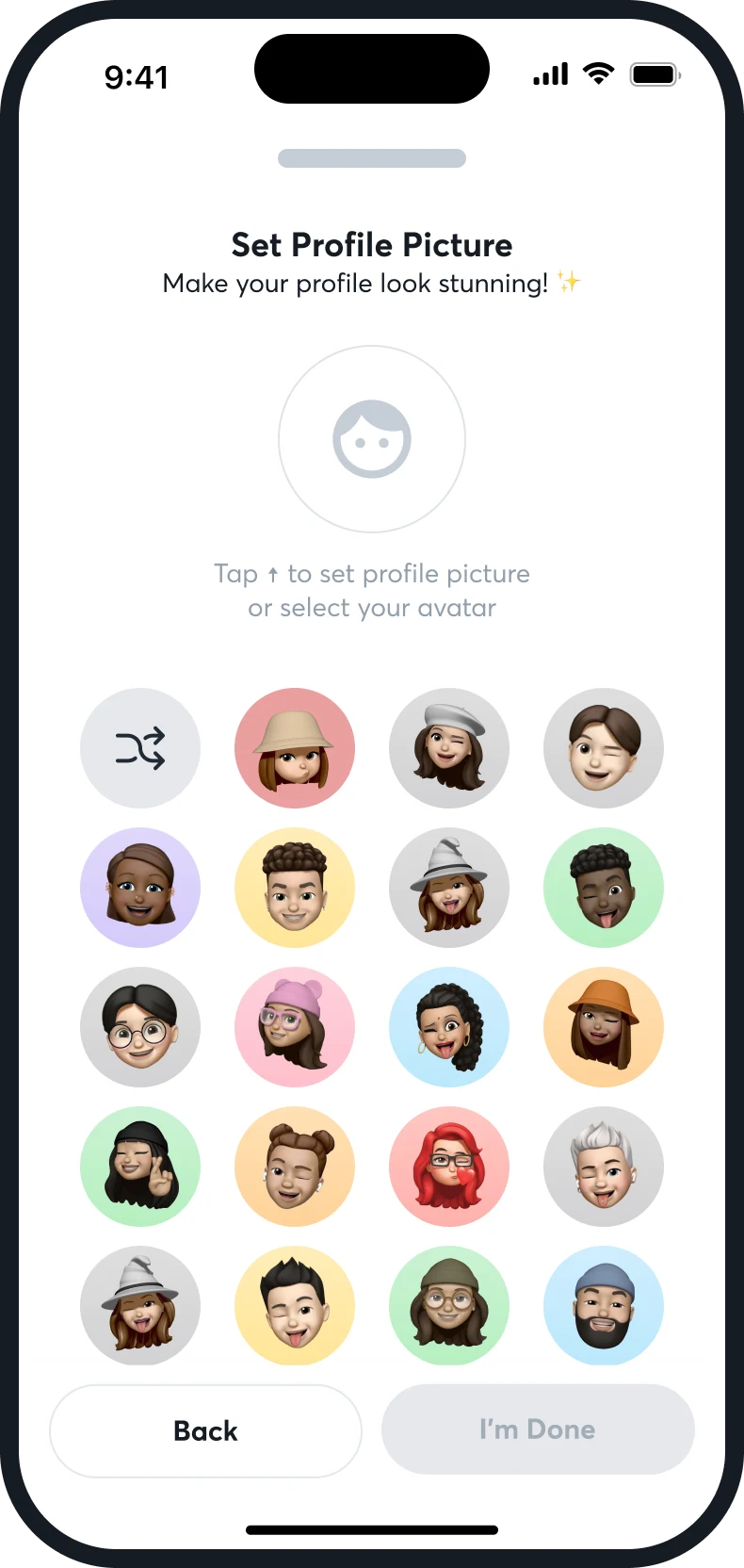
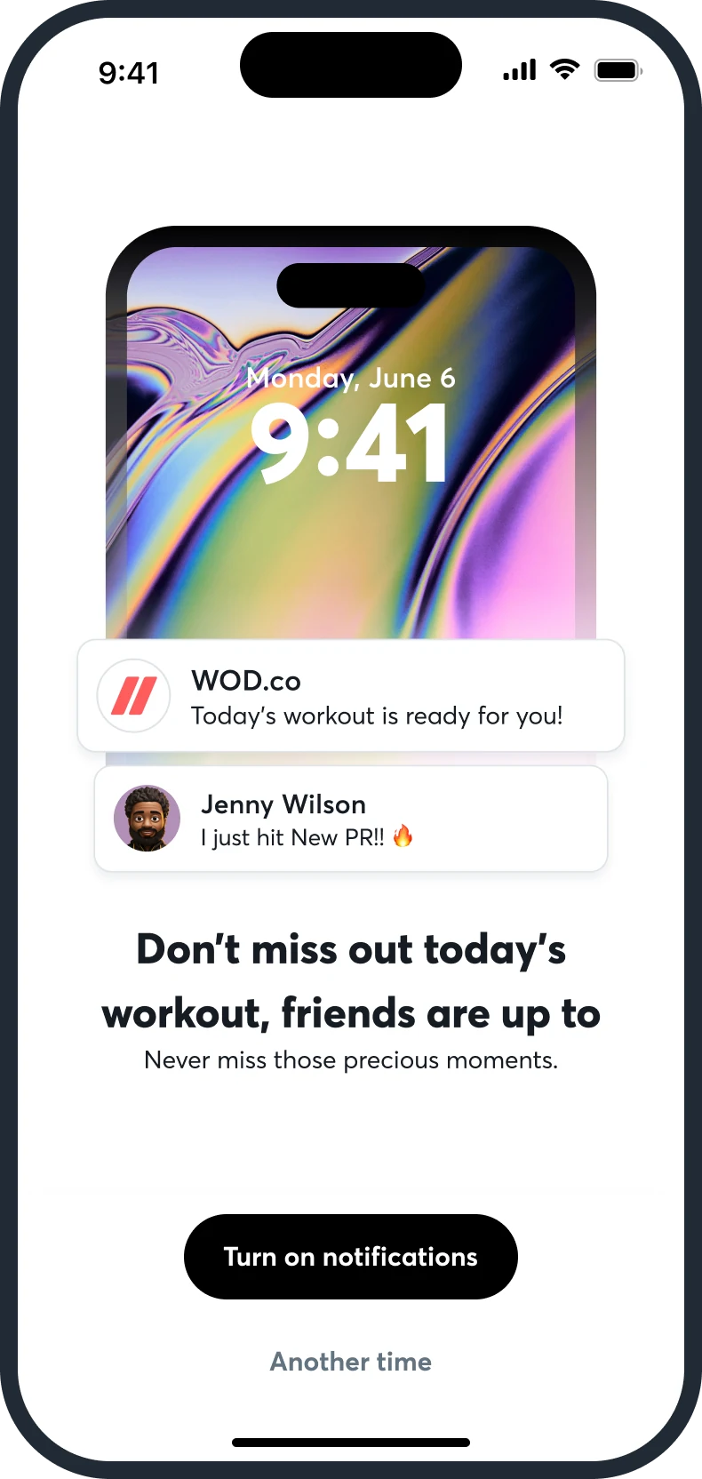
Sign-up is one question a screen, with a progress bar and a Skip. Email or Google, a code sent to the inbox, a name and a birthday, a username, a gender and a unit of measure, a profile picture, and one request for notifications. Both error states, a wrong code and a taken username, are drawn.

Splash
Sign in
Code, wrong
Name and birthday
Username
Username taken
Gender
Units
Profile picture
Notifications

One question, one screen

The thumb stays at the bottom of the screen: Back on the left, Next on the right, and Skip small at the top, away from both.

An avatar before an upload

A grid of illustrated avatars with a shuffle, so a profile is finished without a photo.

The notification ask has a reason

“Don't miss out today's workout, friends are up to it”, with Turn on notifications and Another time.

07 of 08

Progress, people and Pro

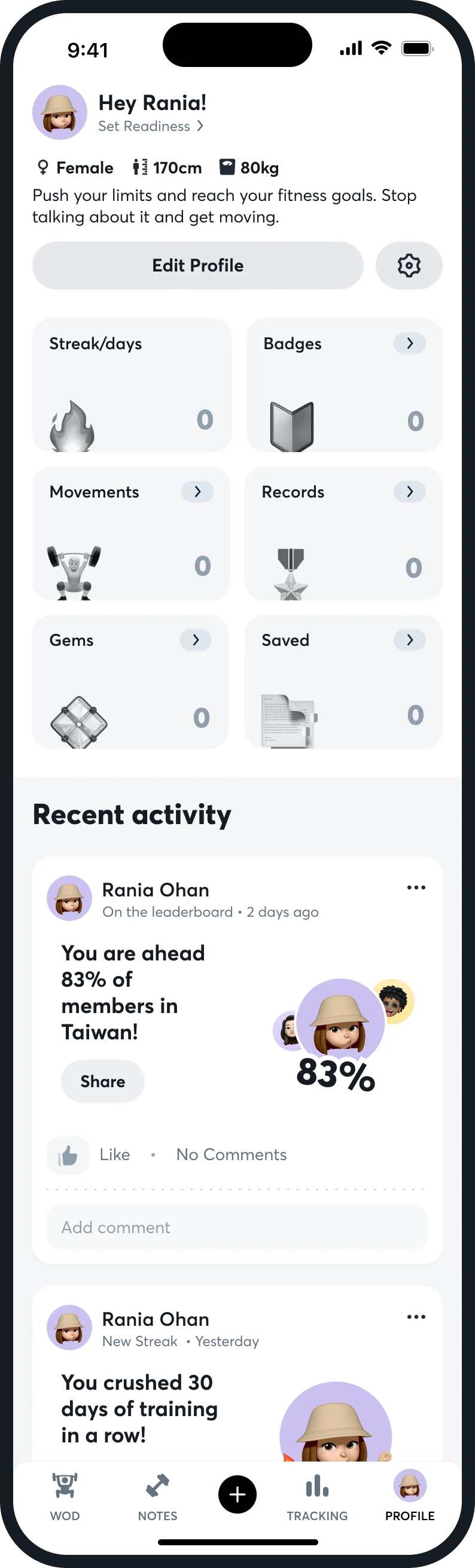
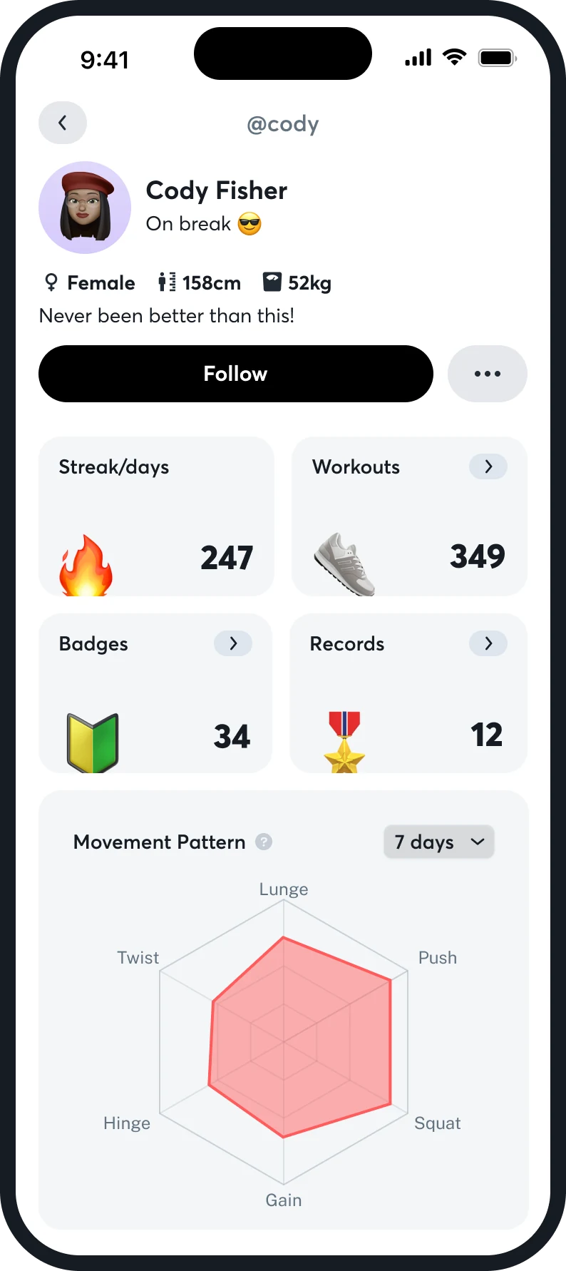
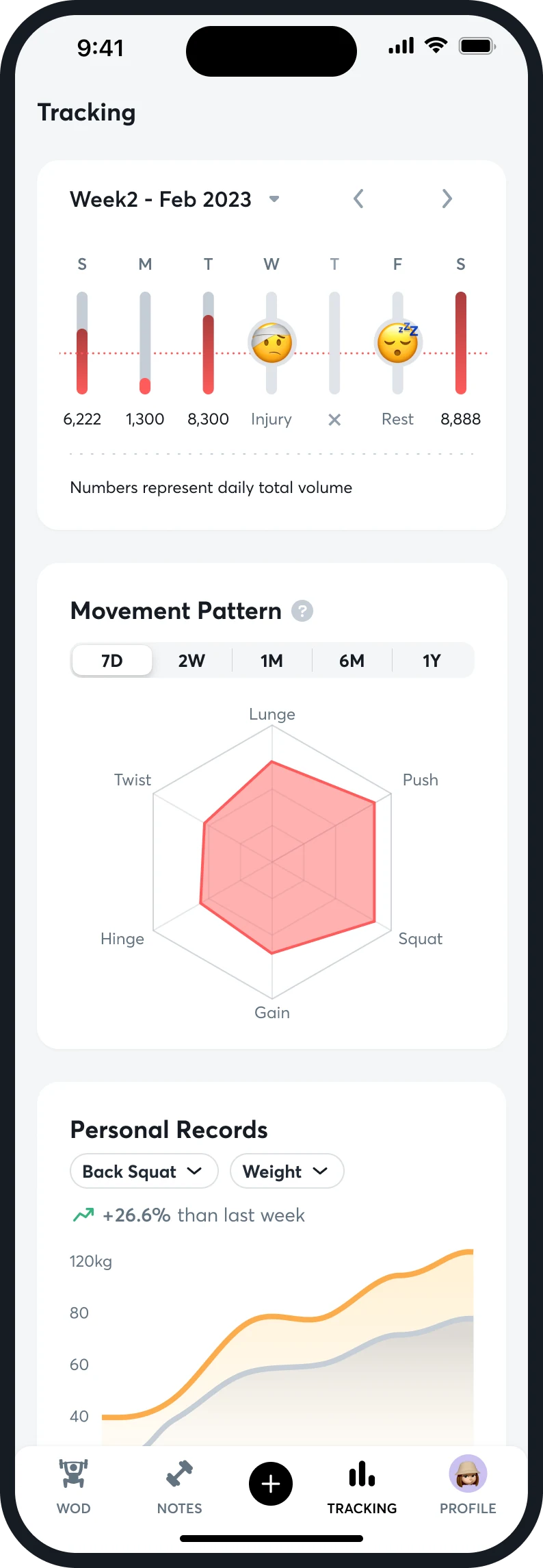
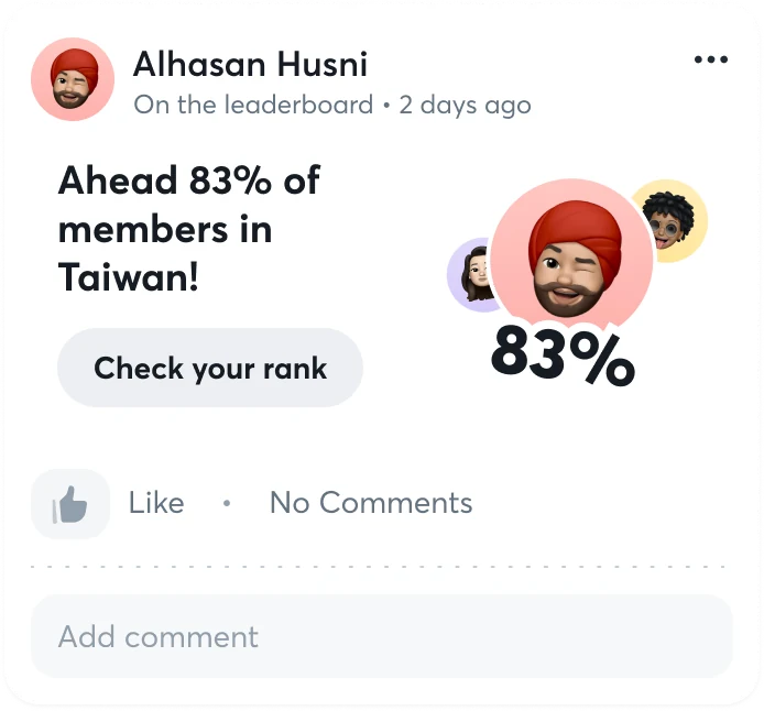
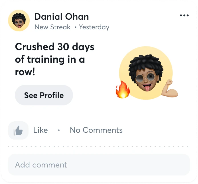
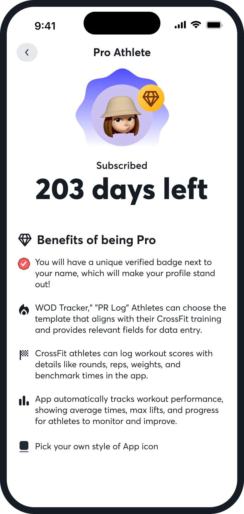
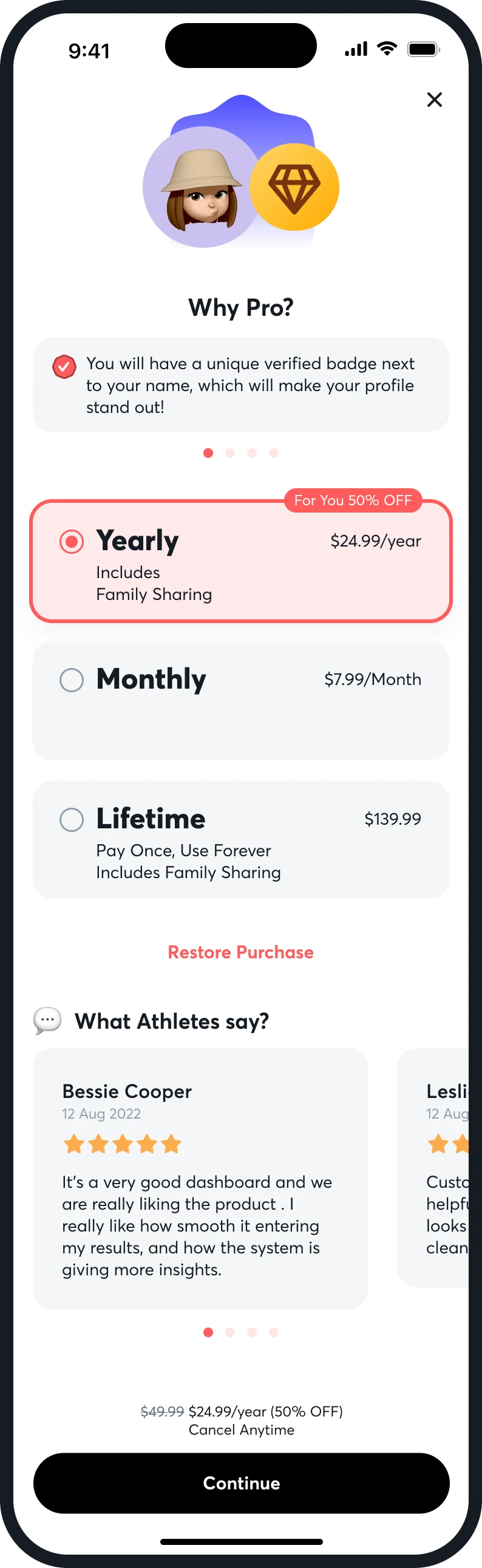
A profile is a handful of counts: streak, badges, movements, records, gems, saved. Another athlete's profile adds Follow and the same movement-pattern chart. Tracking is a week of volume with injury and rest days in place of bars. Milestones become cards that say one thing, and Pro sells what an athlete would otherwise lose.

Profile
Another athlete
Tracking
Leaderboard card
Streak card
Pro
Plans

A card says one thing

“Ahead of 83% of members in Taiwan” with a Share or a Check-your-rank button, and “Crushed 30 days of training in a row” with See Profile.

Rest is data too

The weekly chart replaces a bar with a marker for injury or a rest day, so a gap does not read as a missed day.

Pro lists what it adds

A verified badge, a tracker template that fits the athlete's training, score logging with rounds and times, automatic tracking, and a choice of app icon. Yearly is preselected with a 50% off tag.

08 of 08

The public site

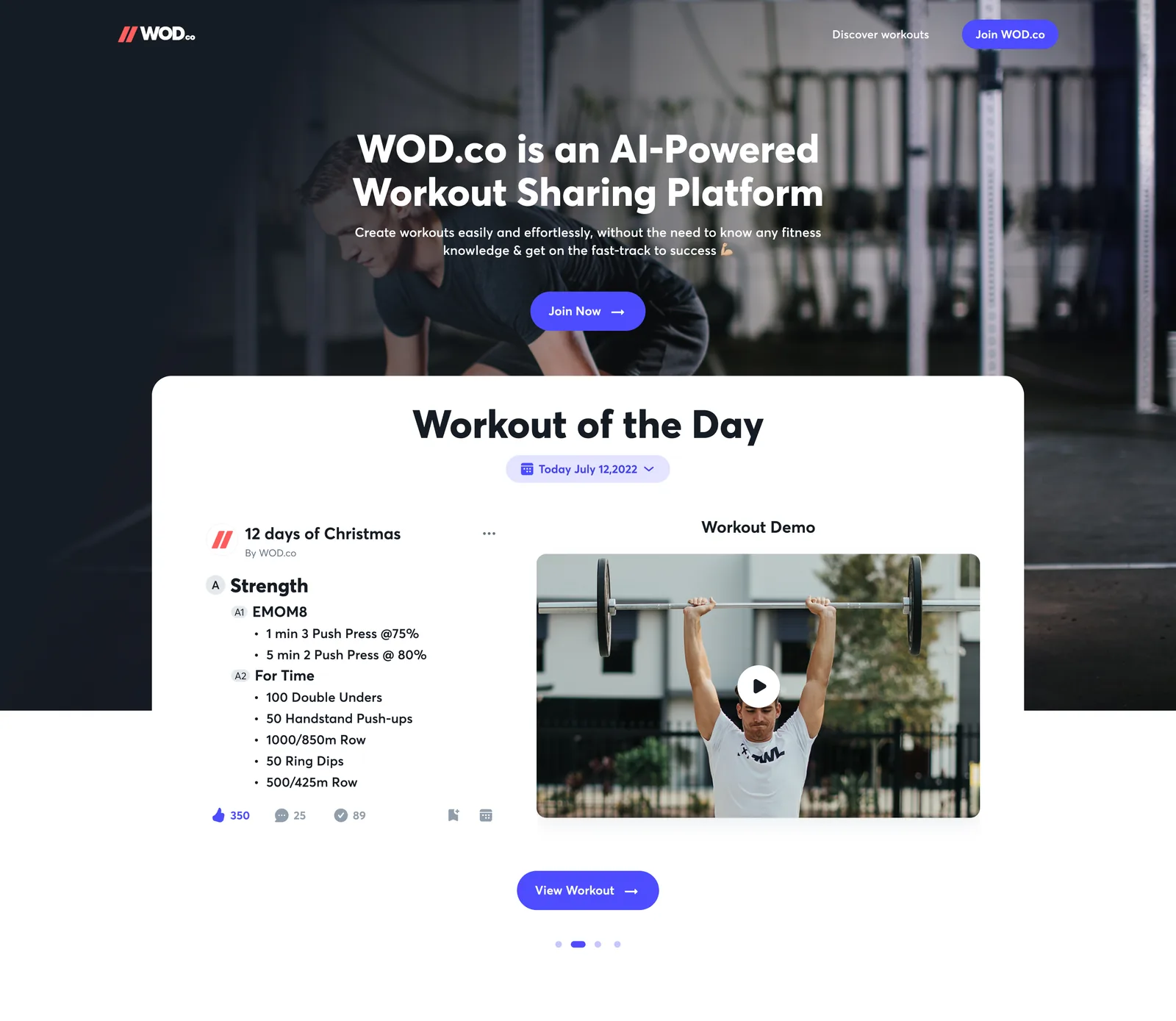
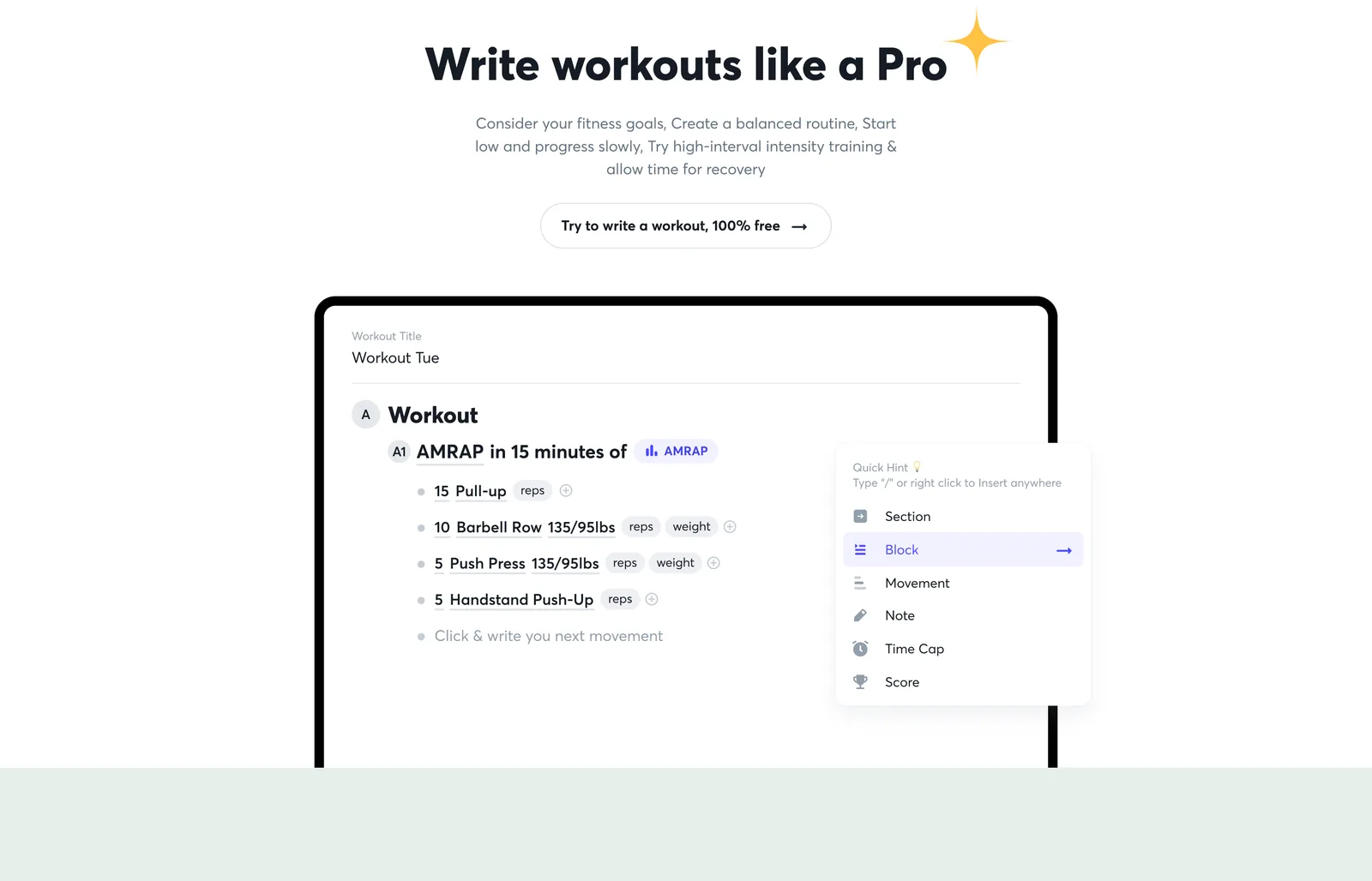
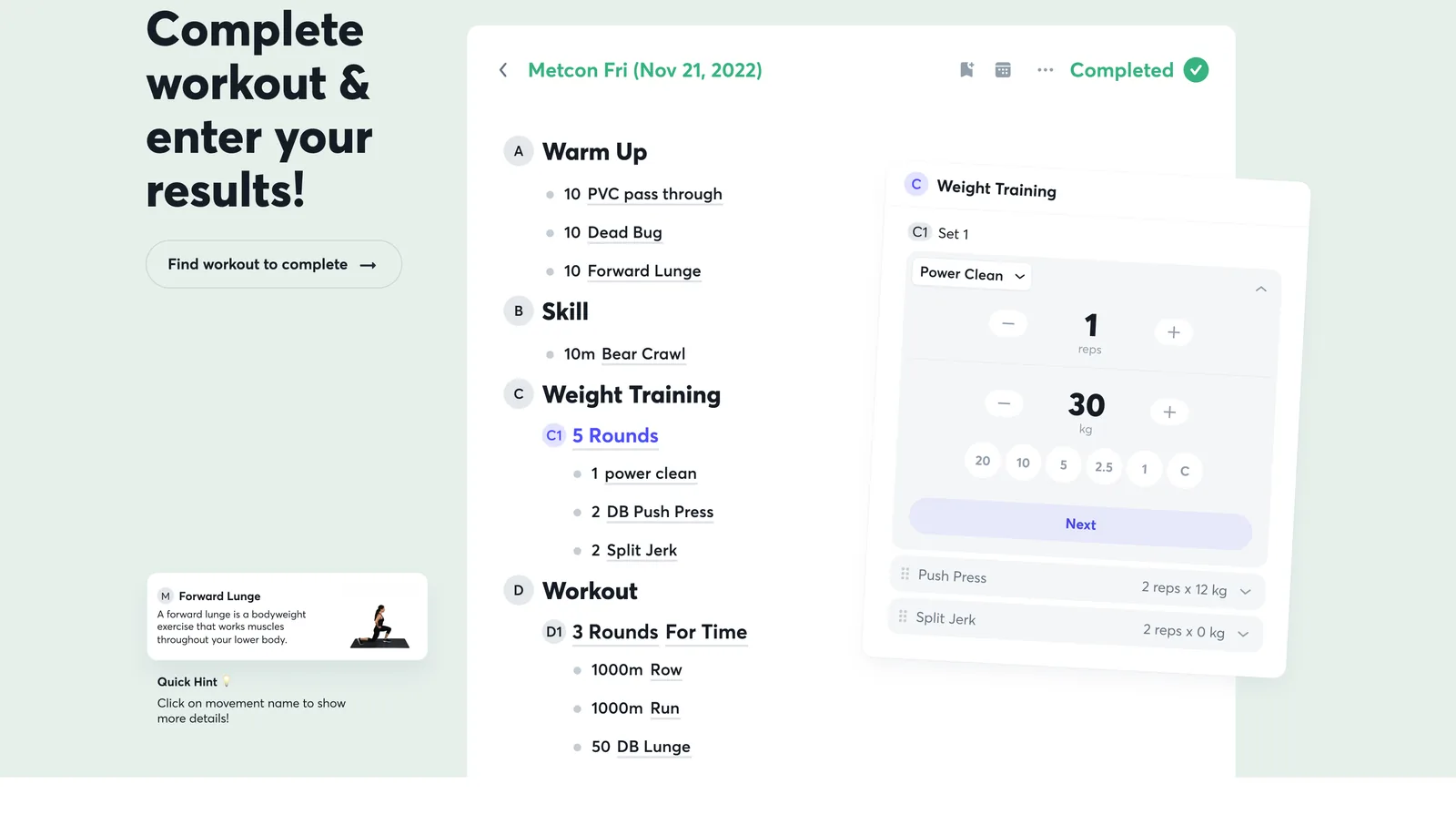
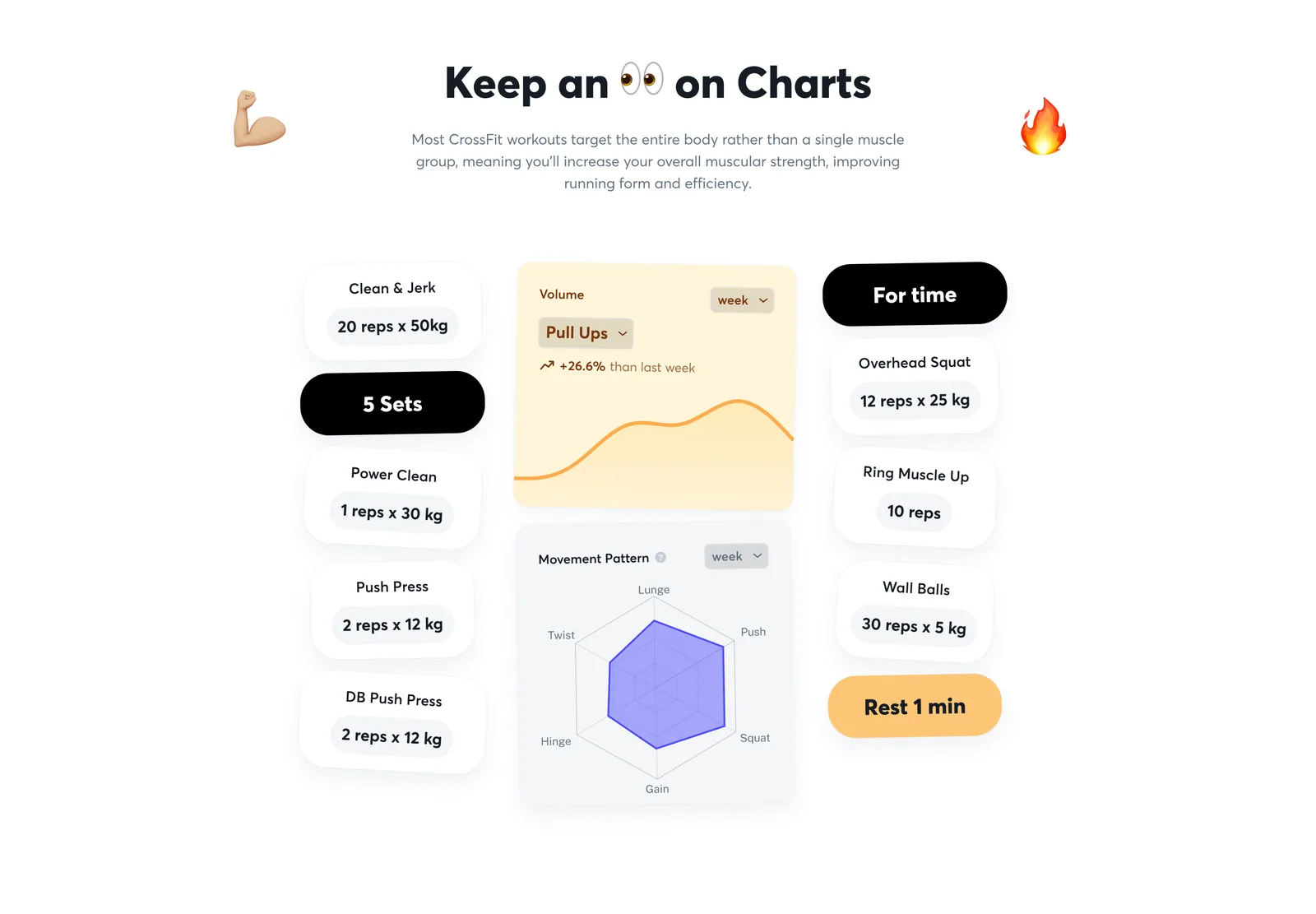
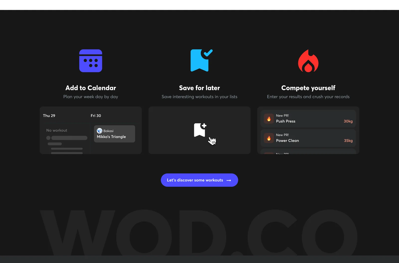
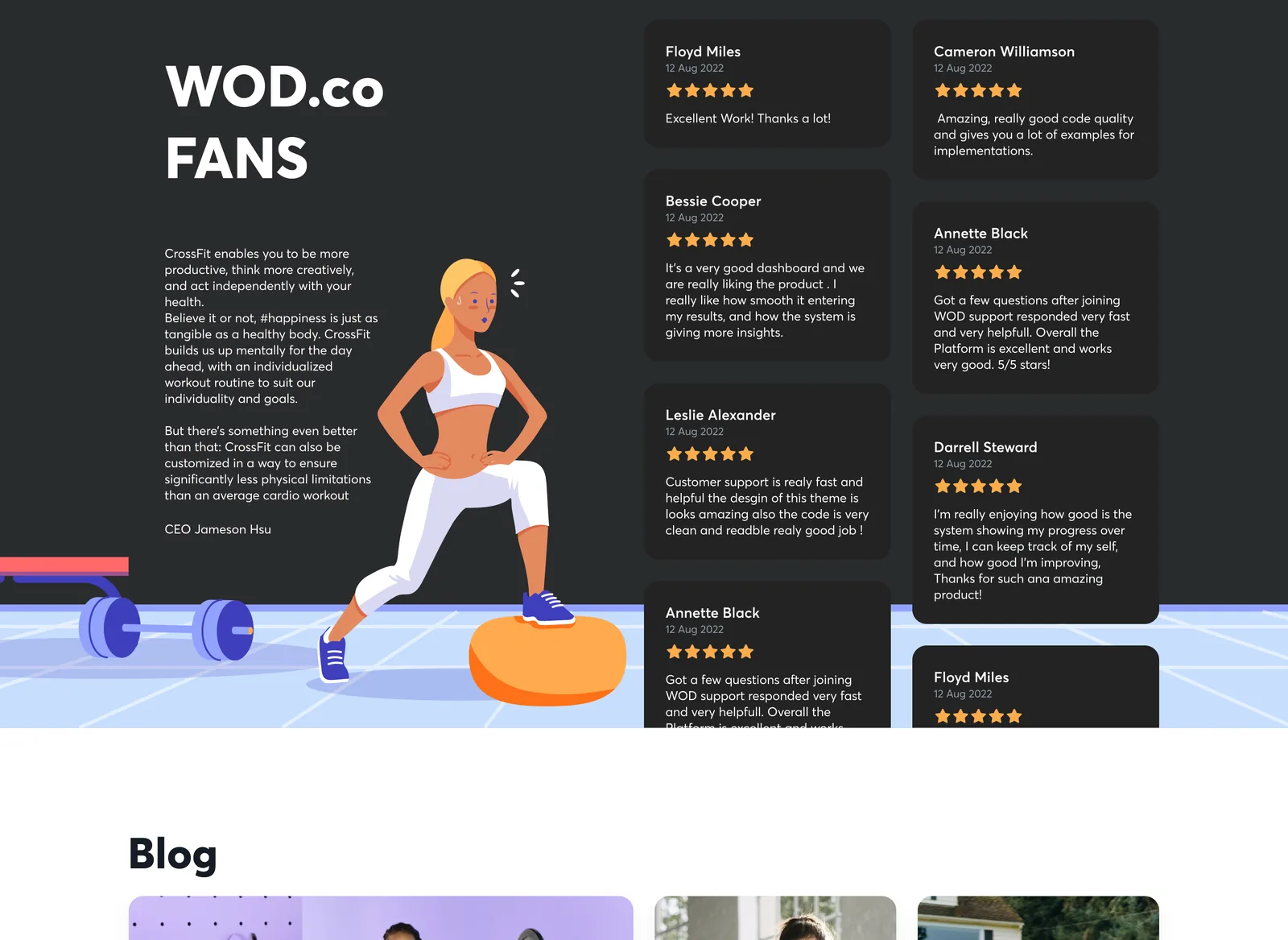
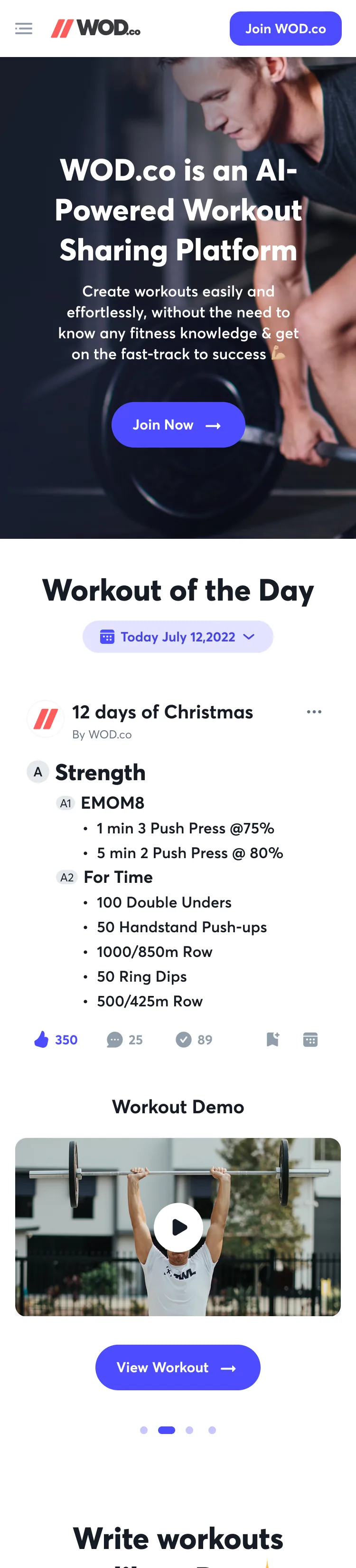
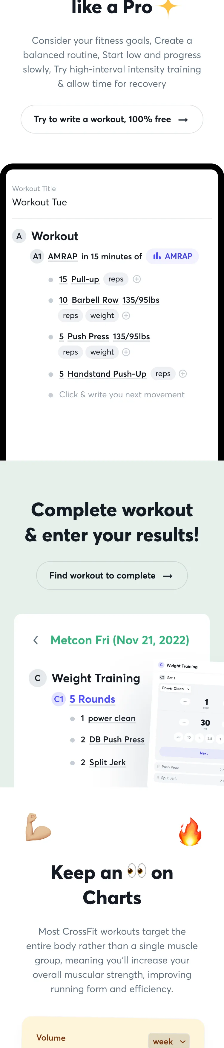
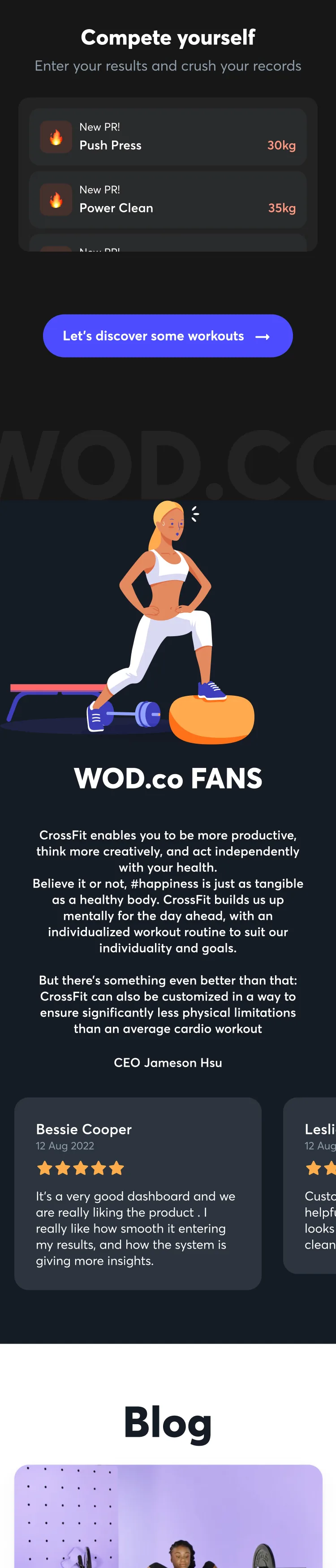
The public page shows the product instead of describing it: the editor is drawn inside the page, with its command menu open, and the results sheet floats beside the workout it belongs to. It leads with a workout of the day and ends on three things an athlete can do: add to the calendar, save for later, and compete with their own records.

Hero and workout of the day
Write workouts like a pro
Complete a workout and enter results
Keep an eye on charts
Add to calendar, save, compete
Fans and blog
On a phone, 1
2
3
4
5

The product is the picture

Instead of a mock-up beside copy, the real editor and the real results sheet are the hero images.

A workout first

The first card on the page is a real workout of the day with a demo video, so the page opens with what the product holds.

The same page, narrowed

On a phone the sections stack in the same order and the editor drawing keeps its structure, so nothing is renamed between sizes.

Underneath

Three surfaces, one vocabulary.

Section, block and movement mean the same on the web editor, in a calendar cell and on the phone's results sheet, down to the lettering. Colour is kept for meaning: black for the main action on the phone, coral for streaks, records and errors, green for gains, and one six-axis chart for movement balance that appears on the web dashboard, the phone's tracking tab and another athlete's profile.

DecisionsAnd the evidence behind them

What we saw, what we knew, what we chose, and what we gave up.

01

Let the coach write the workout the way they already write it

What we saw
A coach thinks in shorthand: EMOM8, AMRAP, 6-12-18-18, “find max load”. Spreadsheets and chat messages take that shorthand as it comes; most forms do not.
Evidence
Interviews· QualitativeSix coaches observed in live sessions, working from spreadsheets, group chats and paper logs.
Design judgement· QualitativeThe calendar cells in the captures are full of that vocabulary: time caps, rounds, sets written as rep schemes. The editor has to produce it, not replace it.
So we
A page you type into. Sections are lettered A, B; blocks A1, B1; movements are lines with small chips for what is measured (reps, weight, distance). Type “/” or right-click for commands and press Tab to format.
Not
A form with a field for every set, which asks a coach to fill in twelve boxes to say what one line says.
What happened
Time spent programming workouts fell by 60% in the coaches' own timing. The share that came from the editor, and the share from reusable sections, is not recorded separately.

02

Make visibility a rule on the calendar, not a button on every workout

What we saw
A coach plans a week at a time, but athletes do not need all of it at once, and some days are not decided yet.
Evidence
Prototype· QualitativeThe calendar control reads “Show workouts to athletes”: Weekly, Daily or Don't hide. Each week carries a green band, “Visible to athletes”, or an amber one, “Not visible to athletes”.
Design judgement· QualitativeThe same grid shows both states at once, so a coach can see what the squad can see without opening a preview.
So we
One rule for the squad's calendar, and a colour band over each week that says what it currently does.
Not
A publish button on every workout, which turns a week of programming into seven small decisions.
How we'd know
If coaches often override the rule by publishing a day early, the default is wrong. I would count overrides per squad in the first month.

03

Give a squad three roles, not a permissions matrix

What we saw
A box has a head coach, assistants who post workouts, and people who only keep the community going. Giving everyone full control is easy and dangerous.
Evidence
Prototype· QualitativeSquad Permissions lists each person with one role: Admin, Post workouts only, or Monitor community. Adding someone is a search field and an Add button.
So we
Three named roles in one small dialog.
Not
Per-feature toggles for each member, which nobody maintains.
How we'd know
Do squads with three or more staff use the middle role? If nearly everyone is Admin, the roles are named wrong or the dialog is too easy to skip.

04

Let a typed word become the right movement

What we saw
Athletes write what they say out loud: “DU” for double unders, “DOB squat”. A strict picker makes them stop and search, in the middle of a set.
Evidence
Prototype· QualitativeTyping “DOB Squat” matches it to Squat, and a confirmation says “DOB Squat is now an alias to Squat”. After “DU”, a sheet asks whether to save it as a shortcut for Double Unders.
Design judgement· QualitativeThe movement's menu keeps the way out: Movement history, Change movement, Turn into Note, and a red Unlink Movement.
So we
Match as they type, offer to remember the shorthand, and keep every match undoable.
Not
A picker that rejects anything that is not already in the library.
How we'd know
Share of freehand movements that match on the first try, and how many are unlinked straight afterwards. A high unlink rate means the matching is guessing.

05

Work out the weight from the percentage

What we saw
Coaches programme in percentages (“5 reps at 50% of your one-rep max”). The athlete needs a number to put on the bar.
Evidence
Prototype· QualitativeThe results view lists each set as reps, percentage and the computed weight: 50% becomes 13 lbs, 60% becomes 15 lbs, and so on to 85%, with a PR flagged against the set it came from.
Design judgement· QualitativeMovement history shows an Estimated 1RM with a tooltip, “estimated based on your past performance”, and an Adjust 1RM control beside it.
So we
Show the percentage the coach wrote and the weight it means, and let the athlete correct the estimate.
Not
Printing percentages and leaving the arithmetic to the athlete, between sets.
How we'd know
Where athletes adjust the estimate, it was wrong. I would track how often they do, and whether the adjusted number sticks.

06

Make being hurt a one-tap status

What we saw
A coach cannot adjust a session for someone they do not know is injured. Telling them is awkward and easy to skip.
Evidence
Prototype· QualitativeA Readiness sheet offers Active, On a Break, Sick and Injured, each with a short line. The choice shows on the athlete's profile, and the weekly tracking chart marks injury and rest days in place of a bar.
So we
Four statuses, one tap, visible where the coach already looks.
Not
A free-text note, which gets written once and never updated.
How we'd know
Do athletes change their status back when they recover? A status that stays on Injured for a month is the sign it has become a chore.

TestingRun, and passed

The test, and how it came out.

The flows were taken back into the environment they were designed for: standing, moving, in noise, against a clock. Each task below was run on the real screens, against a pass bar written before anyone was asked. Every task passed.

You are mid-class and the coach says “three rounds, back squat at seventy-five percent.” Open today's workout and tell me what goes on your bar.

Time to the number, and whether they trust it

5 of 5 within 20 seconds

Passed

“You wrote DU in your log. Make sure it counts as double unders next time.”

Finds the shortcut sheet, accepts it, then undoes it

4 of 5 without help

Passed

“You hurt your shoulder this morning. Let your coach know without messaging them.”

Finds Readiness, picks Injured

5 of 5 within 15 seconds

Passed

Coach side: “Next week is written. Make sure athletes only see Monday.”

Finds Show workouts to athletes and sets Daily

4 of 5 first try

Passed

Coach side: “Add a movement to the second block without leaving the keyboard.”

Uses “/” or Tab, and any mouse trips

4 of 5 with no more than one mouse trip

Passed

Every task met its pass bar. Participant details and timings are not published on this page.

AIHow it fits

Before the class and after it. Never in the middle.

Coaching is a live, physical job, and the research that made this product work was shadowing, which no model could do. The public page calls WOD.co AI-powered, and the editor in the designs has a review control for selected text. Anything beyond that is where I think AI belongs, not what is shipped.

Review a selection

In the editor, select text and choose Improve writing or Fix spelling. Both change words, not the programme.

After class, never during

Where AI would earn its place is the drive home: turning the session log into the programming suggestion a coach would otherwise write by hand.

A draft the coach edits

Any suggestion arrives as a draft in the same editor, with the same lines and the same warnings, and nothing publishes without the coach.

Glanceable, always

The live screens stay large-target and short. Nothing that needs reading goes in front of someone standing, talking to twenty people.

Rules any AI here is held to

  • Observe the real environment before designing for it. Noise, movement and time pressure are the constraints.
  • AI belongs in the preparation and the follow up, never in the middle of a live class.
  • Any suggestion arrives as a draft the coach edits, because the athlete relationship is theirs.
  • Targets stay large and glanceable, since the user is standing up and talking to twenty people.

ImprovementsWhat I would change now

Reading the screens the way a stranger would.

Six things I can see on the captures above, each with what it does today and what I would do about it. Some are artefacts of working boards, and are worth fixing before they ship.

01

One primary-button colour

On the screen

The earlier web boards use indigo for Create a workout and Post workout; the later ones use black. The iOS app uses black throughout.

The change

Use black on every surface and keep indigo for selection and links, so the main action looks the same wherever it is.

02

Two tab bars

On the screen

Some iOS screens have WOD, Tracking, Workouts and Profile. Others have WOD, Notes, a plus, Tracking and Profile.

The change

Settle on the second, with the plus for adding a workout, and update every screen so a tab is never renamed.

03

Titles that read like data

On the screen

Workouts appear as “FRI 20122023” and “20231127 Workout” on the feed card and the calendar.

The change

Show the date as a date and the title as the coach wrote it. If there is no title, say “Friday workout”.

04

A side panel that is empty until you point

On the screen

On the editor, the right-hand panel is a large blank area before a movement is selected, with one line of grey text.

The change

Use that space for the workout's outline and its warnings until a movement is selected, then swap in the movement's details.

05

The Messages bar covers the last week

On the screen

On the calendar, the docked Messages bar sits over the cells of the bottom row.

The change

Reserve a strip at the foot of the page when the bar is collapsed, so the last row can be read and clicked.

06

A taken username should help

On the screen

The error is a short red line in small type under the field.

The change

Say what is wrong in the same size as the field, and offer two names that are free.

The trade-off

I chose a typed, document-style editor over a form with a field for every set. The cost is that a free line can be wrong in ways a form cannot, so the editor needs a warnings count and a movement match to catch it. I kept AI out of the live class entirely, because a coach owns what the room does next.

What it did

Coach context switches dropped from 47 to 12 an hour in a live class, and the time spent programming workouts fell by 60%. Both were timed by observation. Athlete numbers, retention and revenue are not recorded, so I do not state them.

My partUI/UX Designer, 2022 – 2024

What I did.

Tools and methods

Figma · Contextual inquiry · Competitive analysis · Prototyping · iOS · Web app design

  • Ran the shadowing study with six coaches and quantified the context-switching cost
  • Benchmarked Wodify, SugarWOD and BTWB to locate the unserved job
  • Designed the typed workout editor: sections, blocks, movements, slash commands, drag from lists and the states around them
  • Designed the squad calendar: visibility rules, rest days, create from a day and squad roles
  • Designed the athlete dashboard and the iOS app, from onboarding and the workout of the day to logging results, 1RM maths, movement matching, tracking and sharing
  • Designed the public site and its mobile version
© 2026 Alhasan HosniHome