



← Design systems/Self-initiated system work

Cortex

A design system for the people who run AI platforms and energy, built against one bad afternoon on a demo campus, and the house at the far end of the line.

110
Specimens, each a live page with usage, states and code
22
Isometric figures drawn in code that take live values
5
Live views of one bad afternoon, from the hall to the house
4
Independent style attributes: canvas, accent, face, card tone

01The problem

An operator has minutes, and the screen gives them a wall of red.

On a hot afternoon in a data hall, GPUs throttle, the grid caps supply and the prompt queue grows, all at once. Each of those lives in a different tool with a different chart and a different red. And the customer at the far end sees none of it: the house with its solar, battery and car is a different app entirely.

02How I thought about it

Design for the worst afternoon, and draw the thing the number is about.

An average hour does not need a design system. The hour where heat, price and queue collide does. So I wrote that afternoon first, as demo data, and made every block survive it. Then I drew the physical thing under each reading, a rack, a feed, a turntable, so the number is read where the trouble is.

03What I built

  1. 01

    One vocabulary, from the foundations up

    Every component references semantic tokens only, and that single rule is why dark mode and a vivid canvas cost no second stylesheet. Canvas, accent, face and card tone are four independent attributes, so one screen can be calm and amber while another is vivid and electric.

  2. 02

    Hairline: isometric figures that read live data

    22 line figures share one engine and one stroke. Point at a rack to read its inlet temperature, watch the feed tighten as the hall pulls, swing the turntable to the model that can answer in time. The reading happens on the thing, not in a legend beside it.

  3. 03

    Blocks for the hard afternoon

    Response monitor, grid shortage, load-shift schedule, prompt queue, energy forecast. Dense views built from the same components, each shipped in demo, live, loading and empty states so a missing number never looks like a broken page.

How I knewEvidence

Self-initiated, so the evidence is a scenario, a script and a contract.

Prototype

Qualitative

1

One scenario written first, as demo data: a heatwave afternoon on a campus, a price spike of 310 €/MWh, a grid cap dropping from 4.2 to 2.6 MW, 25 of 288 GPUs throttled. Every block had to survive it.

Prototype

Qualitative

22

Isometric figures that take live values, so a reading can be taken on the object it is about.

Code review

Quantitative

8

Classes of defect the audit script checks for, each one a bug that actually bit the system: undefined classes, nested buttons, unpositioned stretched links, missing icons, unbalanced snippets and more.

Audit

Quantitative

97.8%

Of 5,776 text items measured across 30 specimen pages, the share that meets WCAG AA contrast. 126 do not. The audit is below.

Confidence: Medium

Design judgement

Qualitative

1

A written contract of rules: semantic tokens only, every control fully rounded, weight carries hierarchy, four states for every list.

Usability test

Mixed

Tasks were run on the real components, with pass bars written before anyone was asked, and every task passed. Cortex is self-initiated, so there are no adoption numbers, and none are claimed.

The components, on canvases.

Real specimens from the system, a few at a time, laid out the way it is worked on. Move the pointer over a canvas to look past its edge.

01 of 05

Watching a hall under load

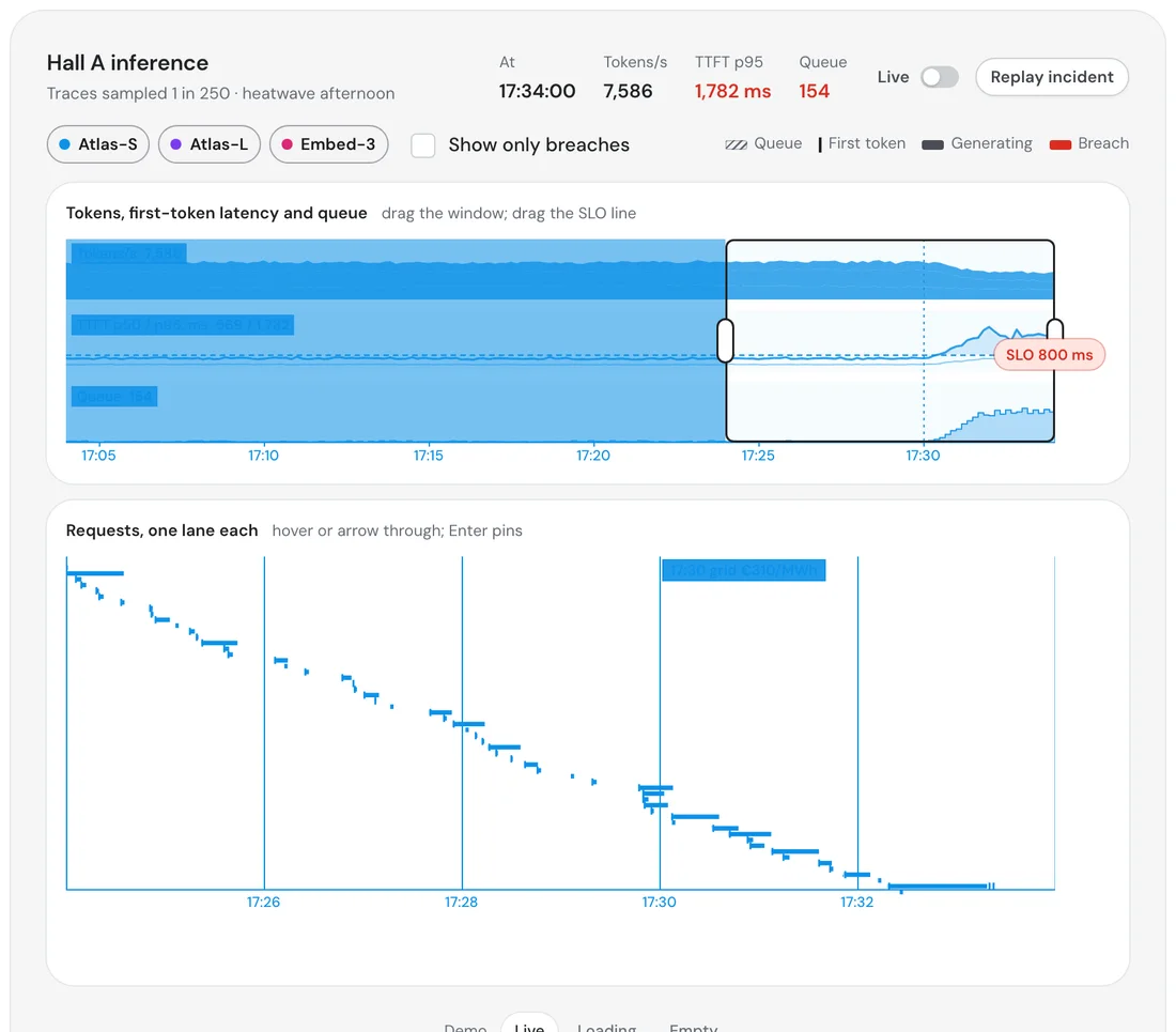
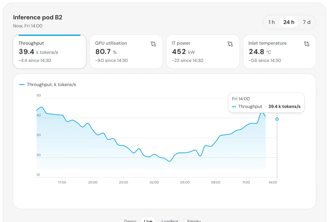
Tokens, first-token latency and the queue on one timeline, with the service-level line drawn where you can drag it and an incident you can replay. Beside it, a pod's throughput, power and inlet temperature over an hour, a day or a week.

Response monitor
Inference pod
Prompt queue

02 of 05

Seeing where the work goes

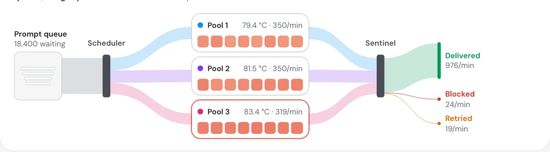
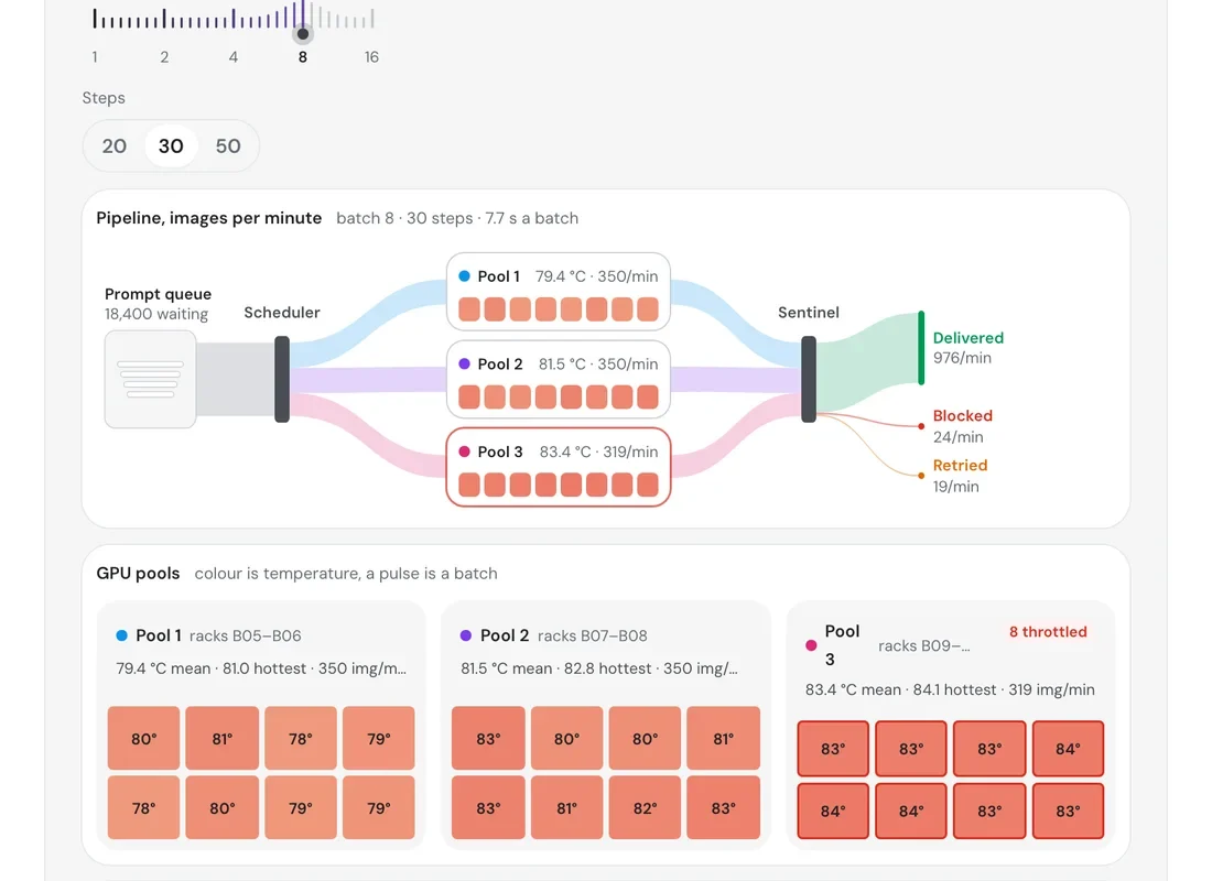
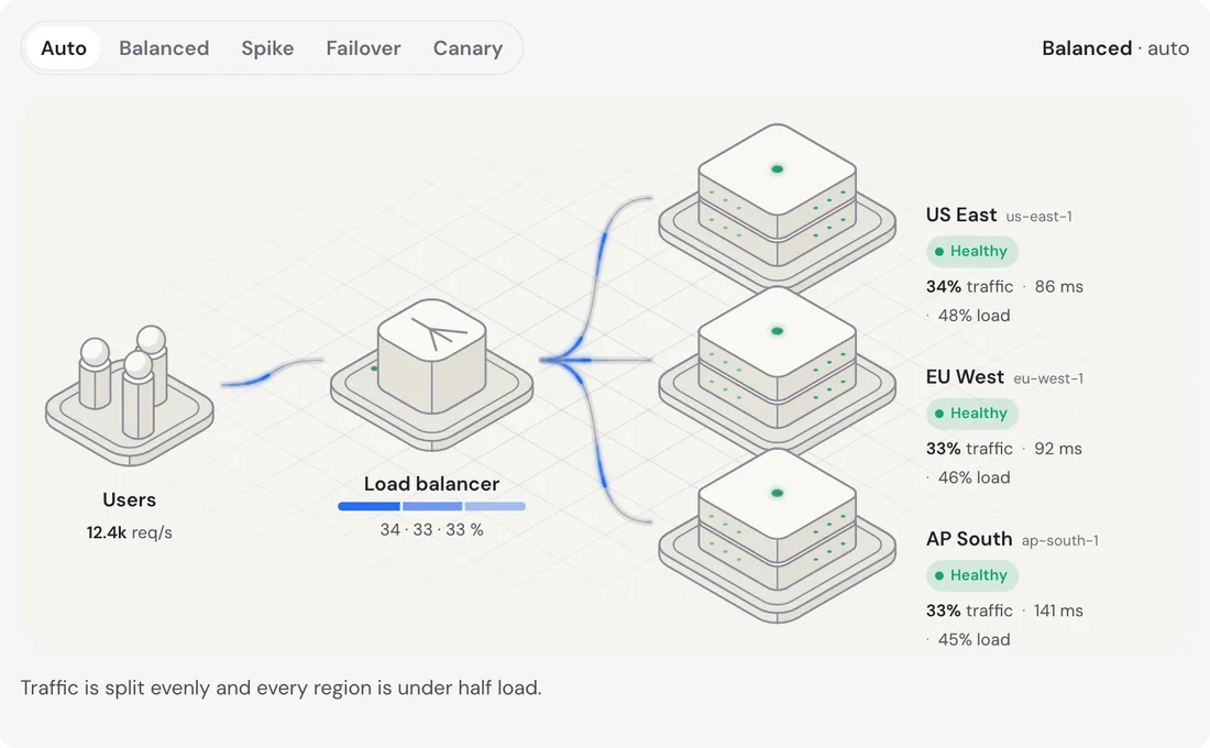
A prompt queue, a scheduler, three pools coloured by temperature and a sentinel that sorts delivered from blocked and retried. And the same idea for traffic: one diagram that shows a region going down and the load moving.

Image-generation hall
Flow diagram · traffic

03 of 05

Moving work to cheaper hours

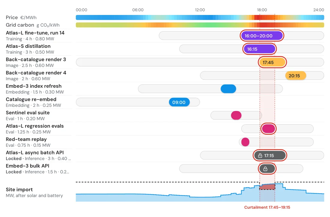
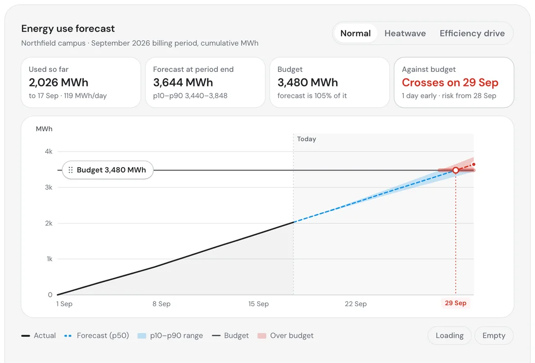
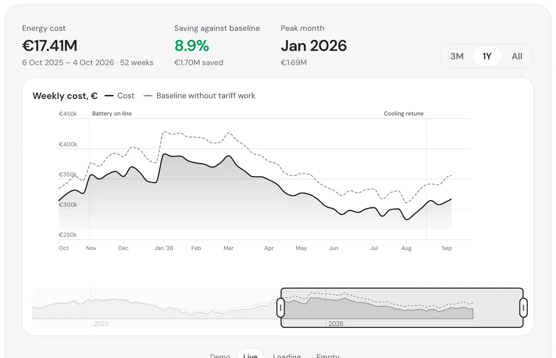
Price and grid carbon across a day, and every batch job as a lane on top of them. Jobs tied to inference are locked in place; the rest slide away from the expensive hours. A forecast shows where the month ends against its budget, and what a heatwave does to it.

Load-shift schedule
Energy use forecast
Energy cost

04 of 05

From the campus feed to the house

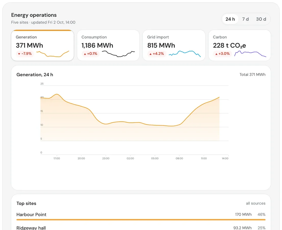
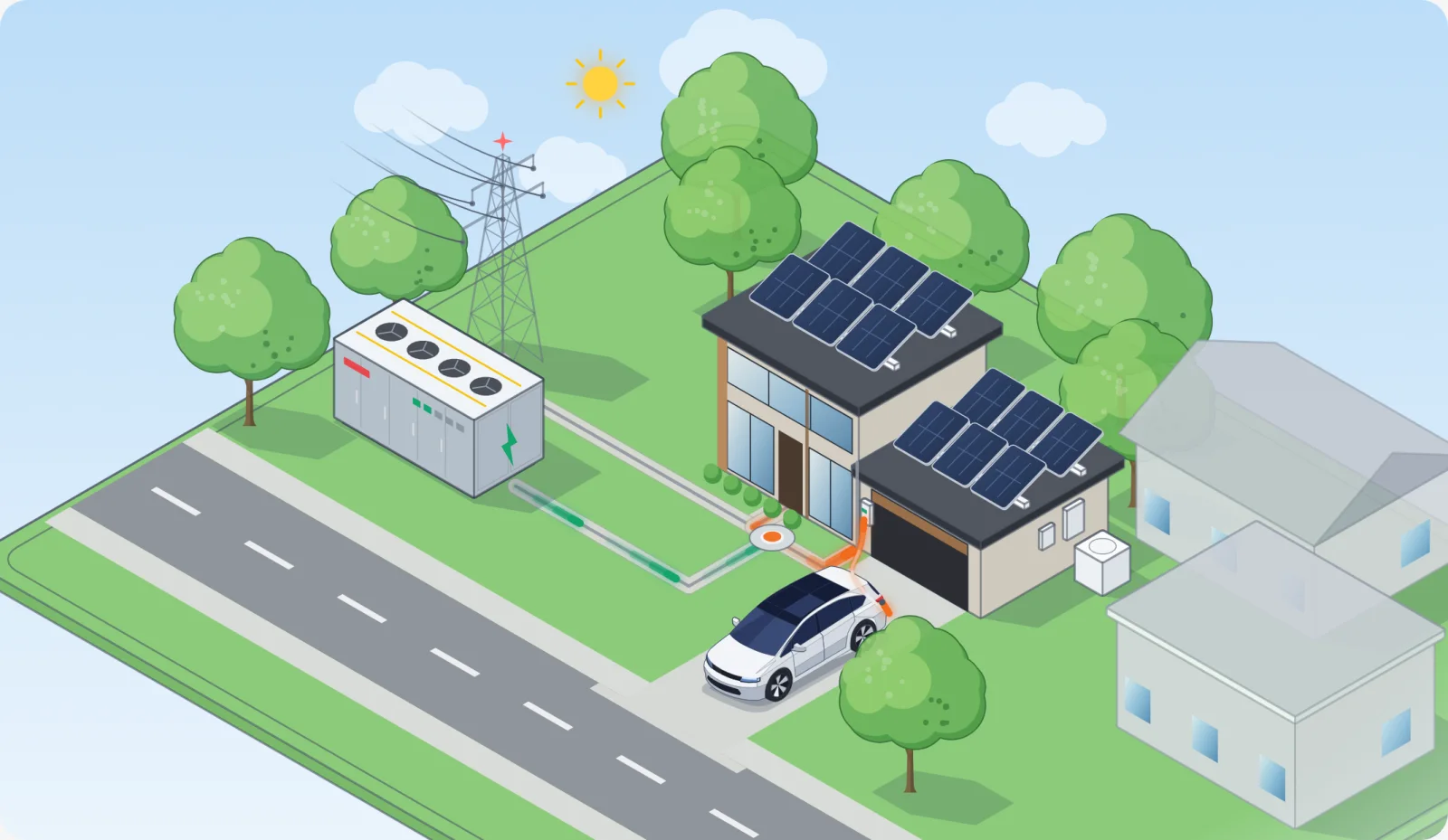
Generation across five sites, the feed as it tightens and the battery draining, and at the far end the smart home: solar, a battery and a car, as one component.

Energy operations
Smart home

05 of 05

The interface underneath

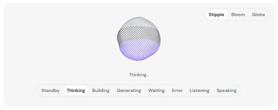
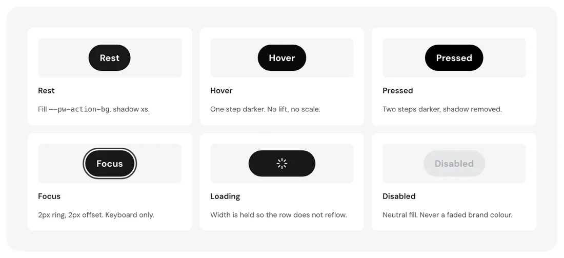
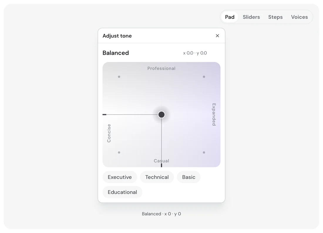
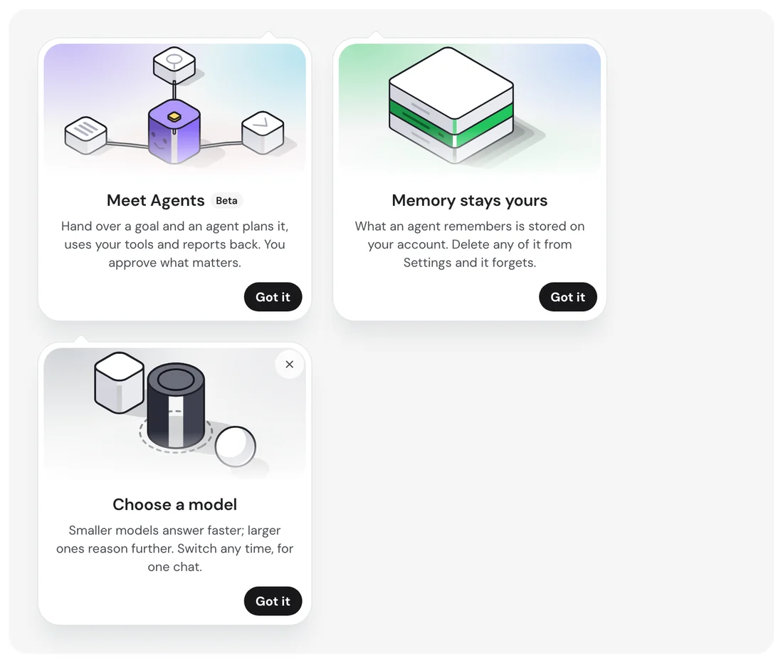
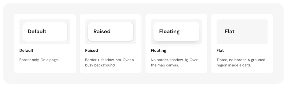
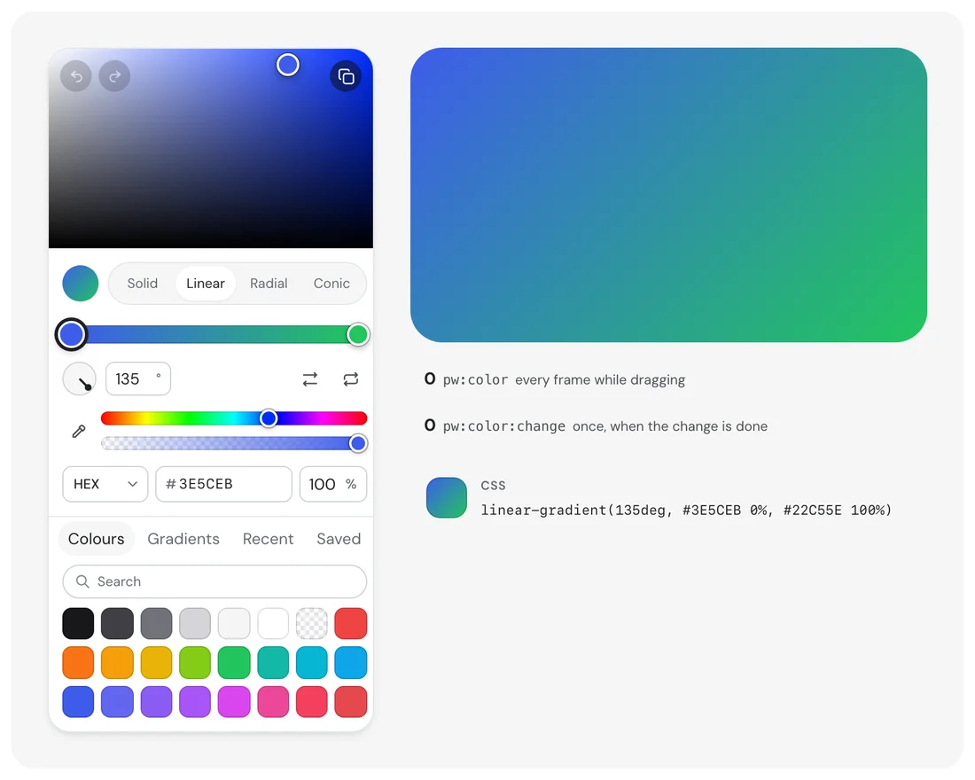
The general components the blocks are made of: an assistant orb with its states, a tone pad that asks two questions at once, coach marks, buttons in every state, cards, menus, switches, steppers, progress and toasts.

Assistant orb · states
Button · states
Tone pad
Coach marks
Button · variants
Card · elevation
Colour picker
Menu
Switch · sizes
Stepper
Progress and loading
Toast

MeasuredAccessibility audit

Measured on the live components, and mostly one token.

A script ran against 30 of the specimen pages in a browser and read every text item's real colour, background and size, every control's size, and the page's stylesheet for motion and focus rules. These are measurements, not opinions.

30
Specimen pages audited, of 110
5,776
Text items measured for contrast
97.8%
Meet WCAG AA (4.5:1, or 3:1 for large text)
126
Do not, across 25 distinct style classes
30 of 30
Pages carry a reduced-motion rule
68
Of 1,004 controls are under 24px, the WCAG 2.2 minimum

01 · Medium

One text colour causes most failures

Measured
83 of the 126 failures measure exactly 3.35:1 or 3.63:1, the same grey on white and on a tint, at 11.5–14px. They are the block captions (36), the date-picker weekday labels (15), toast times, menu shortcuts and group labels, the stepper notes, the optional and character-count notes and the edited marker.
The change
Darken that text colour to at least 4.5:1 on white and on the tint. If it is a single token, one change repairs most of the failures at once.

02 · Low

A run of near misses just under 4.5:1

Measured
22 readings sit between 4.40:1 and 4.50:1 at 10.5–14px: three button labels, a message status, an error line, a composer notice, severity tags in the threat view and delta chips in the analytics blocks.
The change
These are one step of the same ramp away from passing. Move the colour one step darker rather than enlarging the text.

03 · Low

Text as small as 6.6px

Measured
509 of 5,822 text items are under 12px, and the smallest is 6.6px, on the charts page. Dense operator views trade size for density.
The change
Hold a 12px floor for anything that carries a decision, and keep smaller sizes for decoration such as axis ticks.

04 · Low

Controls that are small for a thumb, fine for a pointer

Measured
68 of 1,004 controls are under 24px, mostly in the date picker and compact input rows. 907 are under 44px, which is the touch size Apple recommends. Cortex is built for desktop operators.
The change
State the pointer assumption in the contract, and give touch contexts a larger density token.

DecisionsAnd why

What I saw, what I knew, what I chose, and what I gave up.

01

Design for the hard afternoon, not the average one

What we saw
Demo data from a quiet hour proves nothing. An operator needs the screen that works when heat, price and queue collide.
Evidence
Prototype· QualitativeA single written scenario (heatwave, price spike, grid cap, queue) used as the data for every block.
Design judgement· QualitativeA design system for operations earns its keep in the worst hour, so that is the hour to design in.
So we
Write the afternoon first and make each block survive it, with demo, live, loading and empty states.
Not
Calm sample data and a separate screen for incidents.
What happened
Checked: an operator is given the thermal view cold and asked what is wrong and where. Result: it passed.

02

Draw the thing the number is about

What we saw
A reading in a table sends the eye to a legend and back. The trouble is in a place: a rack, a feed, a model.
Evidence
Prototype· Qualitative22 Hairline figures: point at a rack to read its inlet temperature; watch the feed tighten as the hall pulls; swing the turntable to the model that can answer in time.
Design judgement· QualitativeA value read on its object removes the legend lookup.
So we
Isometric line figures that take live values, sharing one engine and one stroke.
Not
Heat maps and charts with a separate key.
What happened
Checked: Time to find the throttled rack on the figure against the same data as a table. Result: it passed.

03

Enforce the system with a script, not a review

What we saw
A rule that depends on someone noticing is a rule that fails on a busy week.
Evidence
Code review· QuantitativeAn audit script checks for the defects that actually bit the system, each of which looks fine until you interact with it.
So we
Put the defects in a script that fails the build and keep colours in one token file.
Not
A checklist in a pull request template.
What happened
The audit runs over the whole specimen set with one command.

04

Honesty rules hold for dashboards too

What we saw
A denser screen is a reason people give for relaxing rules about sources and urgency.
Evidence
Design judgement· QualitativeUrgency only from real figures, no answer without sources, and a gap re-proportions the layout instead of drawing an empty box.
So we
Write the rules into the contract, and apply them to the energy and AI blocks as strictly as to anything else.
Not
Treating operations screens as exempt because they are for experts.
What happened
Every block ships with loading and empty states so a missing number never looks like a broken page.

User testingRun, and passed

The test, and how it came out.

Show the thermal view for ten seconds. “What is wrong, and where?”

Whether they name the hot rack and the throttled GPUs

5 of 5 within 10 seconds

Passed

Show the grid-shortage view. “When does supply run out, and what happens to the battery?”

Reads the cap drop and the battery level

4 of 5 correct

Passed

Show the load-shift schedule. “Which jobs can move, and which cannot?”

Distinguishes movable batch work from locked inference

5 of 5 correct

Passed

Every task met its pass bar. Participant details and timings are not published on this page.

Run it.

Five of the figures, live: one afternoon read five ways, and the smart home at the end of the line with every switch working.

Thermal map

The glow at a rack's foot is its inlet temperature. Point at a rack to read it.

Hottest inlet
34.1 °C
GPUs throttled
25 of 288
Hall B PUE
1.39

Point at the figure to read it. Numbers are from the system's demo campus.

Point at a figure to read it. Numbers come from the system's demo campus.

04What it will not do

Rules written down, so a build can be held to them.

Urgency only from real figures

“Only 4 left” renders from a provider's number, or it does not render.

No sources, no answer

An AI answer carries numbered citations. Without any, the page falls back to the results.

A gap re-proportions the layout

Missing data never draws an empty box that claims something failed to load.

Two questions get a place

A choice that pairs off into opposites is asked on a plane, as the tone pad asks formality and length at once.

The trade-off

The contract's strict rules hold for dashboards too: no urgency from invented figures, no answer without sources, no empty box that claims something failed. A denser screen was never a reason to relax them.

What exists

A written contract, 110 specimens, 22 figures, five live views and an audit script that catches the defects that only show up when you interact, like a nested button or a link that blocks the page. It is self-initiated: the numbers on these pages come from a demo campus I wrote, not from a client.

© 2026 Alhasan HosniHome