












← Design systems/2023-2026 · Product Designer

PrivacyWall

Search, AI answers, maps, travel and flights, and a new-tab extension: one promise not to manipulate, carried by one design system across all of them.

6
Applications on one promise
14
Privacy tools studied before designing any
20
Privacy-conscious users interviewed
100
Specimens in the system underneath
Start with the PrivateView story

01The problem

Privacy tools charged a usability tax, and mainstream users left at first contact.

Across 14 privacy navigation tools the interfaces were functional but hostile, signalling “this is hard” at every touchpoint. The category was built engineering-first, so the security model became the user's problem.

02How I thought about it

Make the protection invisible and the trust visible, on every surface.

Interviews with 20 privacy-conscious users showed they did not want to think about privacy at all. The friction was not the price of protection; it came from interfaces that expressed the architecture instead of the task. So every surface matches the mainstream model, protects by default, and says what is happening in plain words.

03How we knew

Seven kinds of evidence, each labelled with what it can and cannot say.

Interviews and benchmarks explain why. Surveys and analytics measure how much. Code review shows what was actually on the screen. And one box says plainly what is not published here: the findings of the user testing.

Interviews

Qualitative

20

Privacy-conscious users. The finding that shaped every later decision: they did not want to think about privacy, they wanted it to disappear into the experience.

Benchmark

Qualitative

14

Privacy navigation tools reviewed for one question: where exactly does a mainstream user give up? The same pattern in all of them: functional but hostile.

Benchmark

Qualitative

7

Search engines compared across eight dimensions: Google, Bing, DuckDuckGo, Brave, Kagi, Startpage and Perplexity. Desk research, written as evidence, interpretation, recommendation.

Confidence: Medium

Code review

Quantitative

1

The working prototype, inspected line by line: where filters sat, what the privacy action was, what the mobile layout hid.

Confidence: High

Survey

Quantitative

+34%

User trust scores in post-launch surveys of the ecosystem: maps, mobile, extension and settings.

Analytics

Quantitative

2.4×

Mobile session duration against the previous version, with 30% less cross-platform development time.

Usability test

Mixed

The PrivacyWall work was tested with users. The findings are not published on this page, so no participant behaviour, task success rate or preference metric is claimed here. The search report itself is benchmark desk research.

01 of 05 · Results page

Search

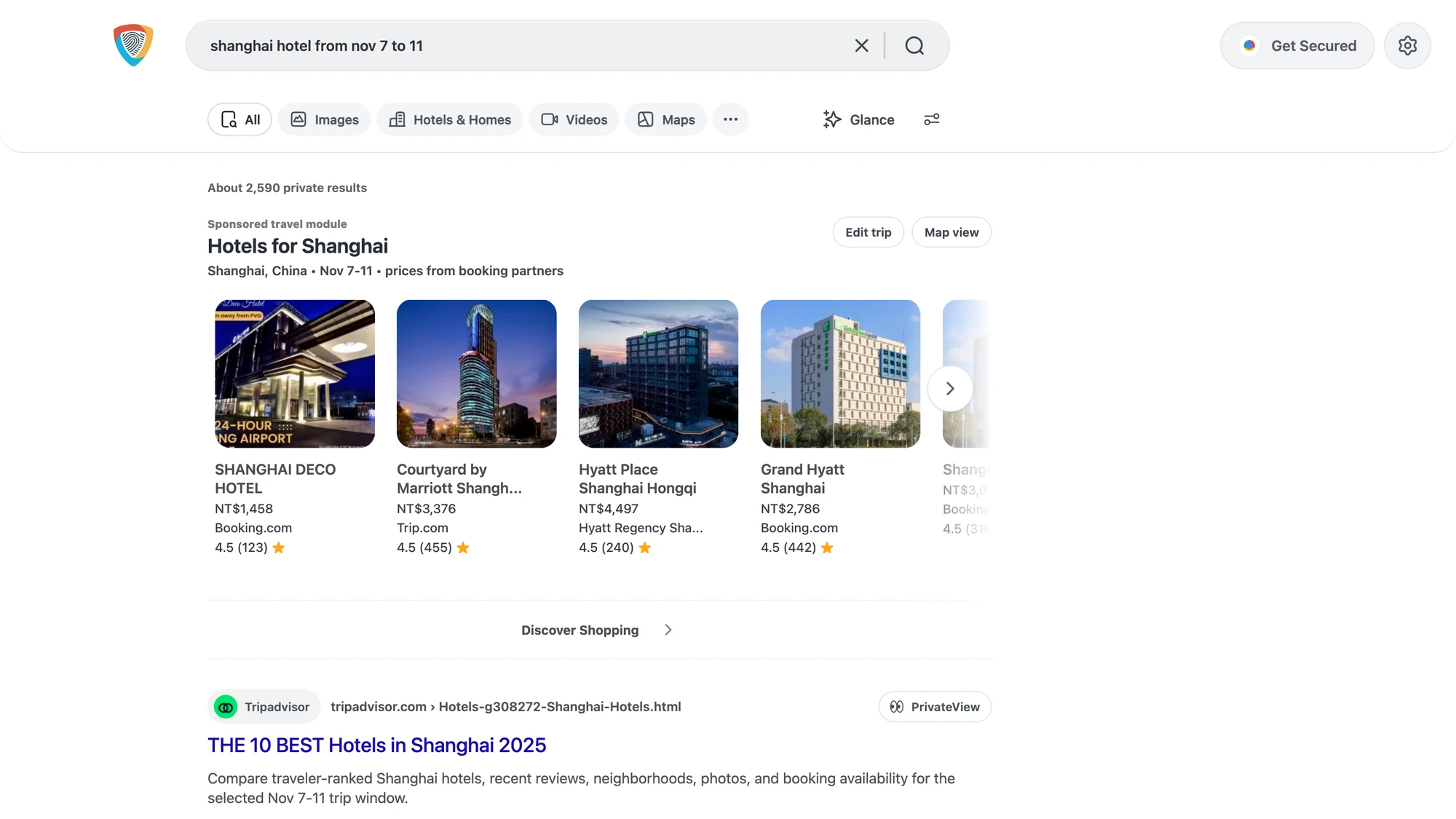
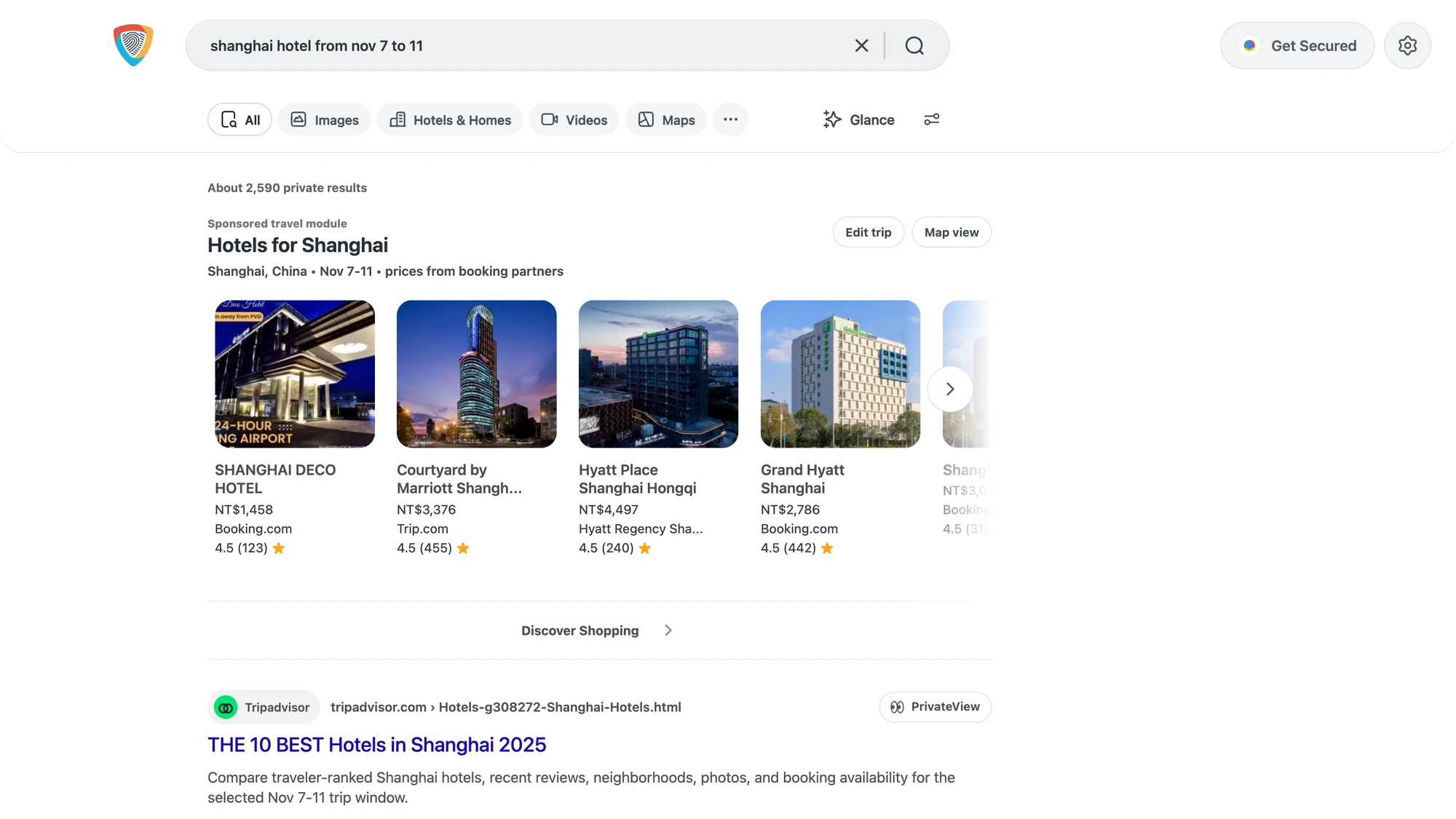
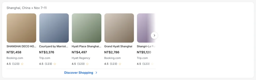
A travel query opened with a hotel carousel before a single organic link.

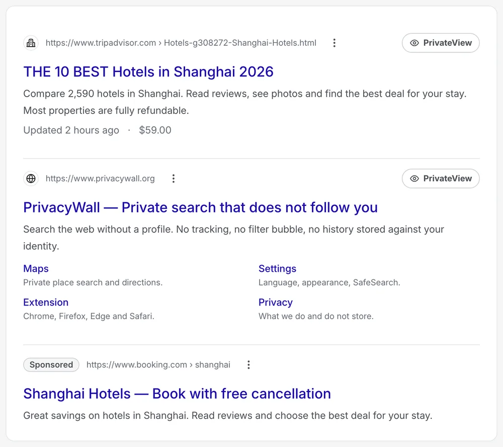
Commercial modules had been added one at a time, each in front of the last, and the privacy feature that made the product worth choosing was an unlabelled icon. I benchmarked the page against seven engines and rebuilt it in scan order.

Results
Landing
Access check
Search advanced · 3
Search filters · 3
Search filters · 4
Search header
Search media
Search media · 2
Search media · 3
Search media · 4
Search modules
Search modules · 2
Search modules · 3
Search modules · 4
Search result
Search result · 2
Search result · 4
Search suggest · 4

Scan order

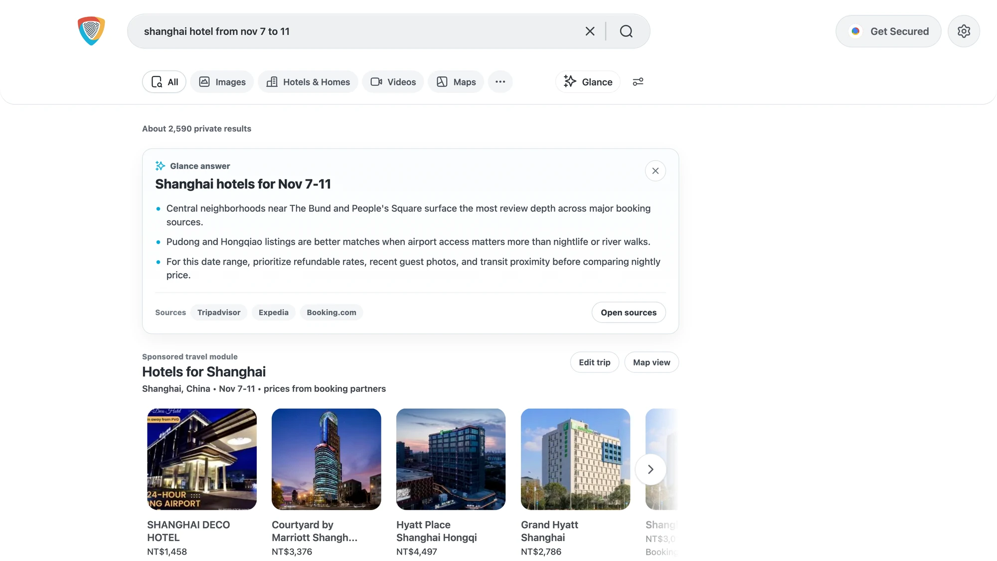
Query, category tabs and a results toolbar sit above the results. The hotels module states its trip window and its source, and sits below the page's own context.

A named privacy action

PrivateView is a labelled control on every result. A shield asks people to guess; a name is a feature they can ask for.

The gate explained

The access check says what it is doing and that it does not store search terms, and only escalates to a puzzle when it must.

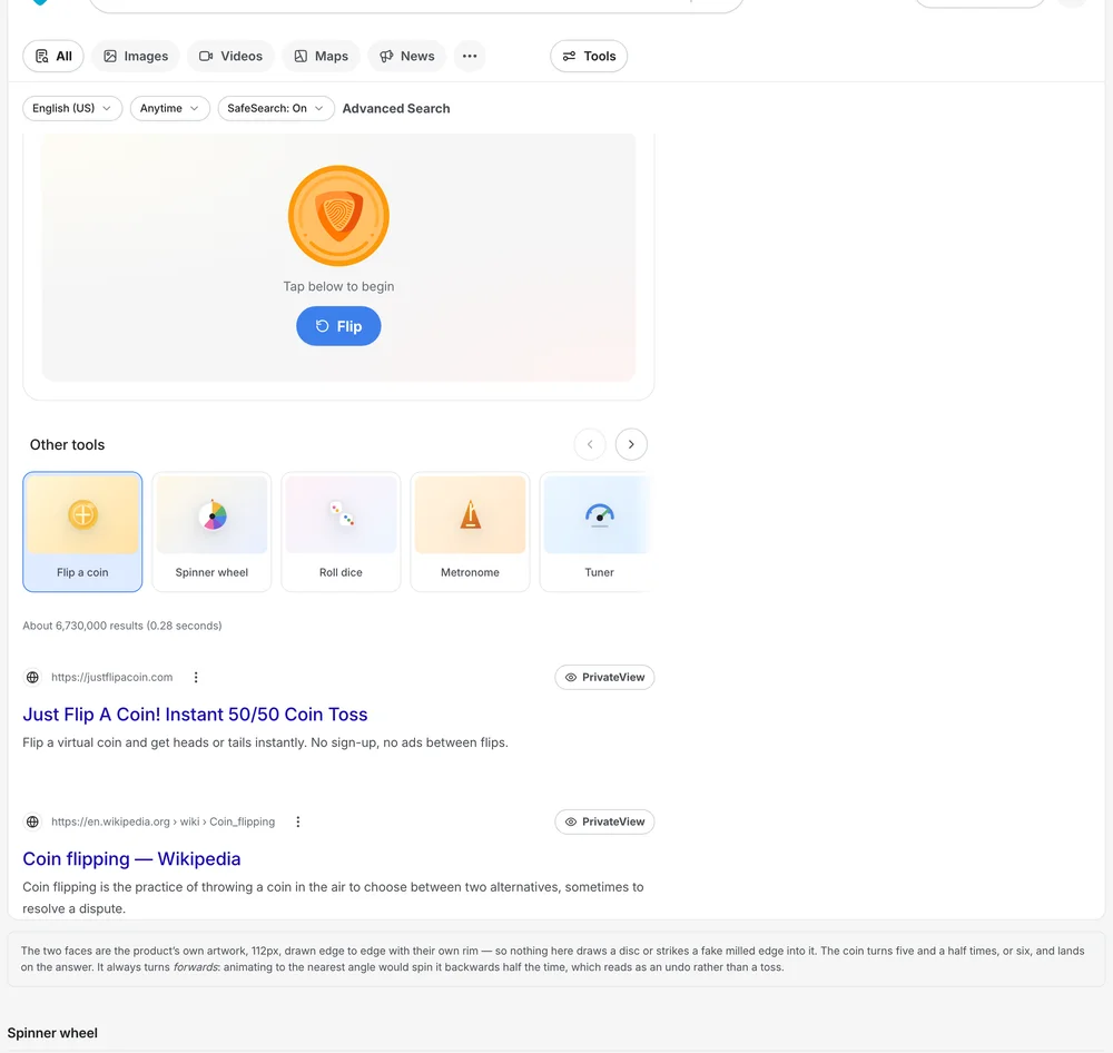
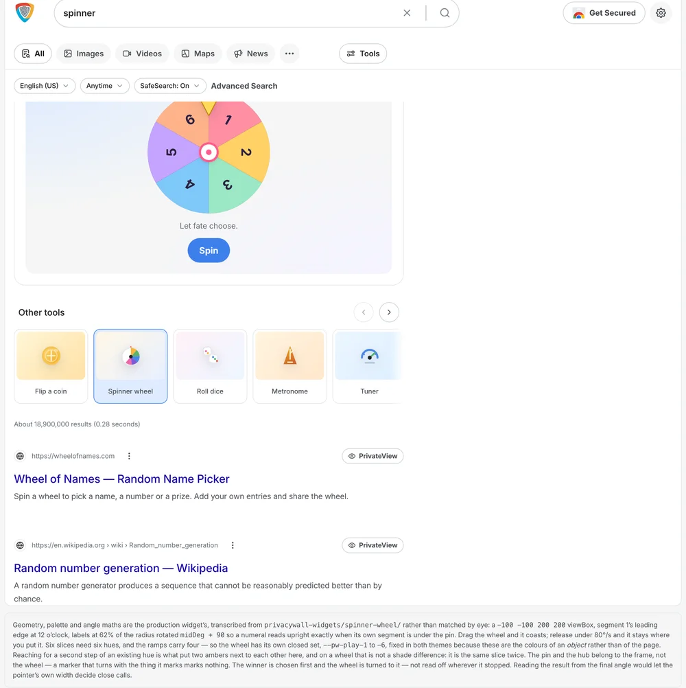
On AI · Commercial and generated content sit below the page's own context, never in front of it.

02 of 05 · Glance and the assistant

AI answers

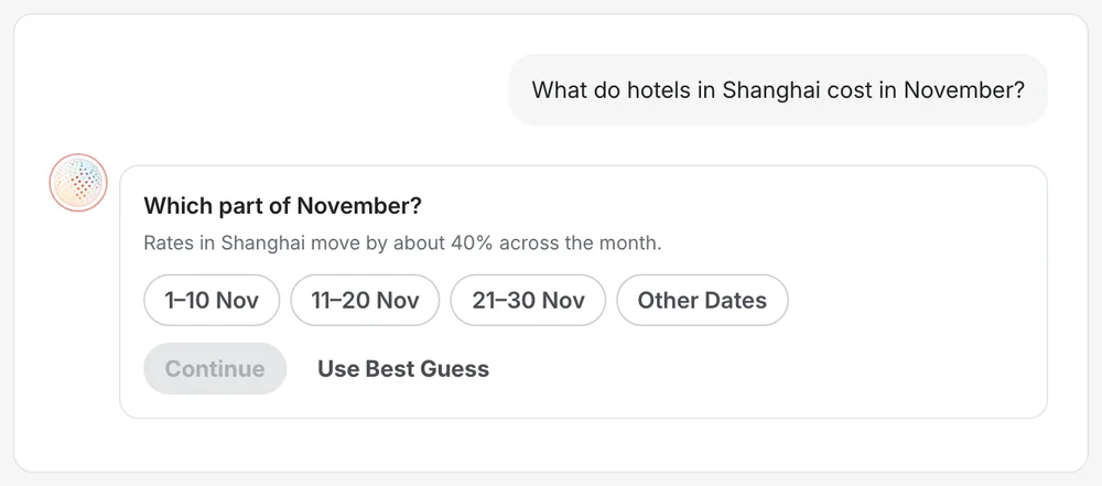
How should a generated answer behave on a page whose promise is that it does not watch you?

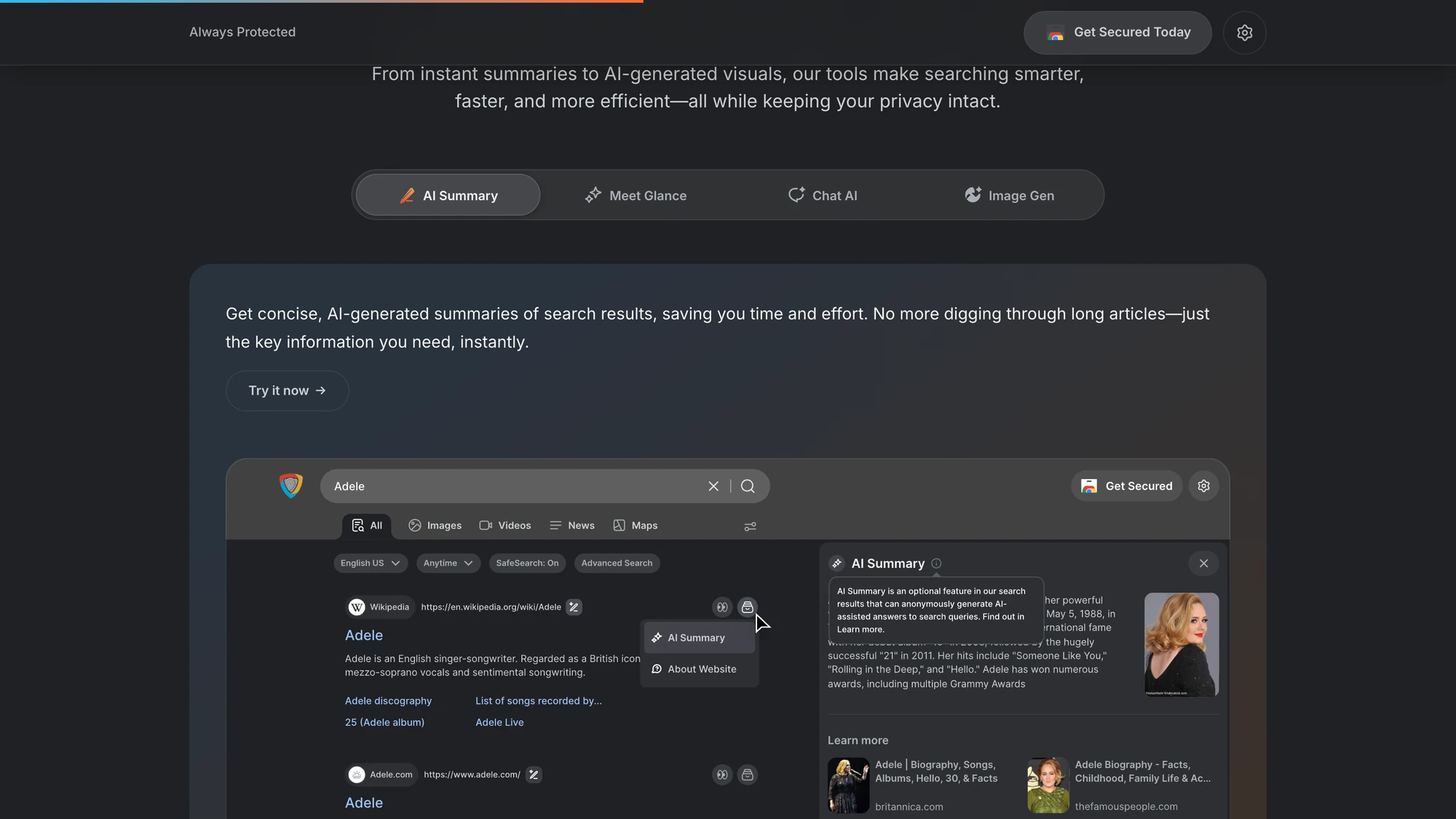
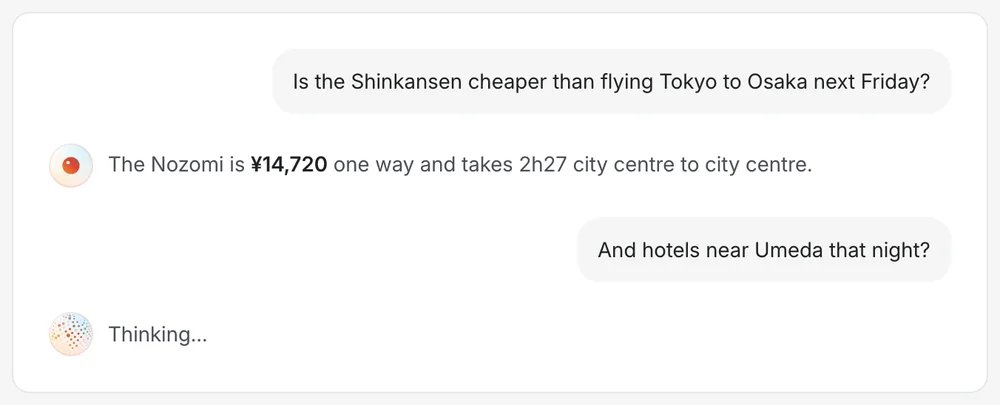
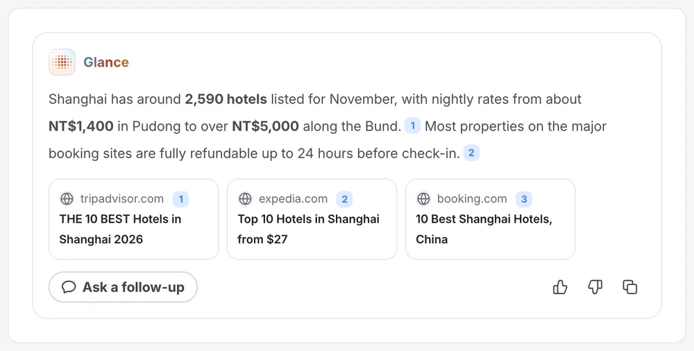
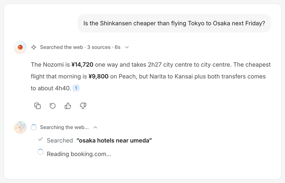
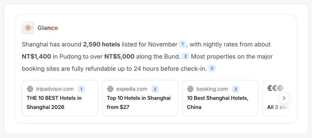
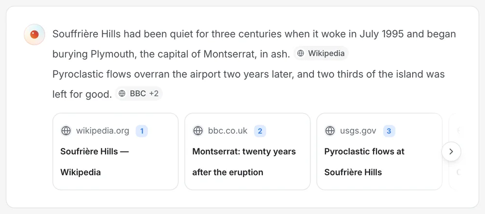
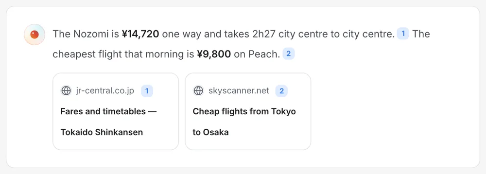
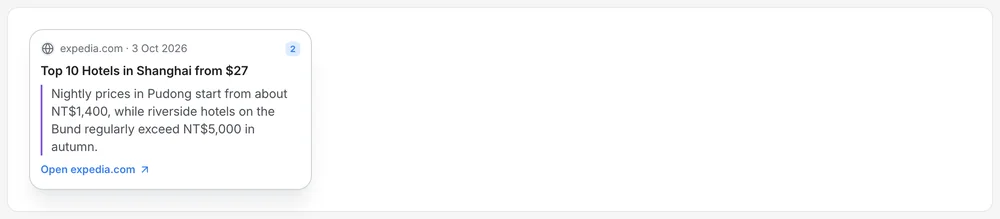
Glance returns three to five sourced points, with its sources named as chips. It is an object on the page with a beginning and an end, not a mode the page enters, and it can be dismissed in one click.

Glance on the results page
The assistant
Ai versions
Ai versions · 3
Ai orb
Ai orb · 2
Ai orb · 3
Ai orb · 4
Ai chat
Ai chat · 2
Ai chat · 3
Ai chat · 4
Ai imagegen · 2
Ai composer
Ai composer · 2
Ai composer · 3
Ai composer · 4
Ai citations
Ai citations · 2
Ai citations · 3
Ai citations · 4
Ai ask
Ai ask · 2
Ai ask · 3

Bounded, not ambient

A card you can open and close. It arrives word by word, which is the honest signal for something being worked out, and reduced motion removes the reveal.

No sources, no answer

Citations are numbered and visible. Without any, the page falls back to the results rather than generate something plausible.

One quiet surface

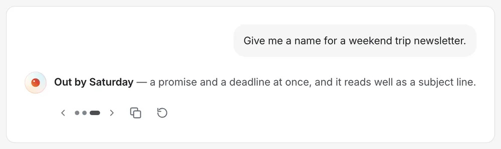
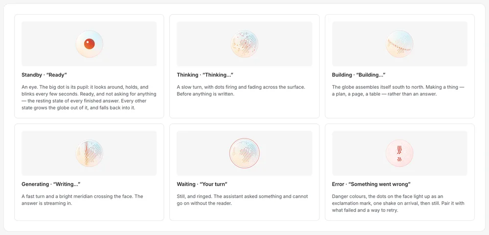
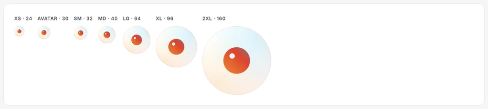
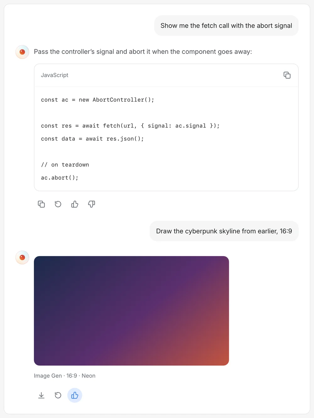
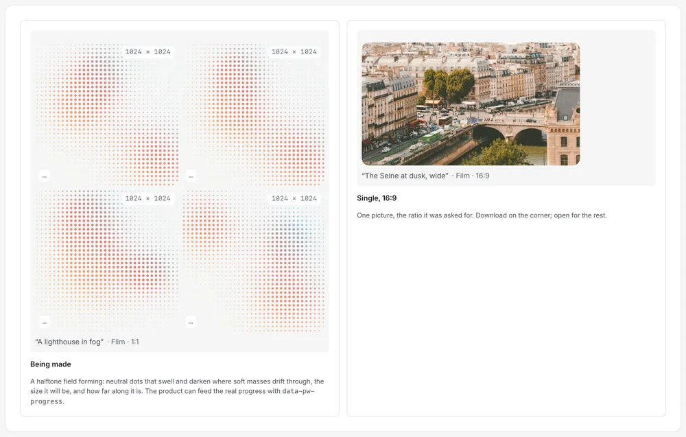
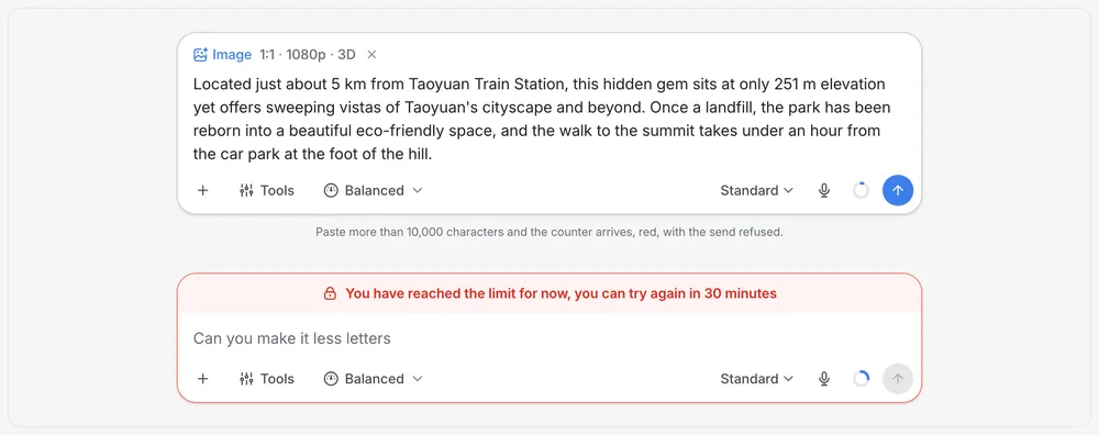
The orb, the composer, attachments, tone and the start screen share one restrained look, so the assistant feels like part of the page and not an overlay on it.

On AI · Glance names its sources as chips you can open. An answer with invisible sources is a rumour.

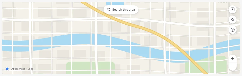
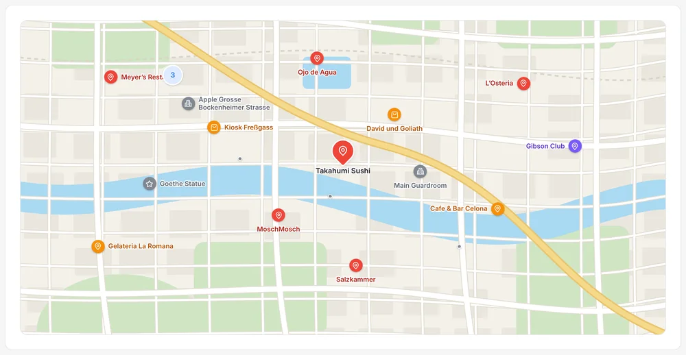
03 of 05 · Web maps

Maps

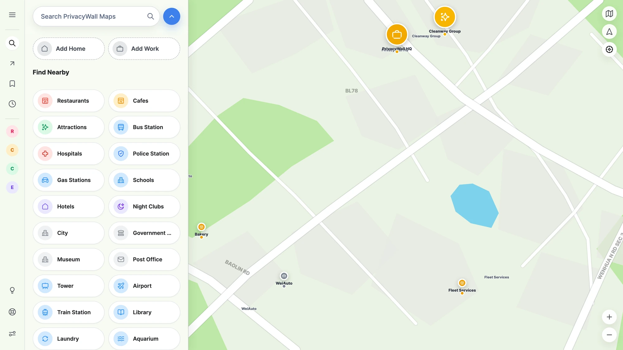
People abandon privacy maps the moment navigation feels slower or stranger.

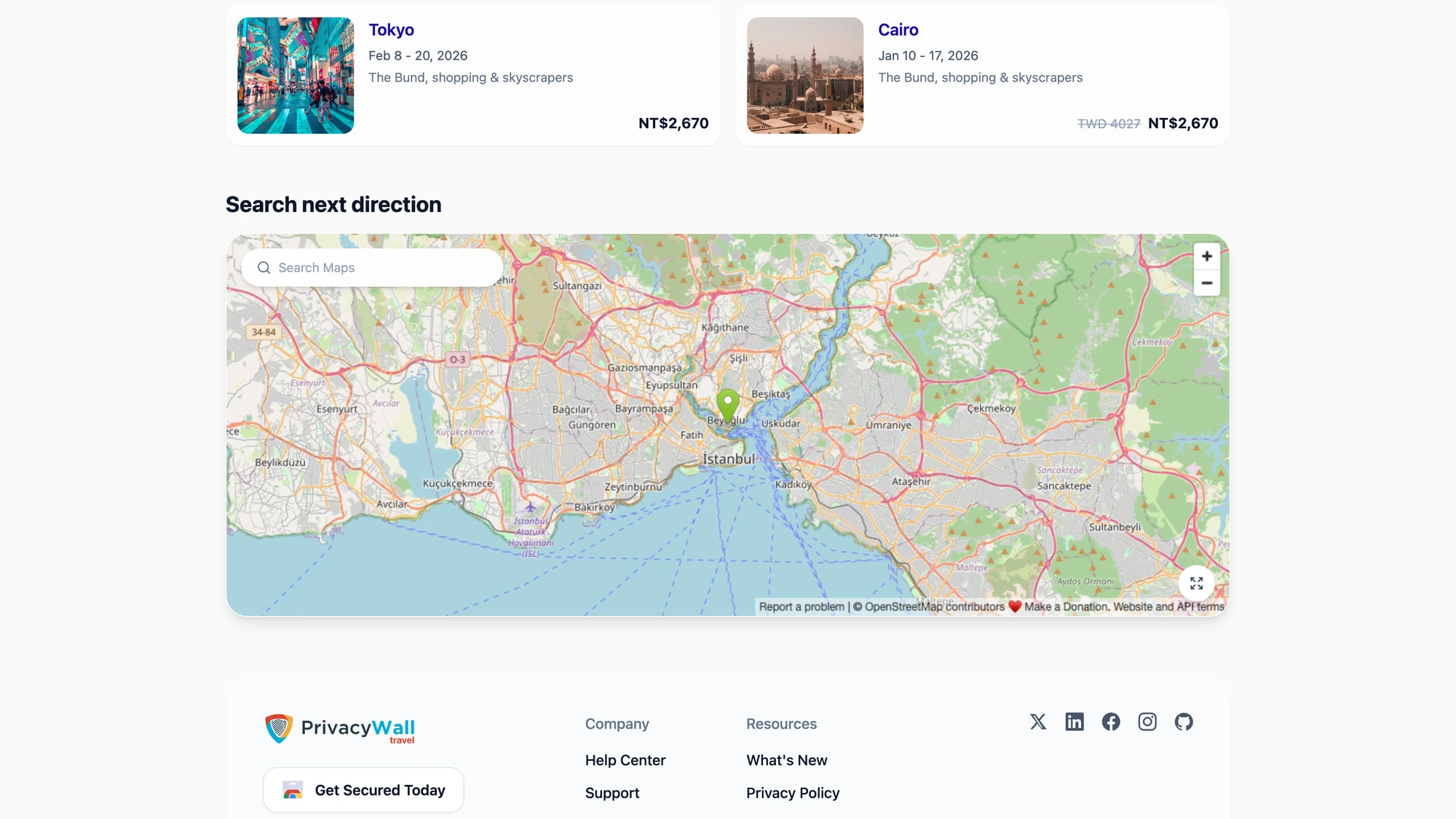
The brief was deliberately conservative: match the interaction model people already have in muscle memory, and spend the originality budget on the data model underneath.

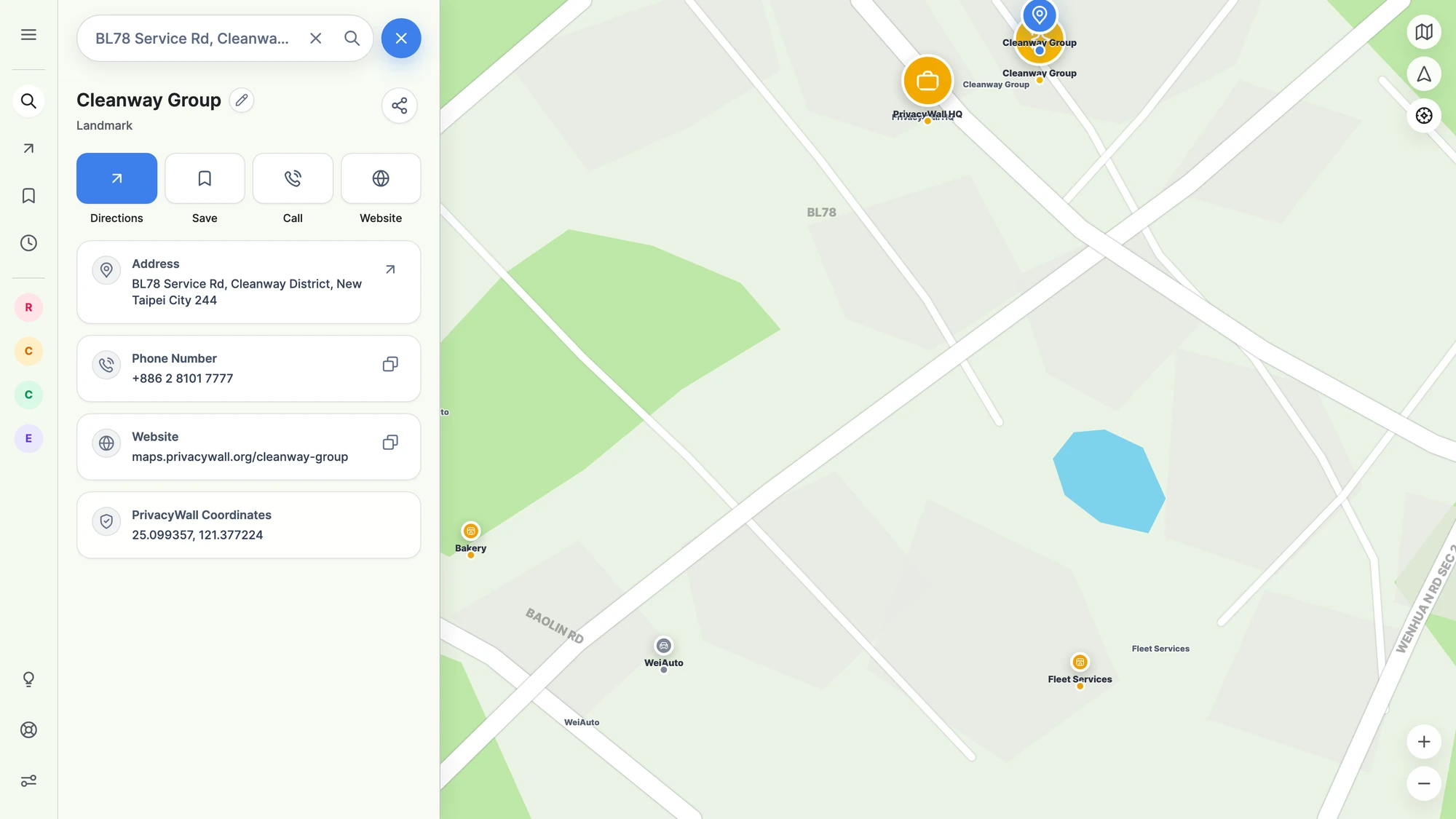
Explore
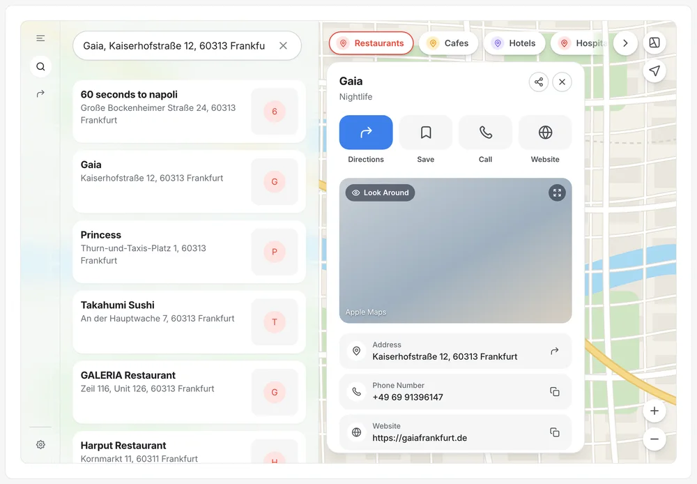
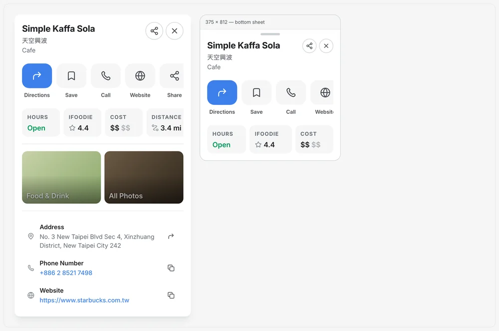
Place details
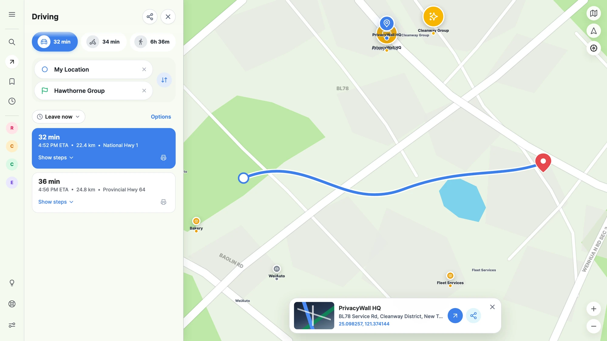
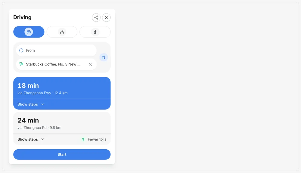
Directions
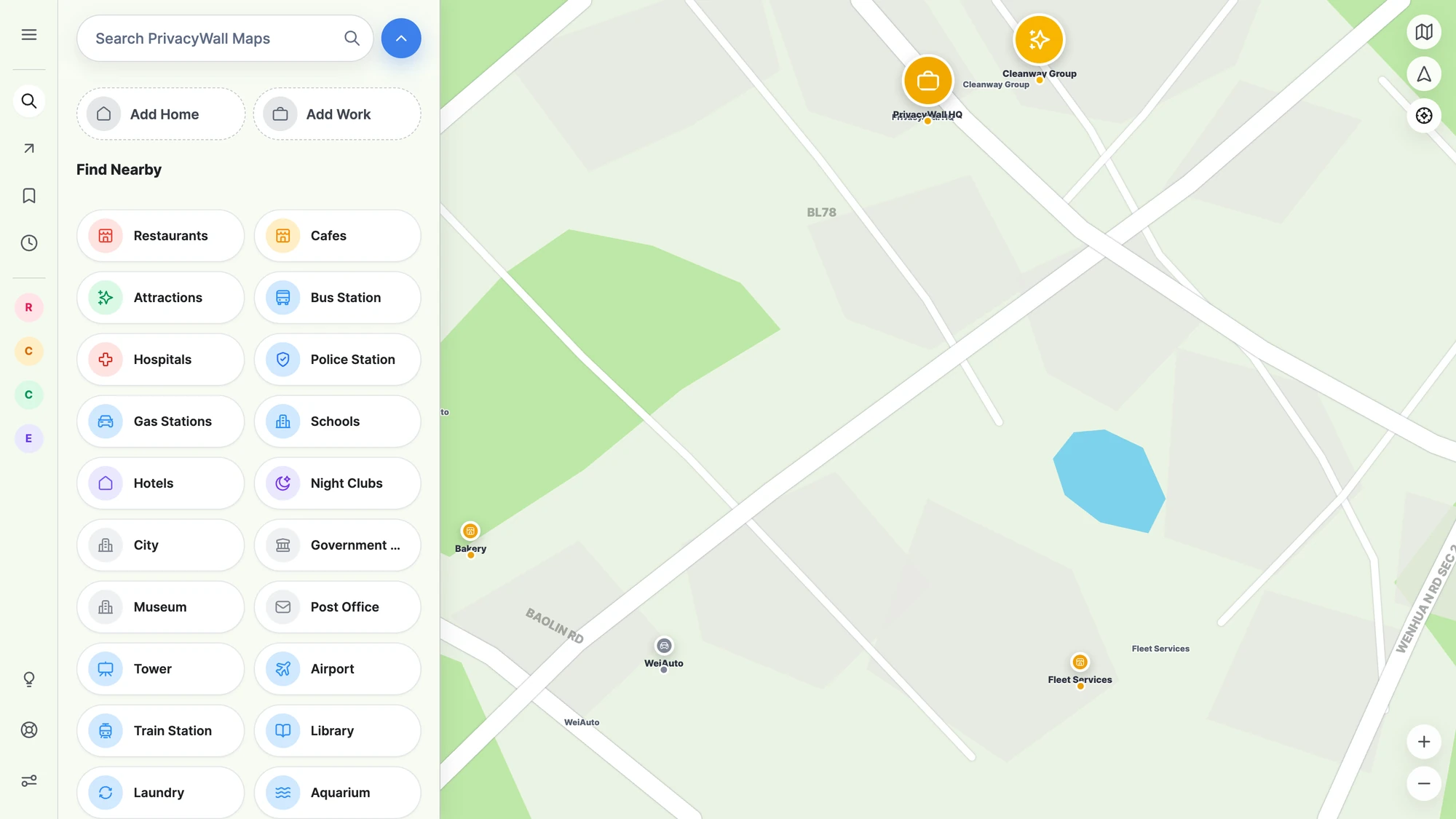
Find nearby
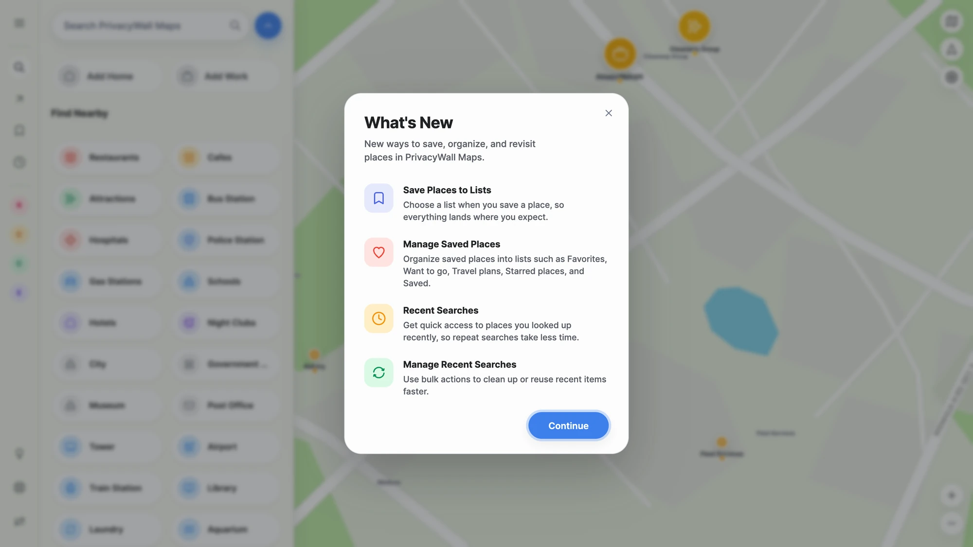
What's new
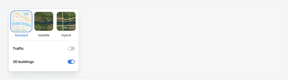
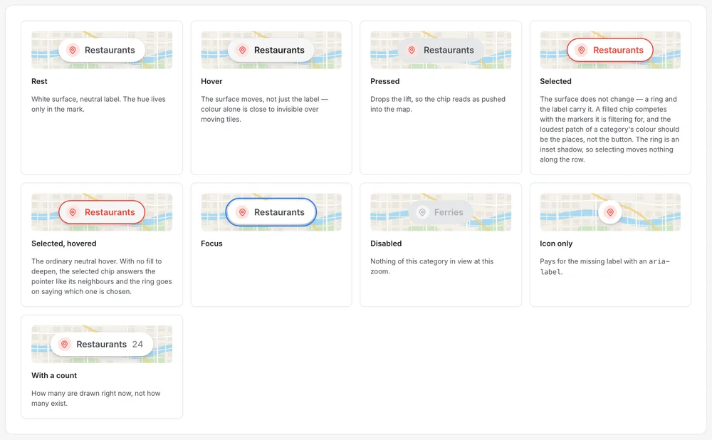
Maps controls
Maps controls · 2
Maps controls · 3
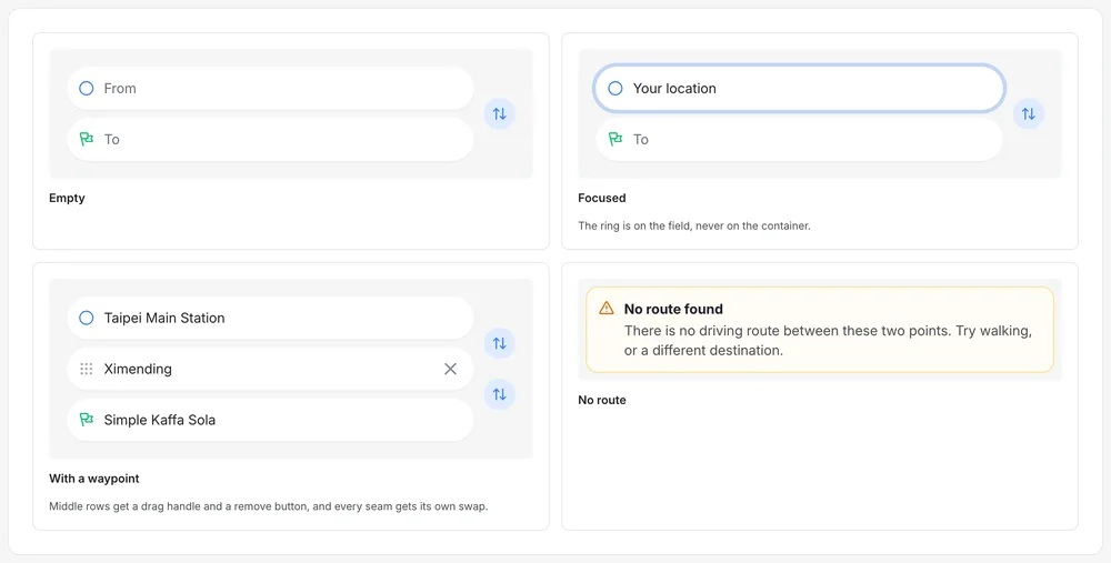
Maps directions
Maps directions · 2
Maps directions · 3
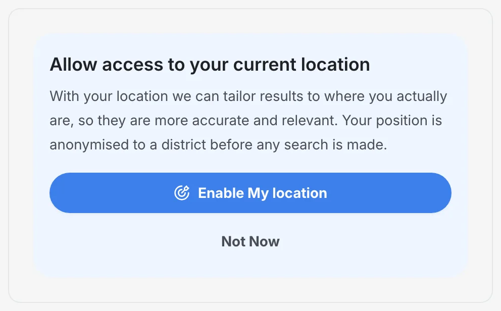
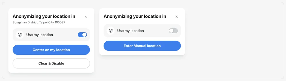
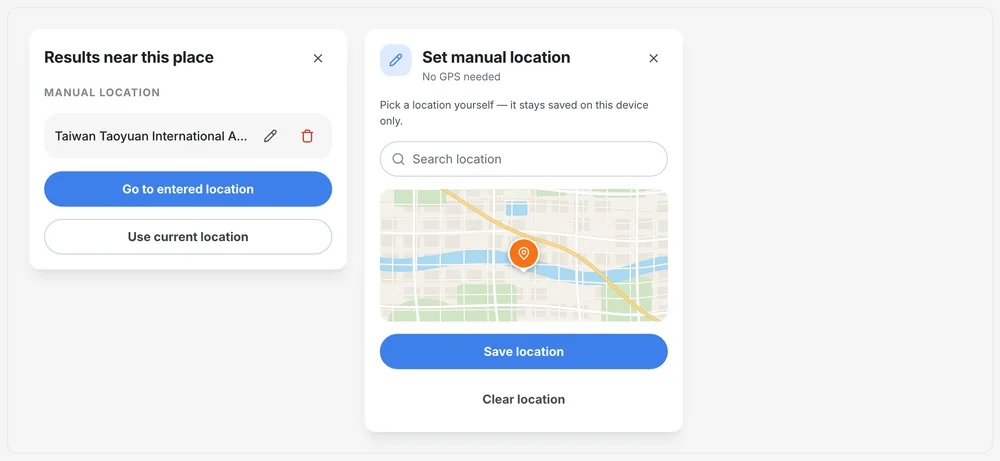
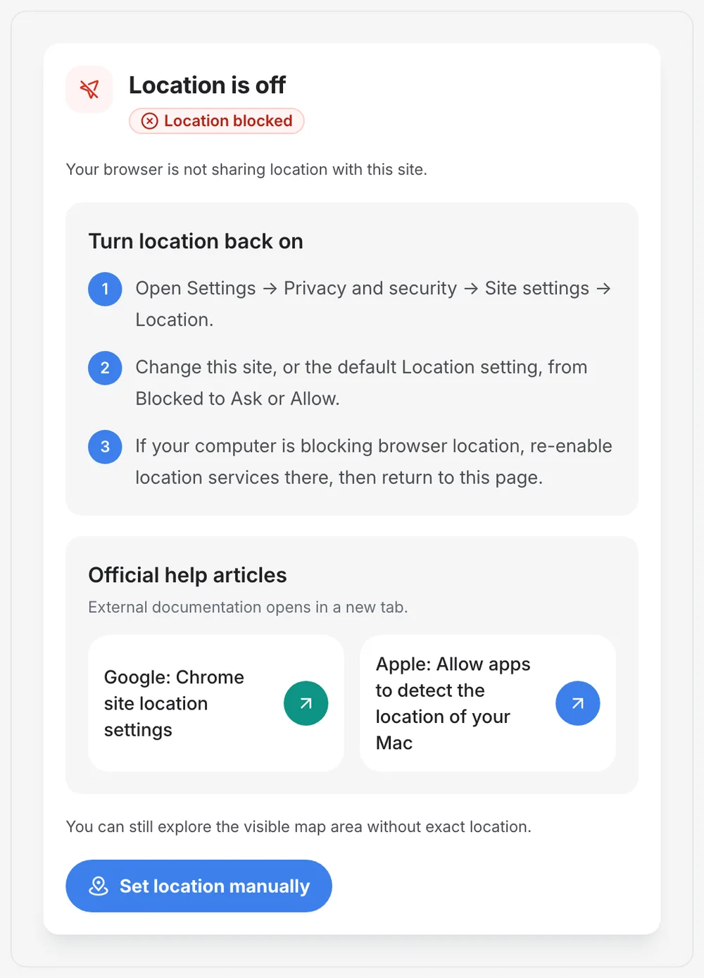
Maps location
Maps location · 2
Maps location · 3
Maps location · 4
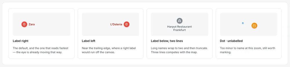
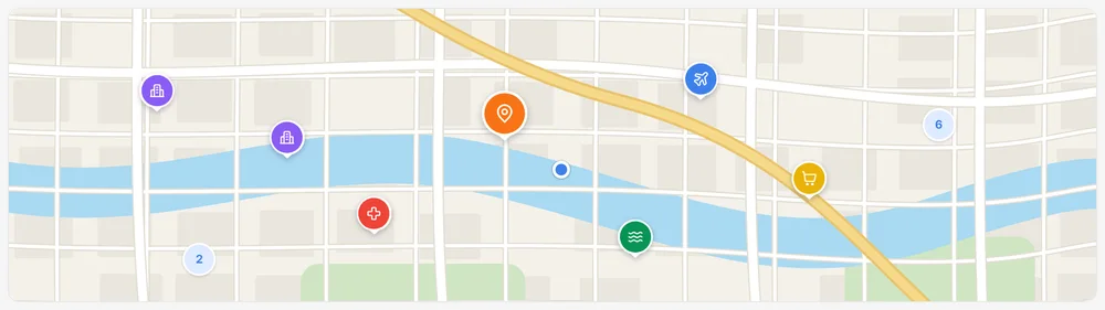
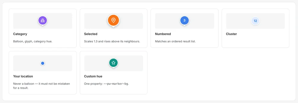
Maps markers
Maps markers · 2
Maps markers · 3
Maps markers · 4
Maps place
Maps place · 2
Maps place · 3
Maps place · 4

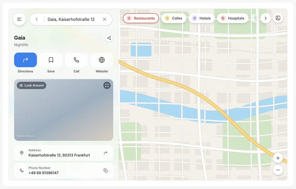
One panel, every state

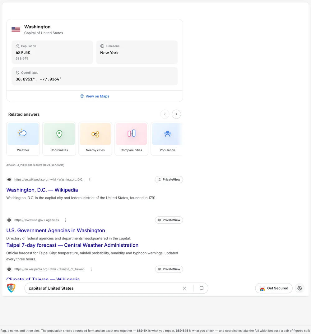
Finder becomes place details becomes directions while the map stays live beside it. Losing the map is losing the user's sense of where they are.

PrivacyWall Coordinates

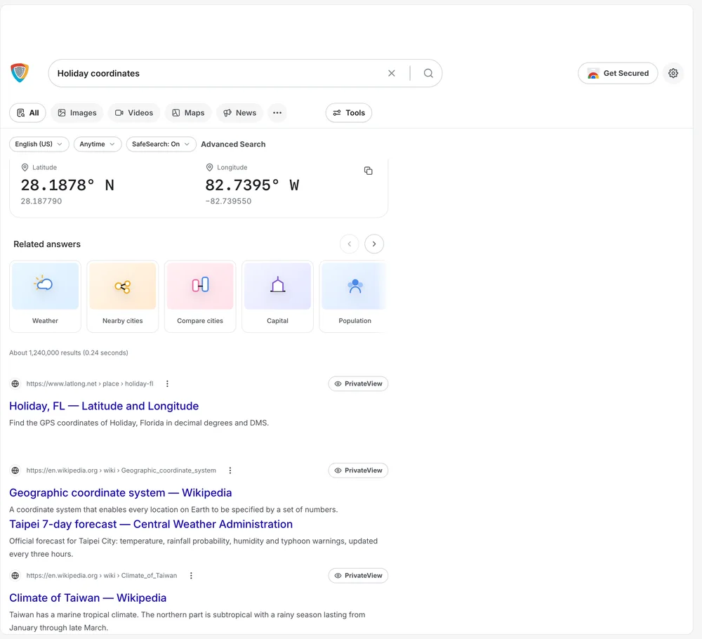
A shareable location in the familiar action row that does not hand over an account-linked pin. This is where the originality was spent.

New things taught in place

A four-line what's-new sheet and a one-time tooltip for place labels, instead of a tutorial.

On AI · There is no model in this product. A map that quietly sends your destinations somewhere is what it is designed against.

04 of 05 · Flights, hotels, shopping

Travel and flights

Without a profile, a private search engine cannot offer competitive travel results.

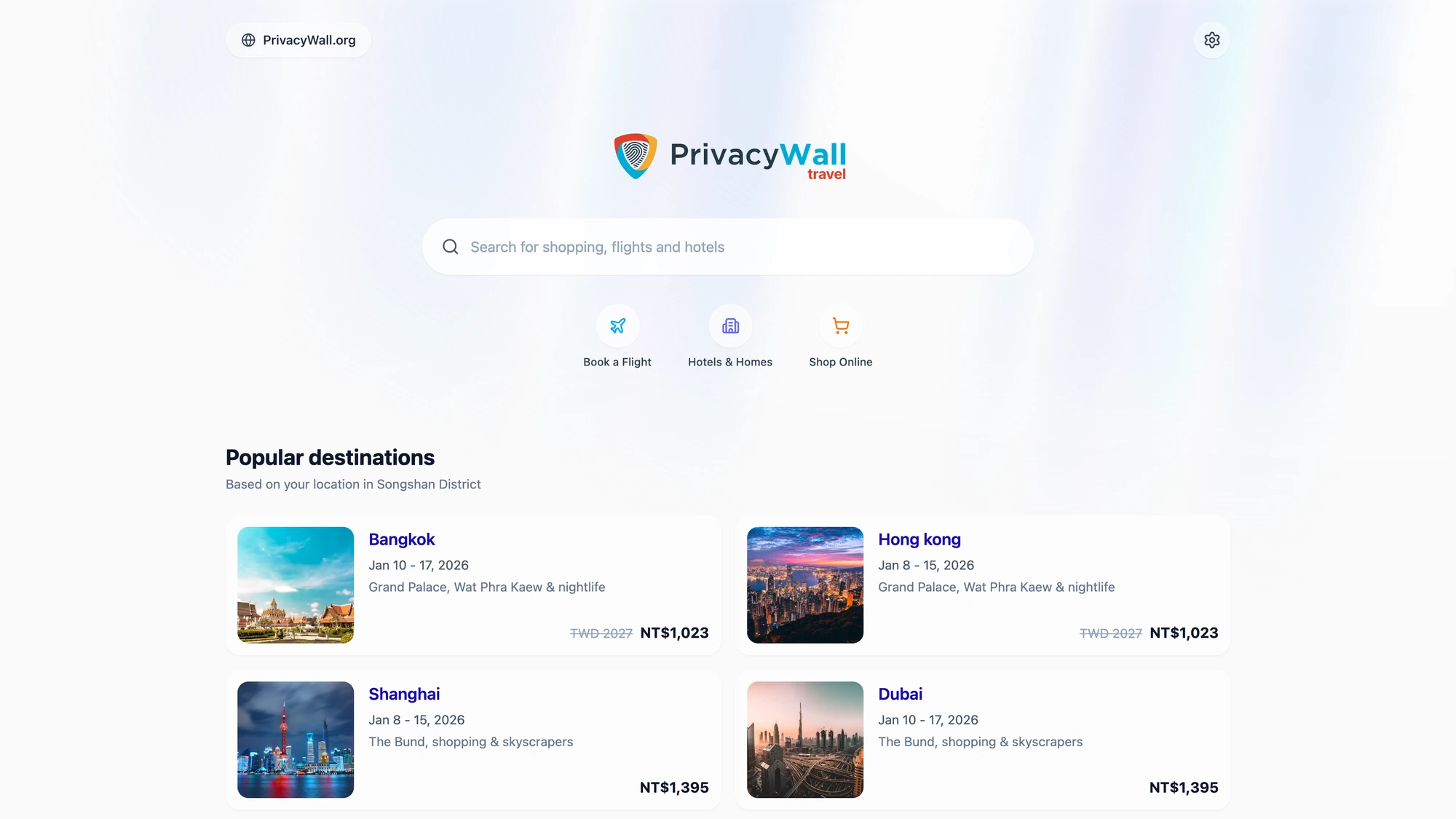
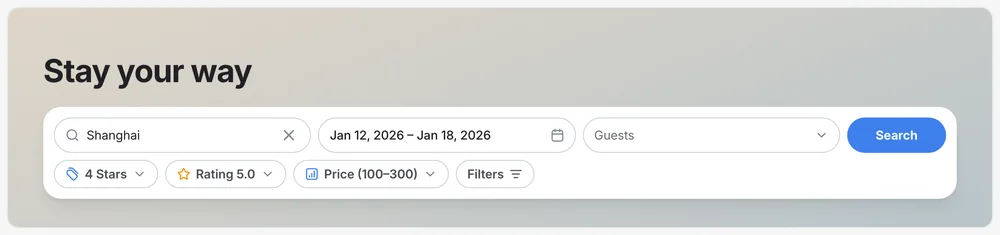
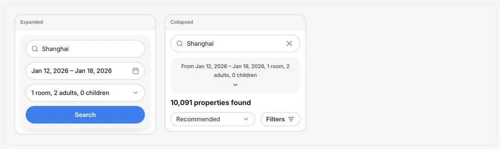
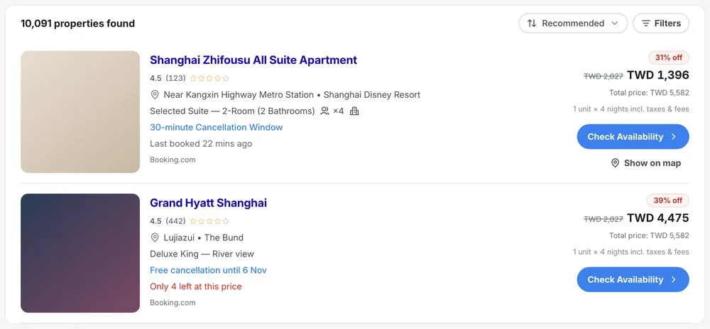
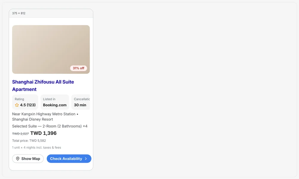
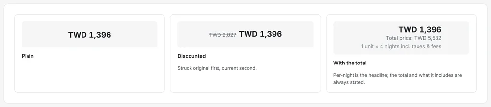
Most of what tracking infers, people will declare if asked once. So intent is chosen from three named verticals, the one inference left (an approximate district) is labelled on the page, and every card leads with dates and total price.

Travel home
Trips
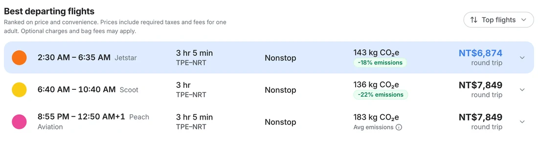
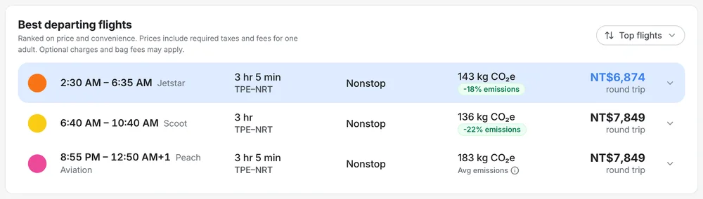
Flights · price, stops, emissions
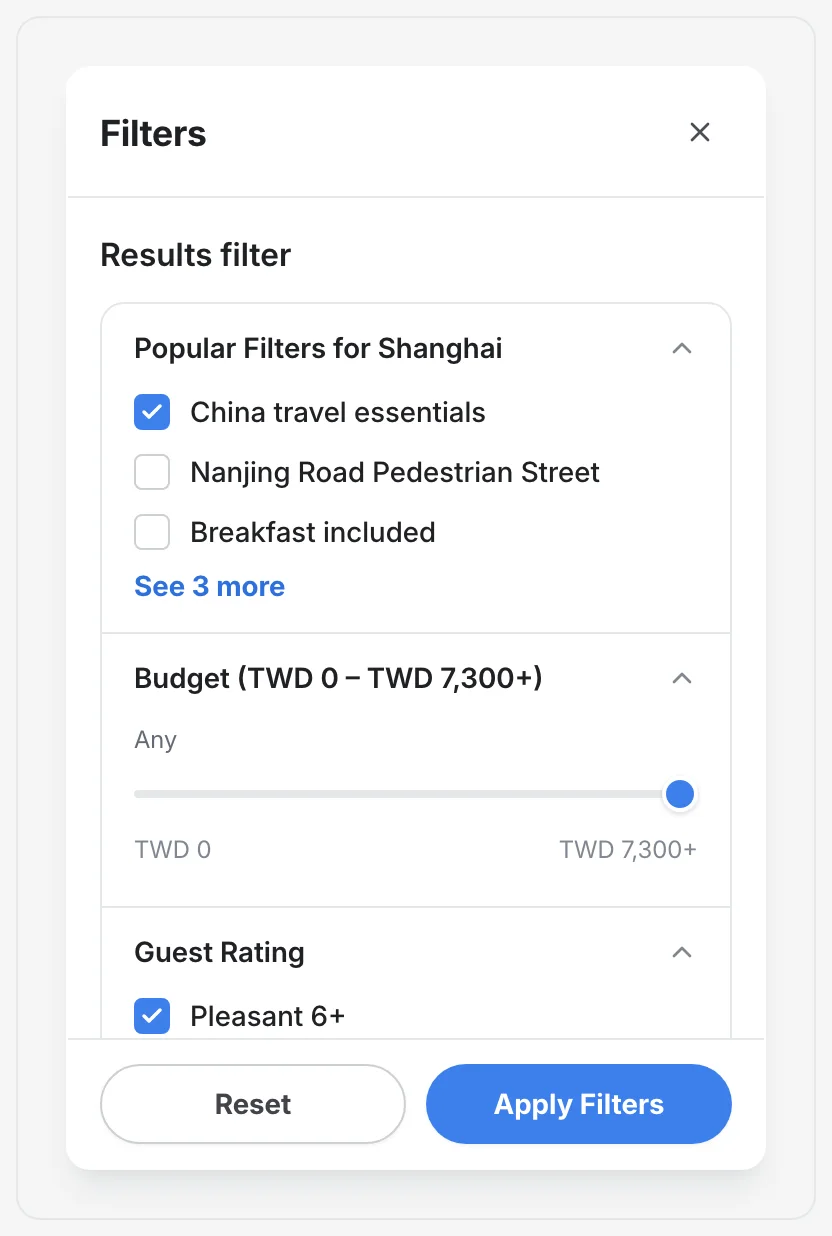
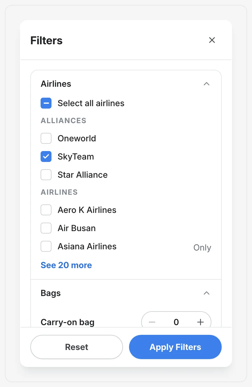
Travel filters
Travel filters · 2
Travel search
Travel search · 3
Hotel card
Hotel card · 2
Hotel card · 3
Flight row
Flight row · 3
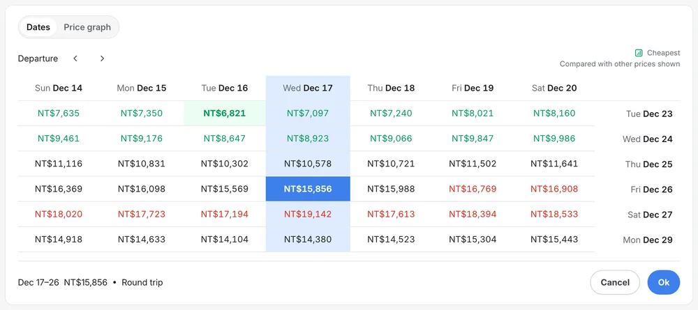
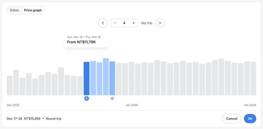
Price explorer
Price explorer · 2
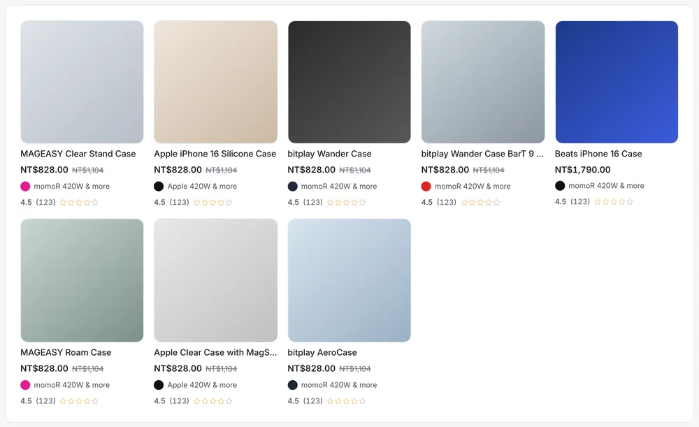
Shopping
Shopping · 2

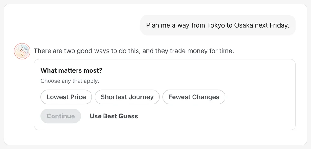
Declared intent

One search field above three choices: a flight, hotels and homes, shop online. A second to choose, and nobody has to have been watched.

Prices that add up

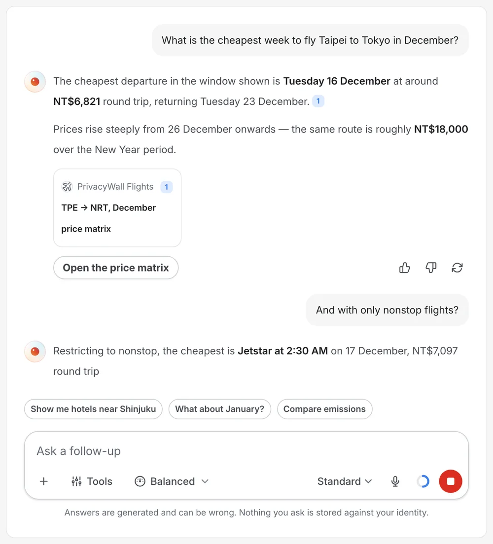
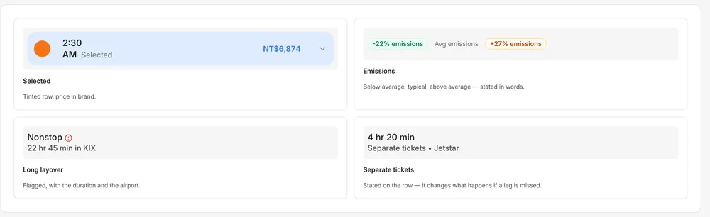
Totals state what they include. Flights show duration, stops and emissions as a plain number with a tag. Dates and prices compare on a matrix and a graph.

Every inference explains itself

Popular destinations say which approximate district they are based on. A recommendation that explains itself does not need surveillance.

On AI · No inference appears that the page cannot explain in a sentence.

05 of 05 · New tab, browser extension

Dock

The most-visited page in a browser was spent on a feed that watched you.

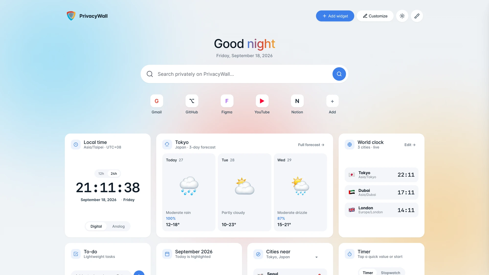
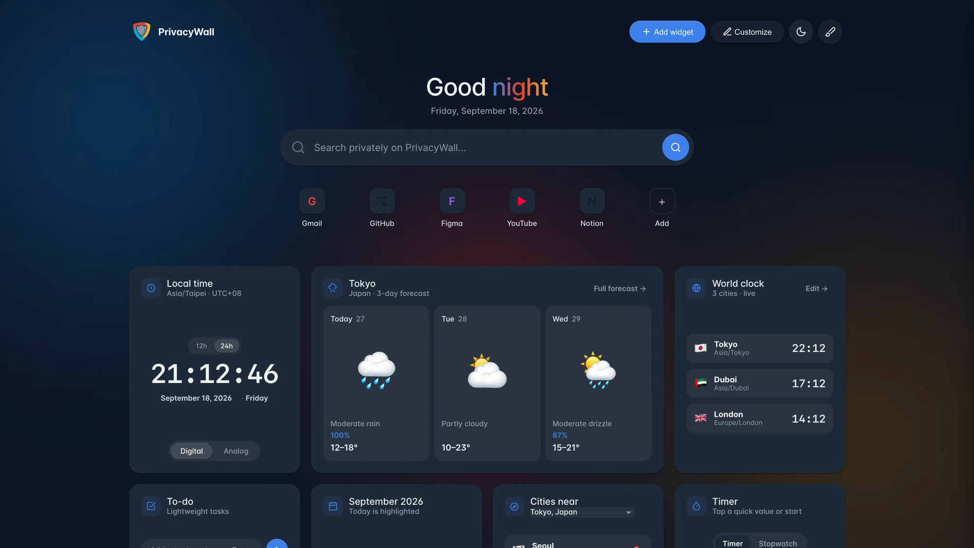
Everything worth having on a new tab is something the user already checks: the time, the weather, a timer, a list. None of it needs a server or an account, so the page is a board the user composes, with every piece of state kept on the device.

The board
First run
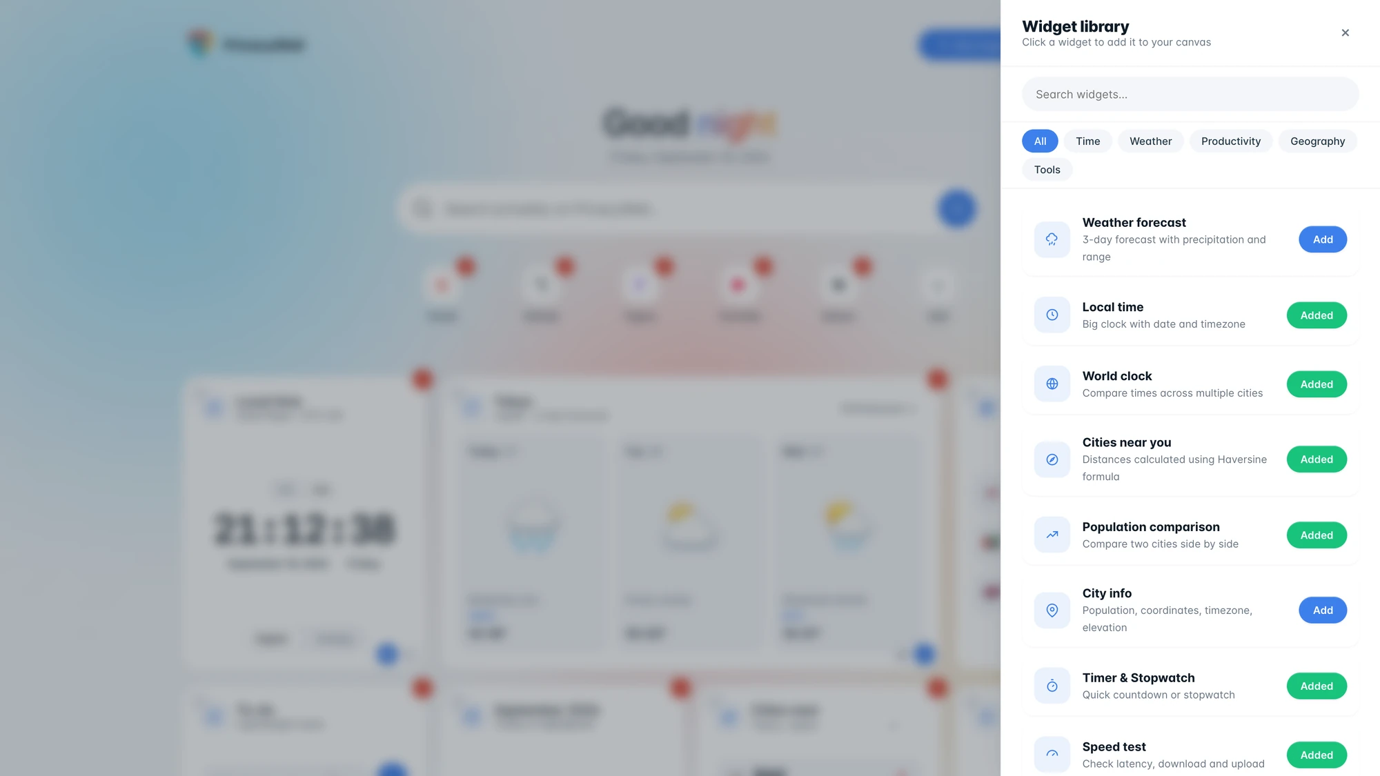
Widget library
Dark
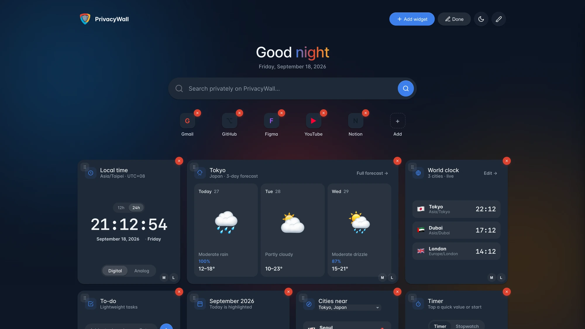
Customise
Weather answer
Stock answer
Entity · a place
Entity · a person
Crypto answer
Widget tools · 2
Widget tools · 3

State never leaves

The board, the theme and the widget data stay on the machine. No tracking, no history becomes a structural fact, not a claim.

A library, not a settings page

Widgets are grouped by time, weather, productivity, geography and tools, each described in a line. Adding is one tap and the widget arrives populated.

Edit where it lives

Customise mode removes, reorders and rethemes the board in place, because a setting that sends you away from the page loses most of the people who wanted it.

On AI · No server, no account and no model. A feature that needs a server needs a different design.

05PrivateView, introduced once

A coach mark that is rationed, and tells the truth about where you are going.

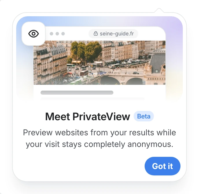
PrivateView previews a result without the site seeing the visitor, so privacy is something a person chooses at the moment they click. The coach mark is how they meet that choice. It is the only surface in the system that interrupts without being asked, so it is rationed: one per session, never twice for the same feature.

The PrivateView illustration from the PrivacyWall landing page, running live from the design system. Hover it.
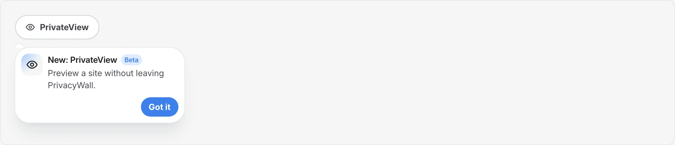
Meet PrivateView · a new feature, in brand
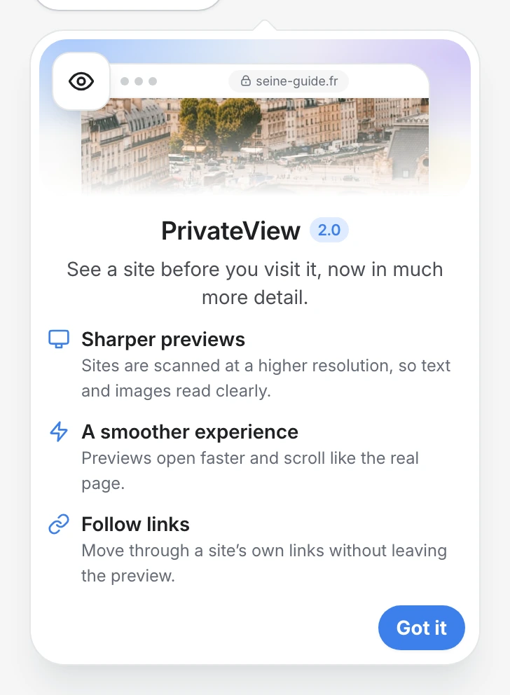
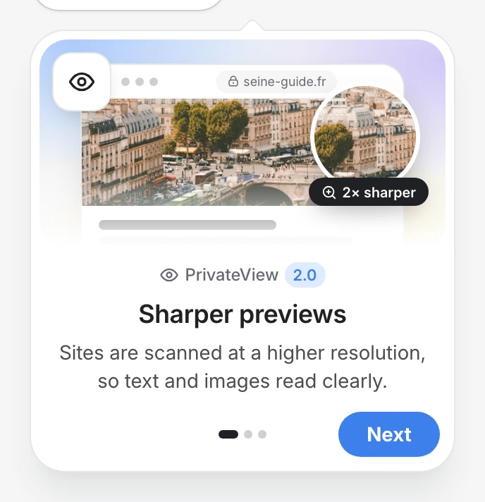
PrivateView 2.0 · it came back better
The same changes, one step at a time

Real coach marks from the PrivacyWall design system: the announcement, the update, and the update in steps.

Privacy as a choice

Stay private, or go public. The person decides, and knows what each costs.

Every result has two ways out. PrivateView previews the page through PrivacyWall, so the site never sees the visitor. Visit opens the site directly, the way any link does. Neither is the default imposed on the person, and neither is hidden. The coach mark exists so the second choice is made with its consequence in view.

Stay private · PrivateView

Preview the site without being seen by it.

  • Your IP address is hidden from the site.
  • No cookies and no tracking reach you.
  • You stay inside PrivacyWall while you look.

Go public · Visit

Open the site directly, knowing what it will see.

  • It opens in a new tab, as any link would.
  • The site will see your IP address.
  • The coach mark says so once, then gets out of the way.

The coach mark is a heads-up, not a gate. It does not ask for confirmation, does not shame the person for going public, and does not repeat. It names the site in bold and says exactly what that site will see, because an invisible consequence is the one case where a control needs explaining.

A compact caution coach mark under the Visit button: Leaving PrivateView, opens youtube.com directly in a new tab, the site will see your IP address
Going public: under Visit, what the site will see.
A compact coach mark beside a control announcing New: PrivateView
Staying private: the compact announcement beside PrivateView.

The storyA problem I carried for a year

A picture of a page, made into a page.

PrivateView lets someone open a result without the site seeing them. It worked, but it showed a screenshot you could not use, and for any page with media, often an empty one. Here is how it got fixed, and why it waited a year.

Preview image quality

60%

up from 60%, with faster loading and a more responsive interface.

What the person can do

LookBrowse

from a static screenshot to a page with its click areas mapped and a sidebar of every link, visited ones marked.

All 6 parts received
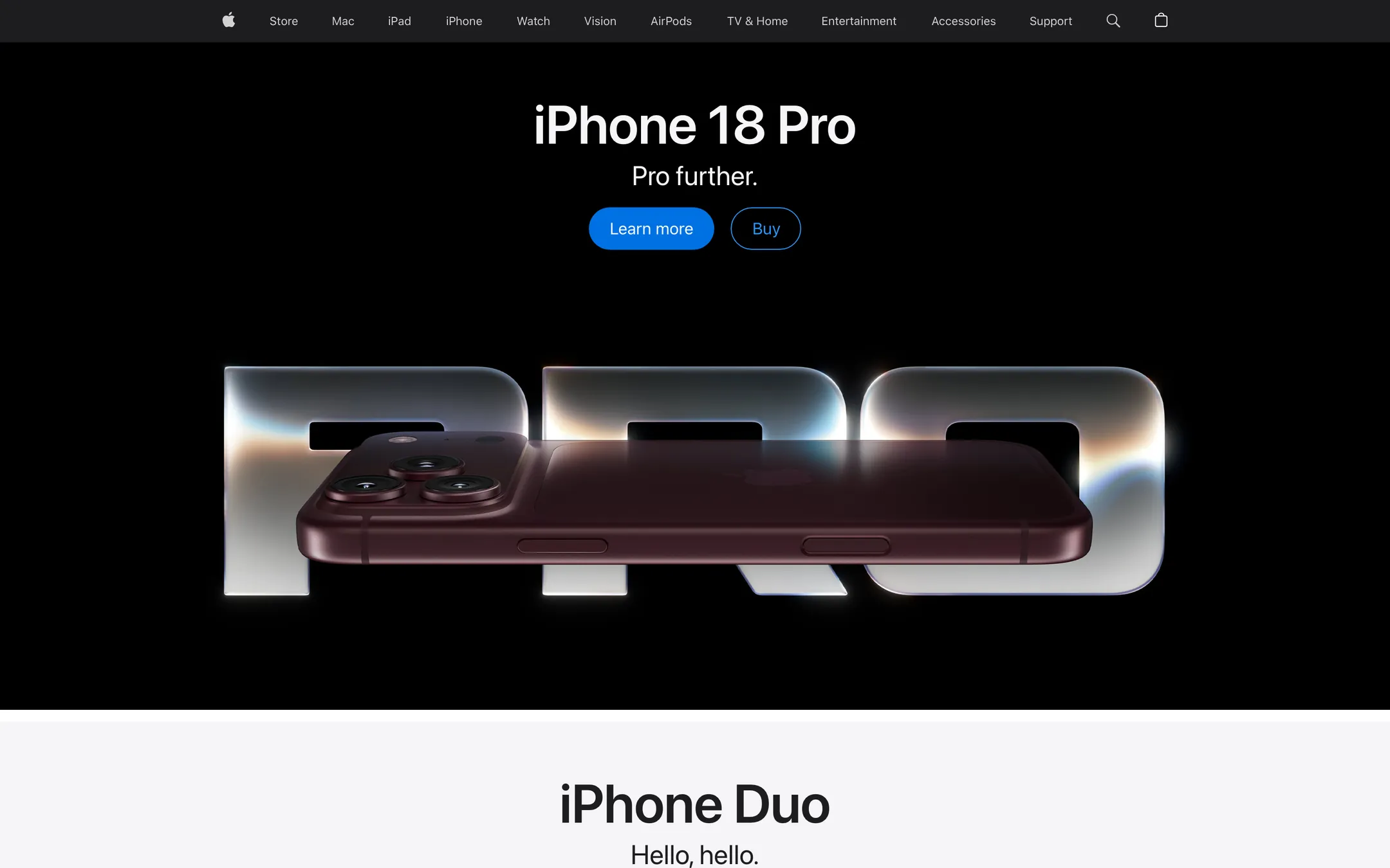
Preview · apple.com · private
Version 2 preview of the same page, fully loaded: the hero image is there and every link is a click area

Hover the page. Click anything that looks clickable.

How it went

Eight steps, one of them waiting.

  1. 01

    The legacy problem

    When I joined, PrivateView was a static, low-resolution screenshot. You could look at the page and do nothing with it, and it frustrated the people it was meant to protect.

  2. 02

    The constraint

    My first solution was paused: the technology to do it properly was not there yet. I chose to wait for the right moment rather than ship a compromise.

  3. 03

    Timing the tech

    A year later, AI tools had matured. That was the opening to build the interactive experience we had needed from the start.

  4. 04

    The execution

    I designed and prototyped the whole second version myself, using AI to get past the development blocks that had stopped the first attempt.

  5. 05

    Pages with media came back empty

    In version 1 the screenshot was taken the moment the page started to load, so any page with images, video or a map came back to the user empty. I fixed the engine: it now waits until the page is fully loaded, supports the media in it, and only then sends back the image.

  6. 06

    Buffered, progressive delivery

    Waiting for a full load has a cost: a heavy page takes time, and no one will stare at an empty panel. So the engine no longer returns one finished image at the end. It buffers the capture and streams it in parts, each sent as soon as it has been rendered. The client paints the parts as they arrive, top of the page first, so the preview starts showing before the capture finishes and fills in while the rest loads. The full-load guarantee still holds: the image is complete when the last part lands.

  7. 07

    A browseable interface

    From a static picture to a page you move through. Click areas are mapped, so a link behaves like a link and a button like a button, still through PrivacyWall. A sidebar lists every link on the page and marks the ones you have visited.

  8. 08

    A visual and performance leap

    Preview image quality went from 60% to 80%, with faster loading and a more responsive interface.

Image quality (60% to 80%) is the one figure recorded. Loading time and responsiveness improved; their figures are not recorded here, so none are shown. The page above is a drawing of the behaviour on a familiar example page, not Apple's site and not the product's code. The six parts in the replay are illustrative, not the engine's real part size.

06Decisions and the evidence behind them

What we saw, what we knew, what we chose, and what we gave up.

01

Protection is the default, and the interface says so in words

What we saw
People who care about privacy still do not want to operate it. The category made the security model their problem.
Evidence
Interviews· Qualitative20 privacy-conscious users: they wanted privacy to disappear into the experience, not to configure it.
Benchmark· Qualitative14 privacy navigation tools signalled “this is hard” at every touchpoint.
So we
Tracking blocked, referrer stripped and history off by default, with one status line in plain words instead of a settings trail.
Not
Per-site toggles and a privacy dashboard to maintain.
What happened
Trust scores rose 34% in post-launch surveys, and the shared language cut cross-platform development time by 30%.
02

Maps: match the mainstream model, spend originality on the data

What we saw
The moment navigation feels slower or stranger than the mainstream app, people switch back and take their location history with them.
Evidence
Benchmark· QualitativeMobbin grounding on mainstream mapping products, with the explicit goal of matching their interaction model.
Prototype· QualitativeThe panel built as a state machine and judged by using it, because transitions cannot be judged in static frames.
So we
One panel that is finder, place and directions while the map stays live. PrivacyWall Coordinates is the one new idea, in the familiar action row.
Not
Separate screens per state, which lose the map and the user's sense of where they are.
What happened
Checked: first-attempt success for someone who uses a mainstream map daily. Result: it passed.

03

Search: refinements above the results, not inside the hotel strip

What we saw
Filters sat behind a button attached to the hotel carousel, so they read as hotel-only.
Evidence
Benchmark· QualitativeGoogle documents filters below the search bar; Kagi puts type filters and Lenses under the search box; every engine of the seven keeps the query and its refinements above the results.
Code review· QuantitativeIn PrivacyWall's prototype the filters lived in a carousel panel, and the page opened on a hotel strip before any result count.
So we
A results toolbar under the tabs: private result count, language, region, time window and safe search.
Not
Keeping filters inside the carousel and renaming the button.
What happened
Checked: the time for a participant to narrow to a date range. Result: it passed.

04

Glance: a bounded, sourced, dismissible answer

What we saw
Glance was a word with no visible behaviour, so nobody could tell whether it summarised, filtered or re-ranked.
Evidence
Benchmark· QualitativeGoogle AI Overviews, Bing Copilot Search, Brave Summarizer and Perplexity all attach cited sources; Kagi offers a Quick Answer that leads into follow-up.
Code review· QuantitativeNo visible answer card existed, only a toggle labelled Glance.
So we
Three to five sourced points, sources as chips, an explicit way to open them, an explicit way to hide the card.
Not
An ambient AI mode the page enters and cannot leave.
What happened
Checked: Dismissal rate, source-open rate, and one trust question after use. Result: it passed.

05

Commerce keeps its strength but loses its priority

What we saw
A travel query opened on a hotel carousel before the user saw a result count, a filter or a single organic link.
Evidence
Benchmark· QualitativeA direct Brave spot-check of a hotel query showed ad data plus hotel clusters with photos, ratings, price range, address and distance, still framed by the page's own context.
Code review· QuantitativePrivacyWall's hotel strip had no dates, no edit control, no map or list toggle and no sponsorship label.
So we
A module header that states the trip window and the source, with edit and map/list controls, placed below the page's own context.
Not
Removing the module, which would have thrown away the one place the product earns.
What happened
Checked: a participant names the result count and one organic result without scrolling. Result: it passed.

06

PrivateView: name the privacy action, and keep it on mobile

What we saw
The product's reason for being was an unlabelled icon, and on narrow screens it was not there at all.
Evidence
Benchmark· QualitativeStartpage's Anonymous View is a named per-result action; Brave and DuckDuckGo lead with their privacy position.
Code review· QuantitativeAt 760px and below the privacy action was set to display: none.
So we
A labelled PrivateView control on every result, and a compact overflow on mobile instead of hiding it.
Not
A tooltip on the same shield icon.
What happened
Checked: Unaided recall of what the control does, and whether it is found on a phone. Result: it passed.

07

Travel: ask once instead of inferring forever

What we saw
Without history, a device graph or past bookings, a private engine starts travel search with a handicap.
Evidence
Design judgement· QualitativeMost of what tracking infers is something people will happily declare if asked once, so the question is what they can say in one tap.
Benchmark· QualitativeMobbin grounding on travel search, destination cards and price comparison patterns.
So we
Three named verticals, an approximate district stated in plain words, and cards that lead with dates and total price.
Not
Inferring intent from behaviour, the way mainstream travel search does.
What happened
The recommendations are specific and comparable with no profile behind them, and the trip framing and price treatment became the specification for the hotels module inside search.

08

Dock: every piece of state stays on the device

What we saw
The most-visited page in a browser is the least designed, and mainstream versions pay for it with a behavioural feed.
Evidence
Audit· QuantitativeAn audit of what a privacy browser already owns, asking which surfaces the category treats as inventory rather than product.
Prototype· QualitativeA working board with live widgets, a library and customise mode, because a board can only be judged by composing one.
So we
No server, no account and no model: the board, the theme and the widget data live on the machine.
Not
Syncing boards through an account, which would have made the privacy claim a promise instead of a structure.
What happened
No tracking and no history is a structural fact of the architecture, not a statement a user has to take on trust.

07What to do first

Findings ranked, so a team can argue with the right one.

The search report ranks each recommendation. High means the hierarchy fails without it.

High

  • A visible global tools row below the tabs
  • Glance as a sourced answer card, or renamed
  • Preserve and label the per-result privacy action on desktop and mobile
  • Hotel module header with location, dates, source and disclosure
  • Fix URL punctuation and conventional result metadata

Medium

  • Reduce continuous header motion on the results page
  • Result count and loading skeletons that match the final layout
  • Active filter chips with removal and a count
  • Keep one organic result near the first viewport beside a large module

Low

  • A Kagi-style Lenses concept: Web, Forums, Academic, Shopping, Travel
  • A compact why-this-result drawer for power users
  • Saved and private search settings, after the hierarchy is stable

08User testing

The test, and how it came out.

The 2023–24 ecosystem was shaped by 20 interviews and measured after launch. The work was then tested with users: the tasks below were run with people who use a mainstream search engine and map every day, against pass bars written first, and every task passed.

“Here is a hotel search. Without scrolling, tell me how many results there are, then change the dates.”

Time to a correct answer, wrong taps, whether the toolbar was found

4 of 5 within 20 seconds, no help

Passed

“Find where this claim in the answer came from, then hide the answer.”

Source opened, hide found, a one-question trust rating

5 of 5 find a source unaided

Passed

“Open this result without the site seeing you.”

Finds PrivateView unaided, first-click success

4 of 5 within 10 seconds

Passed

On a phone: “Open this result privately.”

Finds the control on a narrow screen

4 of 5, no help

Passed

“Find a café near you and get driving directions.”

Completion, how often the map is lost

5 of 5 complete, the map never lost

Passed

“Plan a flight to Tokyo for December. Tell me where these suggestions came from.”

Can explain the approximate-district label

4 of 5 explain it correctly

Passed

Every task met its pass bar. Participant details and timings are not published on this page.

Run them.

Three of the applications, live, as the prototypes themselves.

Open Glance for a sourced answer, try PrivateView on a result, use the filters. This is the prototype's own code, running here.

The system underneath.

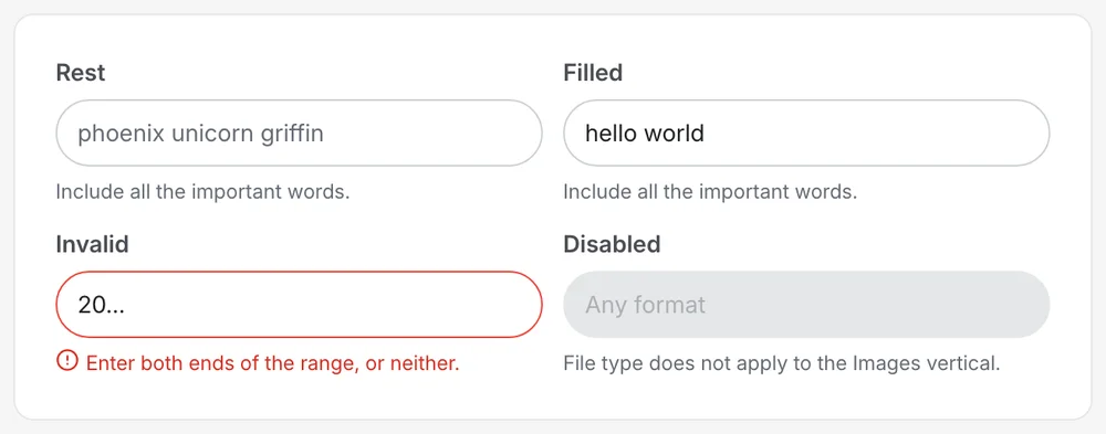
Every component ships as plain HTML with a CSS class API and as a React component, from the same tokens. Components reference semantic tokens only, so dark mode costs no second stylesheet. Every control is fully rounded, weight carries hierarchy, and every list designs four states.

01 of 03

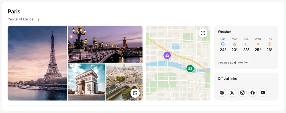
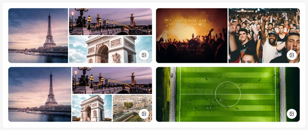
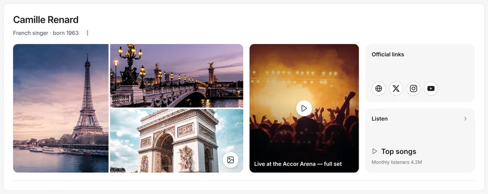
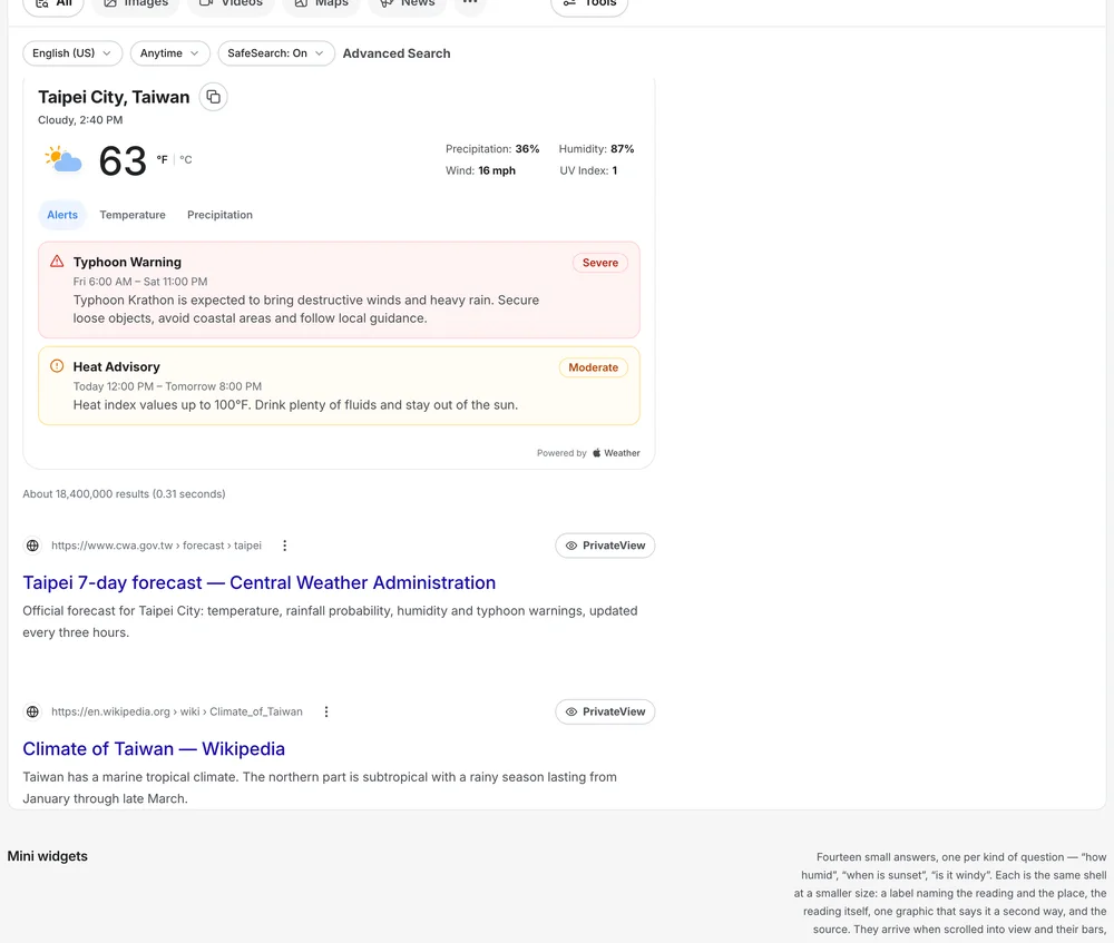
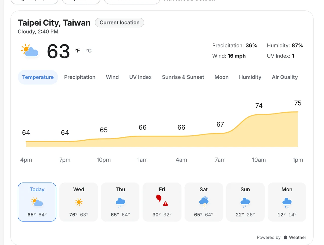
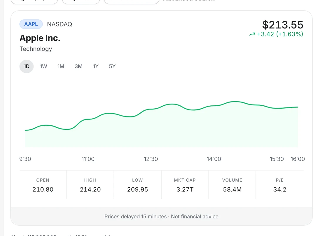
Answers that say where they came from

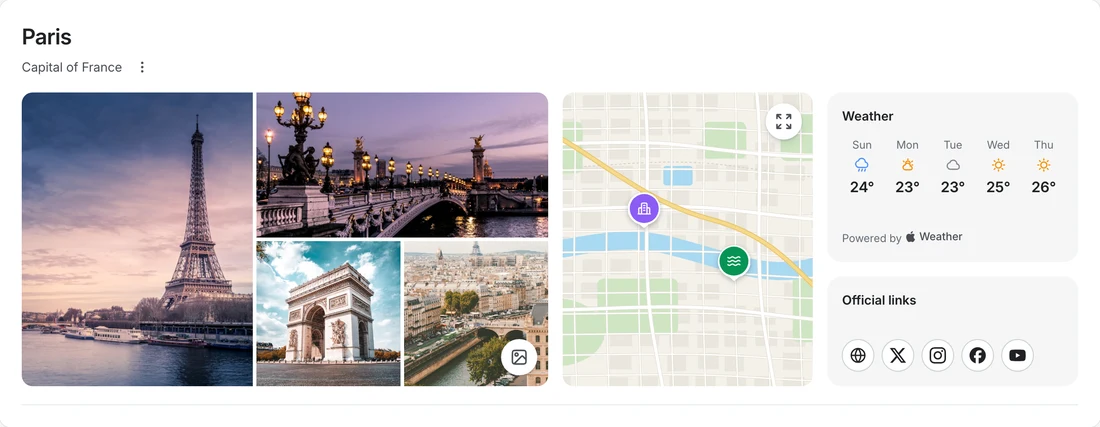
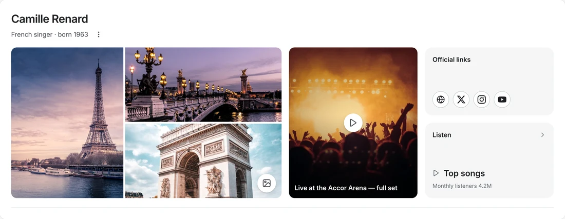
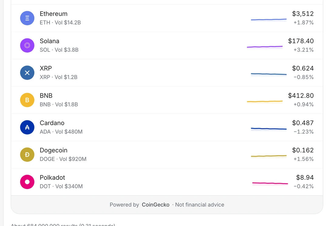
A weather answer credits the provider that supplied it. A stock card says prices are delayed and are not financial advice. An entity page shows what exists for a place or a person and re-proportions itself when something is missing.

Weather answer
Stock answer
Entity · a place
Entity · a person
Crypto answer
Answer cards
Answer cards · 2
Entity hero
Entity hero · 3
Entity hero · 4
Widget weather · 2
Widget weather · 4
Widget tools · 2
Widget tools · 3

02 of 03

Search, filters and results

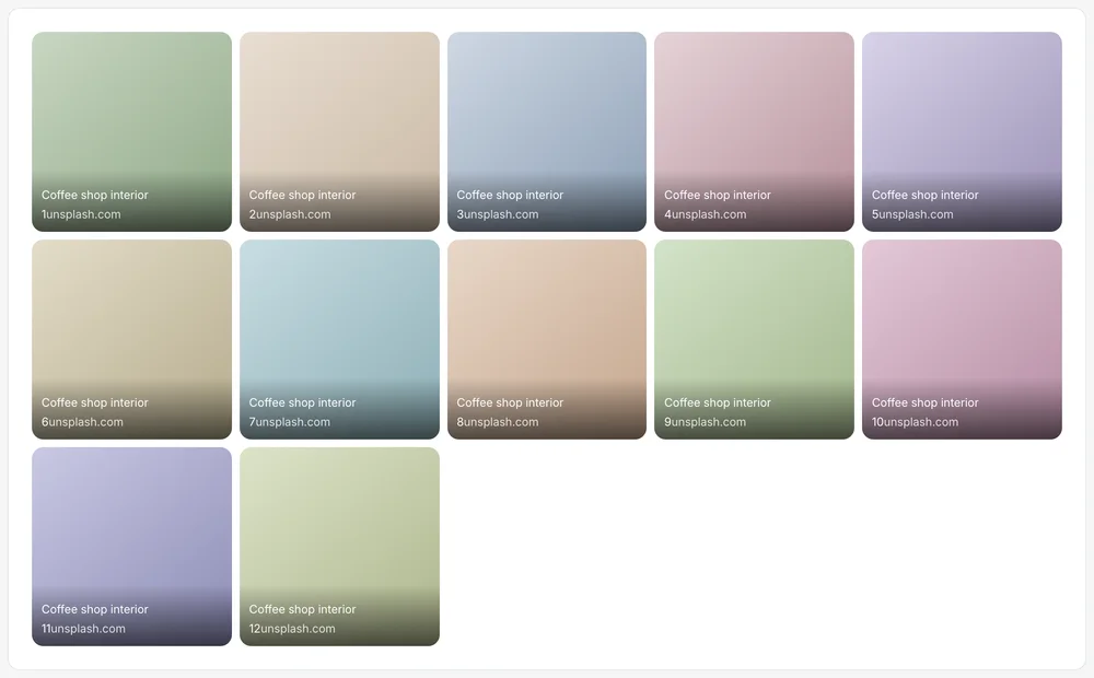
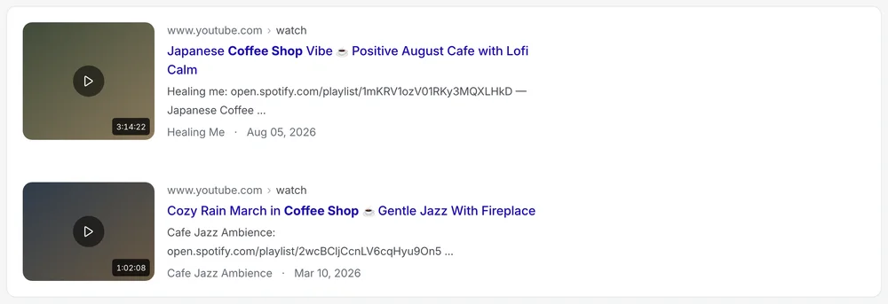
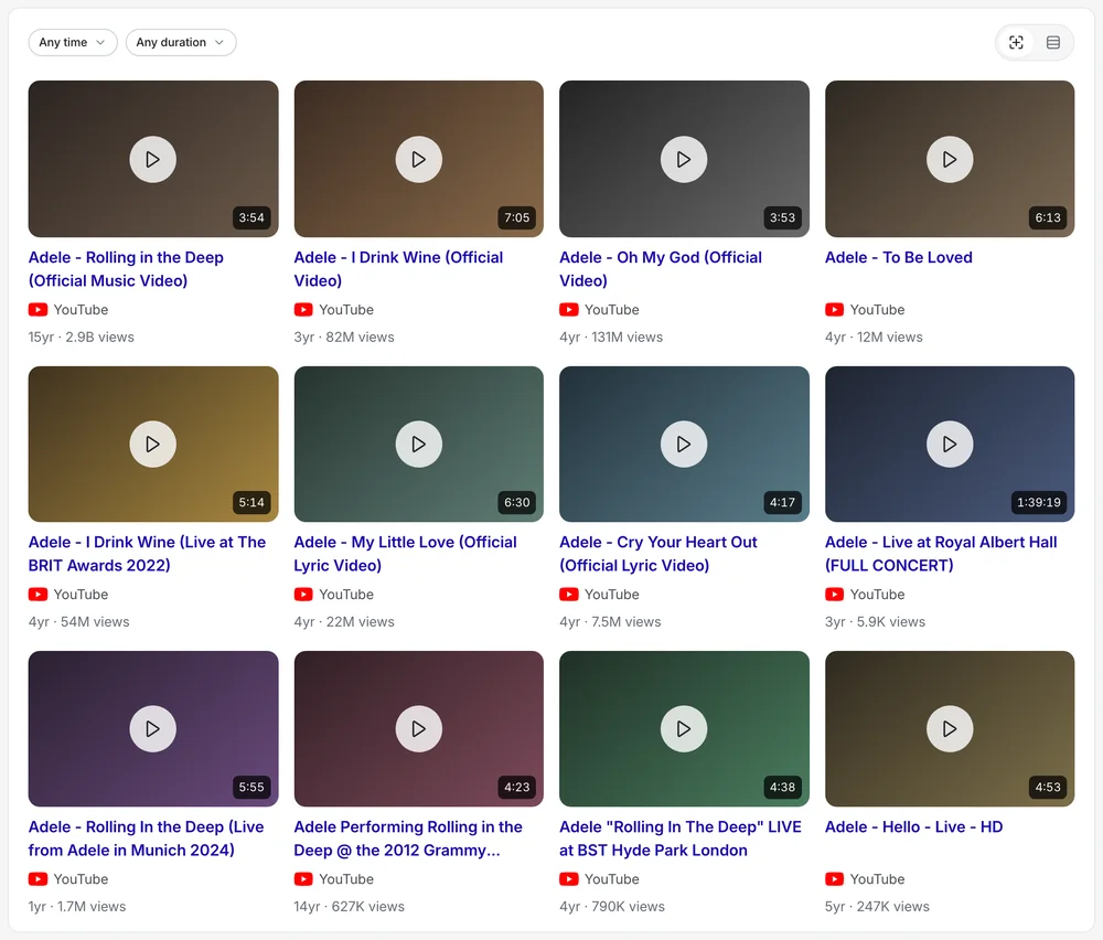
The results page, its modules, filters, suggestions and summaries, each built to be read in scan order.

Search advanced · 3
Search filters · 3
Search filters · 4
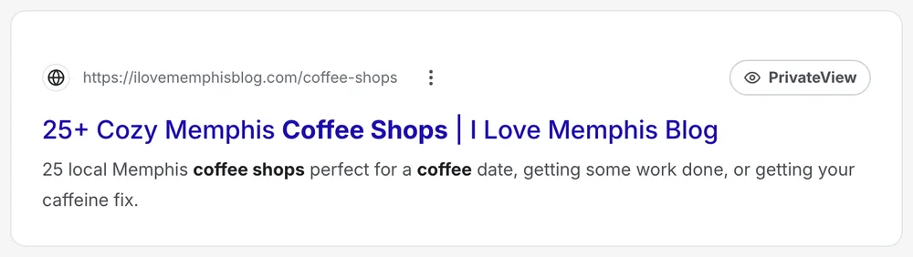
Search header
Search media
Search media · 2
Search media · 3
Search media · 4
Search modules
Search modules · 2
Search modules · 3
Search modules · 4
Search result
Search result · 2
Search result · 4
Search suggest · 4

03 of 03

Maps and travel parts

Place cards, routes, markers, saved lists, search and a flight row, sharing one set of controls.

Maps controls
Maps controls · 2
Maps controls · 3
Maps directions
Maps directions · 2
Maps directions · 3
Maps location
Maps location · 2
Maps location · 3
Maps location · 4
Maps markers
Maps markers · 2
Maps markers · 3
Maps markers · 4
Maps place
Maps place · 2
Maps place · 3
Maps place · 4
Travel filters
Travel filters · 2
Travel search
Travel search · 3
Hotel card
Hotel card · 2
Hotel card · 3
Flight row
Flight row · 3
Price explorer
Price explorer · 2
Shopping
Shopping · 2

09What it will not do

Rules that live in the parts.

Urgency only from real figures

“Only 4 left” is a provider's number, or it is absent.

No sources, no answer

An AI answer carries visible, numbered citations. Without any, the page shows the web results instead.

Data carries whose it is

A source line names the provider. A weather card that read “PrivacyWall Weather” claimed the data as ours; it credits who supplied it.

Say what leaves before it leaves

When a control hands something to a third party, a compact coach mark says where it goes and exactly what that site will see.

Missing data re-proportions the layout

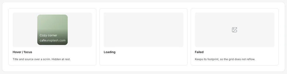
A grey box where a photograph should be claims it failed to load. The entity hero drops the column and lets what remains take the room.

A choice that is two questions is a place

Tone was four words, which is two axes flattened. The tone pad asks formality and length at once.

The trade-off

I kept models out of the product wherever I could, because its promise is that nothing about you is processed to improve it. Glance is the one place a model appears, and it is bounded, sourced and dismissible.

What it did

User trust scores rose 34% in post-launch surveys, mobile session duration rose 2.4×, and cross-platform development time fell 30%. The design system holds 100 specimens in 13 groups, built since late August 2026 in 203 commits.

© 2026 Alhasan HosniHome